NOTE: This blog has been moved to http://www.looksgoodworkswell.com

Saturday, May 28, 2005

Mind Mapping Design Patterns

I have long been fascinated with design patterns.

My first real encounter was in the field of software design when the classic book, Design Patterns by the so called Gang of Four (Erich Gamma, Richard Helm, Ralph Johnson, John Vlissides).

Many of the patterns I had already been using. I just did not know to call them patterns. For example, the classic Model-View-Controller pattern had been something I had known about since reading the original Smalltalk book. It gave a clean way of designing user interfaces. Keeping the model (data), controller (events) and view (page/screen) separate from each other.

Later, when at i2 Technologies, I wrestled with creating a common user interface across our products as well as a common platform of technology. This drove me to look across all of our products. Of necessity you start to see patterns emerge. I kept thinking about coming up with a list of best practices or design patterns for interaction. But, I guess I was not clear enough in my thinking to really put it together then (1998.)

I think I was thinking more about interaction design principles than patterns.

Definitions
Ok, a few definitions are in order. Design principles are foundation concepts that help guide and shape us. Sort of a moral compass to good design. For example, the Xerox PARC adage to Keep Information in Context is a powerful design principle. It reminds us to first of present information and not just data. And to present it in proximity or in relationship with the context to interpret the data with. Style guidelines are specific rules that govern the usage of interface components, container and content. Design Patterns are best practices that express a practice in context of the user's problem focused by the design constraint.

Patterns, Patterns Everywhere
When I arrived at Sabre (Airline Solutions) to create a User Experience Team, one of the first things I did was to start a masochistic effort to evaluate about 25 of our products performing an in-depth analysis at the screen by screen level as well as noting the systemic issues. After spending a solid 4 months doing nothing but using our products, learning their quirks and looking at every screen I saw a negative set of patterns appear that I typically label anti-patterns. And as I pitched solutions I saw the same ones emerging over and over.

Now one would have thought (given my love for google since the first days it went beta) I would have googled' around for interaction design patterns. So as I later did research I found three basic sites that contain a good number of design patterns enumerated. Here they are listed in order of relevance and detail:
Design Pattern Library
At Sabre we are working on an initiative to document interaction design patterns.

One of the things that frustrated me about the patterns is that they are hard to categorize. The current sites try to put them in strict categories. This works for the most part but leaves something to be desired.

I think a faceted approach would be better and hope to one day get around to that on a domain I have reserved (uipatterns.org).

Enter Mind Mapping
Have you heard of Mind Maps? Its sort of like graphically doodling what is on the brain and capturing the associations between the thoughts as they emerge. With the right tool it is a very freeing exercise in brainstorming. There are a number of software products that provide ways to mind map. My favorite is Mind Manager.

Well, I needed a new way to think about the patterns. So I took the concept of Mind Mapping and applied to a set of design patterns.

Where It Led Me
Ok, I didn't know where it would lead me. I just sort of started typing in pattern names as bubbles on the page. Then I started associating them. Soon I started thinking, "Ok, if I keep going this way I will just keep re-arranging and never get done." So I stopped and asked the question that we always as the teams we design for, "Who is the user and what is her goal?"

Duh! When I asked that question I suddenly decided to take a goal-oriented approach to the user. Each design pattern follows roughly the same pattern:
  • Pattern Name
  • Problem
  • Use When
  • Solution
  • Examples
I saw clearly that the problem was just the user's goal. And the use when is just the design constraints placed by the system. The tension is between user goals and system constraints. So suddenly I saw a clean division between the patterns. One half could be structured to follow the user's goals. The other half the designer's constraints.

So I created one bubble just for the User and one just for the Designer.
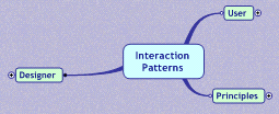


I also added a third bubble for Design Principles. Just ignore that for this discussion.

User's Goals
As I looked at the goals I started seeing just a smaller set of basic goals. Appropriate patterns that address the goal can be added as leaf nodes in the mind map.
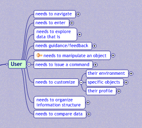


As I began to fill in each node, I discovered that this was a very natural way to express the organization of the design patterns.

Notice on the right hand side of the white bubbles I placed some gray bubbles that express a constraint. On the left is goal leading up to it and a constraint on the right choosing the right patterns.

Designer's Contraints
On the designer side I started listing constraints that were governing the patterns. These are patterns that are primarily driven by the constraints. In many ways these are patterns that do not apply specifically to a goal.
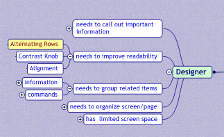


Practical Outcome of this Exercise
What this mind map arrived at was a way to find patterns based on the user's goals and based on design constraints. These are the two factors we as designers use in going to our toolbox. The other categorizations are useful but don't match my mental model of how I find a pattern for usage.

What would this look like on a patterns site? Well besides providing text search and faceted search, a pattern finder wizard could lead a designer to ideas on solving a problem (or show him we are missing patterns for this problem.) Its a pattern itself. The TroubleShooter pattern. Like the Microsoft Hardware Troubleshooter Wizard.

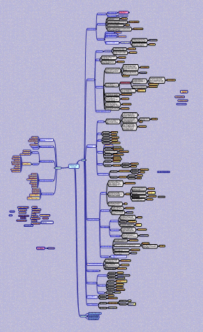
See the Mind Map
Want to view the whole mind map? You can download the map file but you will need the free viewer from Mind Jet. Download the viewer and the map file. Install the viewer and open the map file. You can expand, collapse nodes, zoom and print.
Interactive Wireframes: Documenting RIAs

Background
I started designing (and developing) user interfaces professionally 20 years ago. My first experience was writing GATO, a submarine simulation, for the then newly minted Macintosh.

I moved through a myriad of business domains from there. These included designing interfaces in the areas of:
  • wargaming
  • airline forecasting
  • software reverse engineering
  • integrated development environments
  • shipping and logistics management
  • supply chain planning
  • airline scheduling, operations, planning, revenue management
  • telecommunications
  • oil & gas production
  • lots of interface toolkits and frameworks
Somewhere around 1999 I moved away from desktop applications to the web world.

Interaction Design for the Web
It was exhilerating to have the constraint of visual design removed in product ideation. But with that exhileration came the realization that a much larger constraint had been placed on any design I wanted to come up with. The interaction dimension had all but been eliminated.

This constraint though tended to make it easier to mockup and interface or build wireframes for a design. Since most interaction occured at the page boundary, one could create interactive slide shows of the application to understand happy and sad paths. This had always been challenging in the desktop world... how do I document the interaction dimension?

Simulating Interaction with PowerPoint
By this time I was also doing lots of design work and lots of prototyping of new concepts.

One of the tools I used to present an interface was PowerPoint. It provided a way to create slide snapshots of the interface and stitch them together with hyperlinks and animation to simulate an interface. There were problems however.
  • Screen real-estate constraint. Powerpoint puts you in a smaller resolution to work with.
  • Very hard to maintain and change. No good way to visualize the interaction dimension. Have to debug hyperlinks that are hidden behind an object's hyperlink dialog.
  • Too much time spent wiring.
  • Simulating in-page interaction meant creating animations or duplicating pages with slight modificiations.
  • Limited drawing tools
  • No good way to create templates (throw them all on a single page or put them in the gallery which could not be shared with anyone unless they installed them in the exact same directory structure as you did when they were saved.)
Having said that I was able to successfully use the tool to pitch designs and iterate quickly with our clients.

The Problem
But as we started adding more and more rich interaction in our web application it got harder and harder to document the interaction in the tool.

With the recent rise in popularity of rich internet application solutions, this problem will become a much bigger issue.

Several things could happen:
  • RIA toolkits get simple enough that you can develop a quick prototype that can simulate the various interactions without a lot of code. Sounds great but probably not going to be the majority solution.
  • The community agrees on a set of notations that can indicate various interactions (double click, fade, zoom, etc.) that can be documented in a static page. These efforts have been numerous in the past. I recall working on a notational system in 1993 for desktop interactivity.
  • People cobble together tools that allow them to be pragmatic in their documentation. Wireframe the interface. Take the more interaction-dense parts and create animations with various tools to explain the interface. This will definitely continue to happen.
  • A killer tool comes out that solves all of our problems. And world peace happens, too. :-)
Simulating Interaction in Visio
So in the spirit of cobbling I recently created at technique in Visio to animate wireframes.

The problem we face is how to visualize the interaction dimension. How do we communicate what all lights up, fades, changes, pops and sizzles when the user types, points, clicks our interface.

In the entertainment world, the technique for visualizing the flow of a movie or game is through storyboards.

Enter Visio
One obvious way is to add hyperlinks and then generate the Visio wireframe as a web site. But this just gets us back to PowerPoint (with a little less power.)

Storyboarding
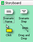
So what I created in Visio is a new stencil library that contains a way to document and drive a storyboard animation for the wireframe interface.

Storyboard Stencil

In another blog I will discuss the features of the Visio Wireframe Toolkit I built. But for now just imagine I have stencils for all sorts of web components, containers and content. I can create my wireframe with all of these elements and then use the Storyboard stencil to drive what parts of the interace show up when walking through a storyboard.

Visio Layers
Visio contains a concept called layers. Think photoshop. With one twist. The layers are really just tags. A shape (component, container, content) can be in zero, one or more layers. I have the ability to turn layers on or off. All objects that participate in that layer will turn on/off with the layer visibility.

The visual glue that holds this together is the ability to snap together storyboard frames and walk through the frames which drives turning layers on or off.

Storyboard Example

In this example, the user scenario (storyboard) is called Swap Shift. The respective steps are clicking on the desired shift, entering search criteria, checking to see if the schedule change will be what they want and finally submitting the request for the swap.

In Visio, as I double-click each storyboard step that part of the interface becomes visible. This simulates interaction with the application in a staged movie-style manner. Double-clicking the header resets the scenario to the beginning state. You can view an animation of this to see it in action.

The feedback has been very favorable. We have used this toolset to present a very complex application to a set of customers that have traditionally been hard to nail down and communicate with. They expressed a real appreciation for getting a chance to observe the interaction at much more intuitive way than traditional functional specs or wireframes.

There are issues of course.
  • I have tried to make it simple to configure each step as to which layers turn on or off. It is still can be tedious if you get a large number of layers.
  • It does not display more advanced effects like: zoom, fade, puff, slide, etc. Although these could be written as VB scripts and mostly simulated with an expanded syntax for each storyboard shape.
  • How to communicate in printing? Well you can tell which layers print or not. So you just have to take the extra step to specify what will show up for a printout.
One thing we have considered is just capturing the whole walkthrough in a movie or flash file and using this as part of our documentation (with voice over.)

I hope to publish a much expanded version of this with detailed examples as well as the stencil library. I am awaiting the editoral staff's decision.

Very Rich Mail Clients

Mail over the web has always sucked.

That is why when gmail came out I signed up as quick as I could get a friend's friend that worked at Google to invite me.

gmail set a new standard for the masses on what a mail tool could be like. Fast, responsive, innovative, keyboard driven, etc.

In fact, when I had the option on my iMac to synch the gmail up with Apple's Mail I initially chose this route. But quickly decided that I loved the following about a web mail client:
  • Don't have to learn another mail tool
  • One place for all my files
  • Don't waste my disk space on keeping mail
  • Easy to find it from anywhere I have web access
  • And I just like the interface (always room for improvement :-)
OddPost
However, I guess my head was in the sand. I never really had heard of a company called OddPost that had been building a rich mail client. It had a very loyal following and was way before gmail and it turns out a lot richer.

Of course Yahoo had heard of them. That is why they bought them out last year. At the Ajax Summit, Iain Lamb one of the OddPosts founders (now part of the Yahoo!Mail team) presented his pre-Yahoo email client.

Iain and his team took the approach to model itself after Outlook (for obvious acceptance purposes). Only they tried to tone down the interface a little.

Some re-incarnation of this technology is the foundation for a brand new (or renovated) Yahoo!Mail client sure to be soon on our horizon. Will be interesting to compare with gmail.

Scalix
Just found this one this morning. This is a Linux/Unix based solution that provides mail & calendars. The client runs in Firefox or IE and displays an almost complete clone of Outlook. Again, the client is the interesting part. It demonstrates how far you can take a DHTML client to mimic a fairly complex desktop application.

Scalix also competes head to head with the back office part of the Outlook Exchange system. Love it when Microsoft has competition :-)

And by the way I really hate the way Microsoft Outlook Web Mail client looks these days. Did they have to paint everything gradiated blue? Geez.

Web mail delivery is a natural. I for one have made the switch and do not want to go back. Of course at work I am still chained to outlook for calendar appointments :-(

Flash Based
Outside of the Ajax world, check out Laszlo Systems. They have a Mail client that has been adopted by Earthlink.

Also check out this Business Week article on web mail.

Ajax Applets: Rich DHTML Clients Via Light-Weight Plug-Ins

Several years back I was reviewing some marketing material that presented what one of my technology teams would be creating for the company I worked for. The team was chartered with building common components for web applications. One of the line items claimed we would deliver 'a rich set of Motif Applets.'

A Little History Lesson
Now if you know a little about the history of user interface toolkits, you will recognize that Motif is a user interface toolkit for UNIX X/11 systems (I first worked with this technology in 1990) and applets are bits of functionality delivered to the browser as Java byte code and run by a Java virtual machine plug-in. Its like making an oil & water shake. The terms don't go together. But I have always enjoyed the way it rolled off my tongue-- motif applets. I kind of like the way it sounds. I could just picture a marketing person gleefully stringing technology buzz words together inventing in whole cloth new dimensions to the web.

When applets burst on the scene they promised to bring about the revolution that would do away with or at least seriously diminish the necessity of desktop applications at all. Of course, lots of problems existed with the applet model. Usually the footprint was too large for the initial download. Of course some of that was bad timing -- not enough broadband to be used widely. They mostly found their home in intranet environments or as some very specific small tools on the web. I am also convinced that most people are not looking for a desktop experience when they use web applications--but that is another blog for another day.

Back to Ajax
So what's this got to do with Ajax?

Well, there are several rich DHTML toolkits that I have recently seen demonstrated that use the same concepts as X11/Motif architecture and Java Applets yet are Ajax based frameworks. A kind of modern day motif applet ;-). So, what are the characteristics that define these toolkits?
  • They download some core library or rendering engine
  • This download is automatic
  • Each page or content request is interpreted by the rendering or plug-in engine.
A Closer Look at X11/Motif
And what's it got to do with Motif?

As I mentioned before, Motif is a GUI toolkit based on the X11 Windowing System developed by MIT. X Windows is a desktop based, network delivered user interface system. When you start an X11 client (like mail tool, terminal window or calculator) the actual process could be running on another machine. A display Server is required (think browser + plugin) on your end to view the GUI application. Of course the program & display server could be running on a single client machine or you could even run the program on one machine and display it on someone else's machine (if they have an X Server with permission). The secret behind the whole thing is the X11 protocol.

By pushing a fairly efficient stream of interface instructions over a network wire to an X11 server GUIs could be remoted in distant places to simple machines with little compute power, just a nice monitor, called X Terminals.

This is exactly what a couple of the DHTML/Ajax Toolkits are doing.

JackBe
JackBe is a super-rich client framework for building web applications that can really replace desktop applications. In fact, I do not think any other toolkit like this exists today. Jacob Derechin and his brother Luis started the company in 2002 and started building solutions for corporate customers. Along the way Intel and others got excited about the potential and invested in the company. They added Ajax before it was called Ajax. They built a full (yes I mean full) IDE for building rich internet applications. Complete with all of the normal bells and whistles: layout grids, rich component set, drag and drop interface, data binding, and so on.

Besides normal looking web applications, at the Ajax Summit Jacob demonstrated the web app that Tupperware uses for its 250,000 salespersons. It was a Visual Basic application that Tupperware really just wanted remoted and not changed in any manner. Just deliver it over the web. Jacob succeeded. It looked and behaved just like the original VB application. Yet was all in DHTML.

And what is one of the core architectural decisions they made?

They wanted to be able to deliver RIA functionality over a dial-up line. And to prove the point Jacob always demos his applications over the client's dial-up line. It responds like it is running over broadband!

So how did they accomplish the speed? When you hit a JackBe application (NQ Suite) you get an initial download of a JavaScript rendering engine (they call it an assembler) that is about 29K. Since it is JavaScript the client will cache based on browser setting (usually 20 days.) Each screen or dialog is defined as a template and delivered in a compressed binary style format re-encoded as text. This means a complex GUI can be delivered in just a few kilobytes.

This takes a page from the X11 book. XRemote was an optimized X protocol for dial-up lines. This is essentially what JackBe does. Of course this is what browser plugins accomplish. They are rendering engines that accept a proprietary protocol. So in essence its kind of like a plug-in without a proprietary technology.

Tibco
Just saw this the other day. Tibco has been working on a complete rich DHTML GUI framework and IDE GUI builder for a while. The video demo is pretty fascinating. They have an incredibly complete set of components, tools and data binding mechanisms (SOAP, etc.). The rendering works the same basic way that JackBe works. The TIBCO General Interface Framework and the client-side application code are passed to the browser as a series of small, cacheable files which the browser treats as native JavaScript and XML. Tibco's rendering/data engine is around 89k in size.

The result is what appears to be (like JackBe) a very snappy interface.

It is interesting to note that both can claim a no-plug-in architecture since no proprietary technology is required to be downloaded (e.g., flash, java, svg). However, in actuality it is kind of a light-weight plug-in architecture since a rendering engine in the native browser language (javascript) is downloaded.

So, as always technology comes full circle.

Only now we have Ajax Applets that provide a richer, faster and more integrated visual experience for the user delivered over a light-weight, native-style plug-in architecture.

Wednesday, May 11, 2005

Ajax Summit: LiveSearch in Moderation

A Lesson from the Ajax Summit

Often we will do something just because we have the technical ability to do it. When performing a live search (ajax-enabled searching), it is just as easy technically to get the results on each keystroke.

Dunston Orchard of Apple has a nice approach to LiveSearch that he presented. Check it out at 1976design.com/blog. (I suggest searching for 'puppy')

Here is the user experience issue. When the user types in an Ajax-enabled field do they want the search to happen at every keystroke? This is the approach Bitflux took. Like Dunston, I find this sort of approach annoying. Dunston provides several nice touches to his live search feature.
  1. as soon as typing stops (appears to be half second) the search initiates.
  2. you know it initiated because you get the apple style spinning wait circle
  3. the list fills in
  4. details show in very cool callouts as you hover over the summary results.
Zuggest does something similar now. It echoes as you type that it is waiting for you to finish typing before starting to search. Then says it is searching. I don't like the text approach due to it being so wordy. But is there room for some kind of visual indicator that it will search when you are done.

One interesting question. Should the search button also be available? Dunston shows it when javascript is disabled (since live search is turned off). But does not if JS is enabled (live search is on). I believe he has done the only correct thing. By the time they get around to hitting the search button, the search is either already started or in process.

However, I experience about a half-second confusion as you wait for the search to initiate.

Maybe allowing the Enter or Tab to initiate the search instantly and would alleviate the confusion (at least for the keyboarders).

BTW, while you are his site read about the panarama banner at the top. Marvel at his slide downs-- way cool and check out the balloon details that show as you mouse over the live search results.

Anyway, the moral of the story is: Remember the user is more important than technical prowess. Just because you can do it, does not mean you should do it.

Ajax Summit - Rich & Scalable Ajax

I was fortunate enough to have been invited to speak at the recent Ajax Summit hosted by Adaptive Path & O'Reilly May 9 & 10. The purpose of the gathering was to bring together a cross-section of designers and developers who have been developing sites and applications the Ajaxian way.

My small part to play in all of this was to present a few things that we are doing with Ajax for our Sabre Airline Solutions applications.

What we are doing at Sabre
Within Airline Solutions I lead the User Experience Team. Over the last couple of years I also led the desktop and web interface technology teams. This included providing technical vision for these core technologies as well as working with 40+ products for user product design.

One of our strategic initiatives has been to create a rich set of web-based components and frameworks to support the development of web applications for the airline industry. This component set includes advanced components like: data grid, tree, menu, layout, tab, calendar, multi-select combo and many others.

Over time we have added remote scripting concepts to our framework to boost performance and interactivity. Once google maps came along we saw that the time was right to adopt their techniques with XmlHttpRequest, or what has come to be known as Ajax.

What I Presented
My presentation was on Rich & Scalable Ajax. It can be summarized as showing Ajax in the context of large data sets and with rich interaction.

Just-in-time Data
To demonstrate Ajax with large data sets we demonstrated our table component (in non-edit mode) with a 1000 records on the server, paging in data in near real-time. The point being that we can keep the data on the server and keep the client memory print small providing just-in-time data.

Just-in-time Business Logic
The second example I presented uses a small JavaScript framework that we will be releasing as Open Source that provides Ajax simplification, true drag and drop and cinematic effects. In the example, you can drag and drop crew members into a calendar. The calendar lights up the available days for scheduling based on information fetched via Ajax as soon as the user selects the crew member in the browser. The cinematic effects are demonstrated during the drop.

I will post the demo at a later date.

Drag and Drop
Drag and Drop is not new on the web, although I would argue it is rare. Most drag and drop frameworks are only drag frameworks. Managing drop management is the more important part. Handling all of the transitions in an extensible way is vital to its usefulness. What we provide is a clean, simple, object-oriented framework that implements drag and drop in a way that is trivial to add to your web-based applications. This is the idea behind the framework.

Well that's enough about my stuff. In the next set of posts I will give my observations on what I learned at the Summit.