James Govenor pointed out a connection between my blog about Interesting Moments and Kathy Sierra's blog on Is it Interesting? (see also her discussion of the tie-in). Her angle is about engagement and delight.
Also, Joshua Porter from User Interface Engineering pointed me to an article by Jared Spool from back in 2002 on The Search for Seducible Moments.
As a parent I learned a long time ago there are times when a person is especially receptive to learning. These are called Teachable Moments. If one is prepared for those times, more can be accomplished in a few minutes that a lifetime of nagging would ever accomplish.
Putting these thoughts together, we should look for the interesting moments of interaction that open the door for us to seduce and engage our audience.
I have written about some of these moments in general. Like the thought of providing an invitation to the user through lightweight events (like hover). Getting users to review a movie by making the interaction with the movie rating control fun and engaging is one example.
I am curious, what sites, products or features have you found engaging-- or even seducing?
Wednesday, December 21, 2005
Friday, December 09, 2005
Distracting or Narrowing: Looking a Little More At Live Search
Ajax opened the door to immediate actions. One of the first types of problems that immediate action was applied to was in the area of search. Here are a few examples.
Google Suggest
Google Suggest was an early demonstration of the concept of Live Search. As the user types in the Google search box, the top search terms that match the user's input are shown in a drop down. If I am looking for 'Tom Cruise' only 5 characters are required to match this search term ('tom c').
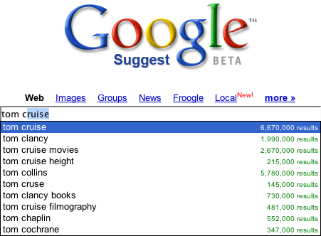
I have never used Google Suggests for anything more than a demonstration of how live search works. I rarely need help in finding search terms based on four or five characters I have typed. Don't get me wrong, I think it is wonderful code, snappy response and perhaps has some purpose. I just have never found it personally useful. I mean if I am going to look up Tom Cruise, I perhaps might find it useful that it completes it for me and spells it correctly. But I think I know how to spell Tom's name.
Here are a few thoughts I have on this.
If you have found Google Suggests useful please let me know. I am sure I am missing something. I would love to understand common use cases in which this is the case.
Yahoo! Instant Search
Yahoo!'s Instant Search takes a different twist on this. A balloon popup shows up with a single best match (based on Yahoo! Shortcuts). Kind of like a 'google suggests' for 'feeling lucky' only your lucky day is on Yahoo!
Typing 'tom cruise' yields the following:
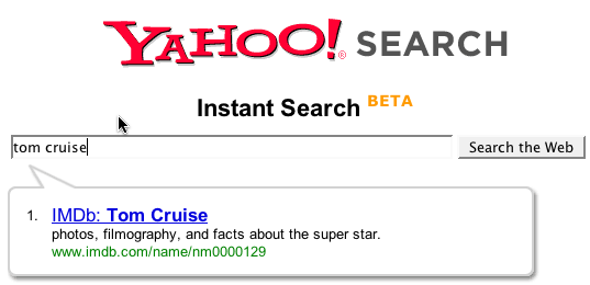
Ok, the difference here is a candidate result is shown based on what I have typed. But here are the caveats.
It is interesting that the instant search provides a nice interface for those with screen readers. The popup triggers visibility and is read by the reader. Those without sight can know the best result found instantly. Nice side effect.
Now I am on the fence overall about its narrowing capability vs. the distraction it causes me. For popular items it seems to have a 50/50 chance finding me exactly what I want. However, I tend to be someone who is searching for more obscure items so to me it is distracting (though cool!) The fact that it narrows to 1 item causes it to have this sharp distinction between distraction vs. narrowing.
Do you like or not? If I understand correctly, it did well in user tests. What say ye?
Kayak Auto Complete
Kayak.com is a good example of live auto complete. Say the user is wanting to fly into New York city. They seem to remember that the airport they want is called LaGuardia (not sure how to spell it or what the airport code is). When I type 'New Y' I get the following results:
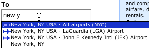
Ok, this is nice. I hate remembering the airport code. And I hate having to go to another page to find out that the site could not figure out what I meant. Jakob Nielsen states as one of his ten usability principles, Error Prevention. Providing the feedback instantaneously to cue me to what the system thinks is great. Saves me time and makes me feel like I am narrowing in on the right thing. This probably ties in with Jared Spool's research on The Confidence Game which shows that users are happy to click and click as long as they feel confident they are reaching their goal. Here I have the best of both worlds. Raise my confidence and do it with the minimal effort!
Hey Travelocity, FareChase, Orbitz, Hotwire, Expedia-- this is good stuff! Get this feature in your sites!
Without a question this helped me narrow to my result and did not distract me.
Of course I have compared apples and oranges. Both Google & Yahoo are dealing with an enormous body of information that it is trying to give you instantaneous feedback on during your typing. Much to infer. Kayak has an extremely limited (though hard to remember) set of data. Perfect for an instantaneous narrowing opportunity.
Yahoo! Mail & Why it Dumped LiveSearch
The new Yahoo! Mail Beta (still in limited release--and no I can't get you in the beta! :-) has a nice search box for finding content in your mail. It works extremely well. When you search for some content you thought came into your mail messages, the results show snippets of the conversations with the matched text highlighted.


Now you will notice that the search box has a little "Go" button beside it (and when activated, the an inline progress indicator shows). So how can I call this live search? Well it really isn't. However, they started with a live search in the Alpha version. The user would type a few characters and then the search would trigger. However, when the product went beta they went with a more traditional "submit" model. In other words instead of key events (or losing focus) implicitly triggering a search, the user has to now hit the "Go" button to get a search initiated. Why the change?
The primary reason was performance. Supporting the scale of users within the Yahoo! Mail network would be an enormous hit on servers. However, I think there is also something to be learned from this on the user experience side.
Now this is not scientific. It is my observation. But when confronted with a live search box that will return results (not suggestions) I immediately expect a button to trigger it. So at first I am a little unsure. Ok, that can be worked around by learning the interface. But next as I start to type a string, say "liberty mutual", it would start matching 'liber' finding things about liberals, liberality, liberty and so on. Now it starts changing as I continue to type. I get through the first word 'liberty' and now I find mail that discusses liberty in the U.S. and elsewhere as well as finding an email from my insurance company. Finally I type the whole thing in and get what I am looking for.
Now here is the point. How helpful was the constant feedback loop?
Did the feedback help me narrow to the message I am looking for or did it distract me during the task of entering what the term I knew I was going to type?
I vote that it was distracting.
I feel like I am in a race with the instantaneous search engine to get my term in before it starts returning the wrong results :-(
Thankfully it was replaced by this more traditional (yet Ajax-based) solution.
Amazon Zuggests
Using the Amazon API, Francis Shanahan created a way (Amazon Zuggests) to search amazon using the similar approach of Google Suggests and Yahoo! Instant Search.
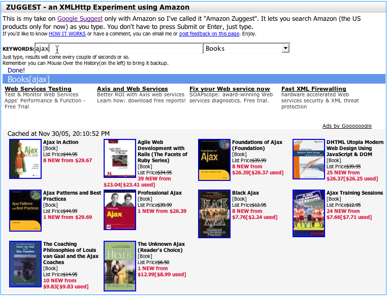
This is really nice since it shows the results to my search terms as I type. Since the results usually have cover thumbnails and some text, it is easy to use it to explore to find books on a topic without ever leaving the page.
But does it really help me narrow quickly? Well, yes & no. Since it seems to not try to search too fast (on my pausing to type) I don't get into the race I felt like in the early Y! Mail Alpha. I can type a word, say "football." What I get back is a bunch of books on football for NFL and college. What I really want is college football. So I continue typing, adding the word "college". Now I get a bunch of college football results.
By not narrowing too quickly (to one result as with Y! Instant Search) and not trying to return results to fast (like Y! Mail Alpha did), the feedback loop is nice and allows me to refine by typing keywords.
Summary or What I Think I Have Learned So Far
So I am interested in feedback. What other general rules am I thinking of? What other examples come to mind? What do you like or hate about live search examples?
Feedback appreciated.
Google Suggest
Google Suggest was an early demonstration of the concept of Live Search. As the user types in the Google search box, the top search terms that match the user's input are shown in a drop down. If I am looking for 'Tom Cruise' only 5 characters are required to match this search term ('tom c').
I have never used Google Suggests for anything more than a demonstration of how live search works. I rarely need help in finding search terms based on four or five characters I have typed. Don't get me wrong, I think it is wonderful code, snappy response and perhaps has some purpose. I just have never found it personally useful. I mean if I am going to look up Tom Cruise, I perhaps might find it useful that it completes it for me and spells it correctly. But I think I know how to spell Tom's name.
Here are a few thoughts I have on this.
- If I am typing a term I probably already know the term I am typing
- The drop down can be annoying as it distracts me from typing
- It is really only useful for common searches. Since I find myself typing fairly qualified search terms; and there the suggestions start to trail off rapidly (at the end of the long tail)
- Once I find matching terms I just get a second pile of results. So in essence I have searched twice.
- The usefulness seems to be if I just want to see what is hot that starts with a few characters ;-)
If you have found Google Suggests useful please let me know. I am sure I am missing something. I would love to understand common use cases in which this is the case.
Yahoo! Instant Search
Yahoo!'s Instant Search takes a different twist on this. A balloon popup shows up with a single best match (based on Yahoo! Shortcuts). Kind of like a 'google suggests' for 'feeling lucky' only your lucky day is on Yahoo!
Typing 'tom cruise' yields the following:
Ok, the difference here is a candidate result is shown based on what I have typed. But here are the caveats.
- I have to type fairly specific, complete search terms. 'tom c' does not cut it. 'tom cruise' does. And do I really want the imdb database result for Tom? Interestingly, the Y! Shortcut is his fan page, which is what I was looking for in this case.
- The balloon can be distracting since I am personally conditioned to multiple results to look at. Giving me just one seems to make me think harder about whether this is the right place to go. I tend to compare results before picking a term to drill into.
- With the balloon in place, hitting enter just takes me to the results. Which seems reasonable but there is amiguity about where I am going when I hit Enter. Ctrl+Enter is supposed to go to the link in the balloon. But on the Mac with Firefox it does not seem to work.
It is interesting that the instant search provides a nice interface for those with screen readers. The popup triggers visibility and is read by the reader. Those without sight can know the best result found instantly. Nice side effect.
Now I am on the fence overall about its narrowing capability vs. the distraction it causes me. For popular items it seems to have a 50/50 chance finding me exactly what I want. However, I tend to be someone who is searching for more obscure items so to me it is distracting (though cool!) The fact that it narrows to 1 item causes it to have this sharp distinction between distraction vs. narrowing.
Do you like or not? If I understand correctly, it did well in user tests. What say ye?
Kayak Auto Complete
Kayak.com is a good example of live auto complete. Say the user is wanting to fly into New York city. They seem to remember that the airport they want is called LaGuardia (not sure how to spell it or what the airport code is). When I type 'New Y' I get the following results:
Ok, this is nice. I hate remembering the airport code. And I hate having to go to another page to find out that the site could not figure out what I meant. Jakob Nielsen states as one of his ten usability principles, Error Prevention. Providing the feedback instantaneously to cue me to what the system thinks is great. Saves me time and makes me feel like I am narrowing in on the right thing. This probably ties in with Jared Spool's research on The Confidence Game which shows that users are happy to click and click as long as they feel confident they are reaching their goal. Here I have the best of both worlds. Raise my confidence and do it with the minimal effort!
Hey Travelocity, FareChase, Orbitz, Hotwire, Expedia-- this is good stuff! Get this feature in your sites!
Without a question this helped me narrow to my result and did not distract me.
Of course I have compared apples and oranges. Both Google & Yahoo are dealing with an enormous body of information that it is trying to give you instantaneous feedback on during your typing. Much to infer. Kayak has an extremely limited (though hard to remember) set of data. Perfect for an instantaneous narrowing opportunity.
Yahoo! Mail & Why it Dumped LiveSearch
The new Yahoo! Mail Beta (still in limited release--and no I can't get you in the beta! :-) has a nice search box for finding content in your mail. It works extremely well. When you search for some content you thought came into your mail messages, the results show snippets of the conversations with the matched text highlighted.
Now you will notice that the search box has a little "Go" button beside it (and when activated, the an inline progress indicator shows). So how can I call this live search? Well it really isn't. However, they started with a live search in the Alpha version. The user would type a few characters and then the search would trigger. However, when the product went beta they went with a more traditional "submit" model. In other words instead of key events (or losing focus) implicitly triggering a search, the user has to now hit the "Go" button to get a search initiated. Why the change?
The primary reason was performance. Supporting the scale of users within the Yahoo! Mail network would be an enormous hit on servers. However, I think there is also something to be learned from this on the user experience side.
Now this is not scientific. It is my observation. But when confronted with a live search box that will return results (not suggestions) I immediately expect a button to trigger it. So at first I am a little unsure. Ok, that can be worked around by learning the interface. But next as I start to type a string, say "liberty mutual", it would start matching 'liber' finding things about liberals, liberality, liberty and so on. Now it starts changing as I continue to type. I get through the first word 'liberty' and now I find mail that discusses liberty in the U.S. and elsewhere as well as finding an email from my insurance company. Finally I type the whole thing in and get what I am looking for.
Now here is the point. How helpful was the constant feedback loop?
Did the feedback help me narrow to the message I am looking for or did it distract me during the task of entering what the term I knew I was going to type?
I vote that it was distracting.
I feel like I am in a race with the instantaneous search engine to get my term in before it starts returning the wrong results :-(
Thankfully it was replaced by this more traditional (yet Ajax-based) solution.
Amazon Zuggests
Using the Amazon API, Francis Shanahan created a way (Amazon Zuggests) to search amazon using the similar approach of Google Suggests and Yahoo! Instant Search.
This is really nice since it shows the results to my search terms as I type. Since the results usually have cover thumbnails and some text, it is easy to use it to explore to find books on a topic without ever leaving the page.
But does it really help me narrow quickly? Well, yes & no. Since it seems to not try to search too fast (on my pausing to type) I don't get into the race I felt like in the early Y! Mail Alpha. I can type a word, say "football." What I get back is a bunch of books on football for NFL and college. What I really want is college football. So I continue typing, adding the word "college". Now I get a bunch of college football results.
By not narrowing too quickly (to one result as with Y! Instant Search) and not trying to return results to fast (like Y! Mail Alpha did), the feedback loop is nice and allows me to refine by typing keywords.
Summary or What I Think I Have Learned So Far
- The results are direct results-- not indirect results (as is the case with Google Suggests)
- The results are narrowing and not diverging (as in the case of showing more search terms in Google Suggests)
- The results are narrowing and not distracting (as was the case with Y! Mail Alpha, Google Suggests and potentially Y! Instant Search)
So I am interested in feedback. What other general rules am I thinking of? What other examples come to mind? What do you like or hate about live search examples?
Feedback appreciated.
Storyboarding Interesting Moments
In a previous post, I discussed the idea of an Interaction Matrix. I described its purpose as documenting the event states that occur within drag and drop, inline editing and other types of interactions.
However, the term event states is a rather dry and sterile way to think about this really important concept. In fact the term comes from the programming world (which I lived happily in for many years.)
Recently, I was at a talk where Nate Koechley presented about the new vocabulary of user experience in the world of Rich Internet Applications. He used the term Interesting Moments (which was coined by Eric Miraglia) to describe the event states within an interaction that are points of user engagement or interest.
I really like that term. Wish I had thought of it first ;-)
Thinking of storyboarding interesting moments within an application, an interaction, or a widget simplifies our thinking.
It actually turns event states inside out and focuses them instead on the user. It asks the question, "What is interesting to our user?" and "What is needed to engage them (invitations) and aid them (feedback) through our story?"
Nate also pointed out that designers have the role of director. As such we have a cast of characters (our interface elements) and the timeline (interesting moments) on which to play out our interface.
Let me know what you think...
Tags: storyboarding interactiondesign prototyping article
Thursday, November 17, 2005
Visio Wireframe Toolkit for Download
In an earlier post I mentioned a wireframe toolkit I wrote for Visio to make wireframe creation go much faster. Specifically I discussed one aspect of the kit-- animating wireframes with Visio. I wrote a fuller article that is just getting around to being published on boxesandarrows.com. It should show up this weekend.
In the article, I provide a reference to the fuller wireframe toolkit and they (at boxesandarrows) have agreed to host the installation files. Since I have not really explained the wireframe toolkit nor provided a way to download it before, I felt it would be important to provide a blog article about the kit and how to get it for your own use.
Caveats
Please note. The kit was fine-tuned for our frameworks at Sabre (some of which became the openrico.org project). As such the code generation is only beneficial to those with that framework (sorry, not Rico). However, those that are industrious can open up the Visual Basic Editor in Visio and find the code that generates JSP and Java/Swing code and simply replace it with code to generate PHP, ASP or whatever suits your fancy.
Also, the style has been reduced to a mostly color-less variety suitable for wireframes. In the original we had our demo CSS style implemented in Visio. The color-less variety was a really quick hack I did to dumb it down.
I don't have any proper documentation. I have included a movie presentation on how some of the features look when someone is using them.
And finally, I have spent no time in the last 5 or 6 months refining it. Now that I understand how to create Visio shapes and manipulate them I would do some things differently. I keep thinking it would be nice to clean it up, fully document it and release it. That though was what kept me from sharing it before. So, here it is. Hopefully, some will find it helpful.
Wireframe Prototyping for Visio
Visio is widely used by interaction designers and information architects for creating wireframes. At my previous employer, Sabre, I created an extensive wireframe toolkit for Visio that included such features as:
- Complete web component stencil library (including standard components, table, menus, tabs, and tree)
- Fast, intelligent snap-to layout using pre-programmed Visio connectors
- Provide a way to visualize rich interactions (animating a wireframe)
- Intelligent components that have built-in behaviors
- Generate requirements documents from wireframe artifacts
- Generate code from wireframe artifacts
- Automated annotations and callouts
Download & Installation
The stencil library is available for download.- Make sure you have Microsoft Visio 2003 installed on your machine.
- Download the zip file
- Unzip this into your C:\My Documents\My Shapes folder. (My Shapes should have been created by Visio when you installed it.) You should have the contents of the zip directly in the My Shapes folder.
Now that it is installed, you can navigate to this directory and double-click inlineEditWireframeExample.vsd to experiment with the photo editing example. If you want to create a new Visio wireframe using the stencil library double-click the Wireframe.vst file.
Notes
- Make sure you allow macros to run (change your security setting to avoid the annoying messages... sorry I know how to fix this, just haven't gotten around to it.)
- The templates were originally built for enterprise web applications. Some parts may or may not be applicable to your application. I welcome feedback. At some point I would like to rework to be more generally useful.
Boxes And Arrows Article
Look for upcoming article (11/20/05 ?)
Presentation
- You can download a presentation of what the Visio stencil library contains. Download it as flash (4 MB) or as a quicktime movie (this contains all of the embedded videos -- 5 MB). I recommend the .mov version.
Saturday, November 12, 2005
Y! Trip Planner & Web 2.0 Content Objects
A couple of weeks back, Yahoo! announced Trip Planner
If you haven't had a chance to use it, I strongly encourage you to get your hands on it. In a nutshell, you can plan day trips, weekend trips, vacations into a trip plan. You can build the trip plan collaboratively with a group of fellow travelers or if you are a control-freak, all by yourself ;-)
At a later time I may blog about the details of the interface. Others have gone into lots of detail. And the team has lots of really cool features planned. On top of that, the team is full of talented folks and they are jazzed about this product. I am too.
Trip Planner is a good example of how an older idea can be transformed as it moves to become a Web 2.0 tool.
I used to use Microsoft Trip Planner. However it was limited since the maps and travel guide information were based on a snapshot on my CD. I loved it but it was severely limited in what it could give me as well as rapidly growing out of date.
There are a lot of things I love about this product:
But I think what has really excited me about this product is how it illustrates the power of Web 2.0 Content Objects.
In Microsoft Trip Planner the trip plan was a file on my disk. I could send the file to a friend and if they had the same application they could access it.
But think of the power of the web as a platform for these Web 2.0 style files. I can create trip planning content, share it publicly, and allow others (of my choosing) to collaborate with me on it. And once good trip plans surface over time, there will be less and less need for me to create trip plans from scratch.
This is what del.icio.us (and later furl.net and myweb2.yahoo.com) did for bookmarks. Shareable and findable.
Microformats
microformats.org is an attempt at defining the underlying data format for sharing user generated content. I don't want to discuss the merits of whether it should be in HTML or XML format. I just find the idea of movie reviews, restaurant reviews, trip plans, news clips, and a host of other content being in a format that is shareable, bloggable, findable to be really exciting.
Challenges for User Experience
So that leaves several challenges for us in the User Experience world. Here are just a couple of issues.
What do you think the challenges are for these types of applications? For these types of shareable content objects? Other examples you have seen?
The Blurry Line
And, one more thing. I notice that Microsoft has Streets & Trips 2006. Looks to be very full featured. It seems to pull its content from the web. This raises a number of questions about what is the right approach. Do I build a product like this as a desktop application or as a web application? Sounds like a good topic for another blog...
If you haven't had a chance to use it, I strongly encourage you to get your hands on it. In a nutshell, you can plan day trips, weekend trips, vacations into a trip plan. You can build the trip plan collaboratively with a group of fellow travelers or if you are a control-freak, all by yourself ;-)
At a later time I may blog about the details of the interface. Others have gone into lots of detail. And the team has lots of really cool features planned. On top of that, the team is full of talented folks and they are jazzed about this product. I am too.
Trip Planner is a good example of how an older idea can be transformed as it moves to become a Web 2.0 tool.
I used to use Microsoft Trip Planner. However it was limited since the maps and travel guide information were based on a snapshot on my CD. I loved it but it was severely limited in what it could give me as well as rapidly growing out of date.
There are a lot of things I love about this product:
- Collaborate on trip planning
- Share trips publicly
- Pulls trip planning into a single location
- Can find other's trips
- Uses the ever expanding Y! Maps products (map view)
- Has enormous tie in potential to other Y! products (watch for upcoming features!)
- I just love travel. Hey I live in the Bay Area. Lots of places to explore!
But I think what has really excited me about this product is how it illustrates the power of Web 2.0 Content Objects.
In Microsoft Trip Planner the trip plan was a file on my disk. I could send the file to a friend and if they had the same application they could access it.
But think of the power of the web as a platform for these Web 2.0 style files. I can create trip planning content, share it publicly, and allow others (of my choosing) to collaborate with me on it. And once good trip plans surface over time, there will be less and less need for me to create trip plans from scratch.
This is what del.icio.us (and later furl.net and myweb2.yahoo.com) did for bookmarks. Shareable and findable.
Microformats
microformats.org is an attempt at defining the underlying data format for sharing user generated content. I don't want to discuss the merits of whether it should be in HTML or XML format. I just find the idea of movie reviews, restaurant reviews, trip plans, news clips, and a host of other content being in a format that is shareable, bloggable, findable to be really exciting.
Challenges for User Experience
So that leaves several challenges for us in the User Experience world. Here are just a couple of issues.
- Discovering Content Objects. Progressive disclosure (giving the user just the amount of features they need at the beginning and growing with the user) will help. Finding other trip plans while just searching around travel related items lead the user to explore.
- Getting folks to share. We all have suspicions about sharing information on the web. Do I want people to know where I travel, what I like to do? To some of us it is not an issue. To others that is terrifying. How do we create assurances (and more importantly we had better do the right thing with their data!) that there can be some anonymity? Trip Planner allows you to choose to share or not. But perhaps there should be a way to share anonymously. Have Trip Planner only post the outline of the trip and no user generated comments (only from other sources).
- Understanding collaboration. At Y! we struggle with who your community is. Is it Y!360, address contacts, IM buddies, flickr friends and family? And do user's really understand how they would work with other people (or how many will do this?)
- Avoiding feature bloat. We are building full-scale applications. Yet most user's engage us ligthtly. How do you make feature rich, discoverable applications? Providing "feature invitations" unobtrusively at the moment they need it.
- Getting users to understand how other tools might work together to solve their problem. Trip Planner uses Y! Local, Y! Maps, Y! Travel, Y! Search, Y! Travel Guides. It will use more properties in the future. How do you take a slice like trip planning across all of these products? Obviously you have to treat the other properties like services and build a complete application out of this slice. That leads to understanding how to present robust applications (without undue clutter, etc.) as a web application.
What do you think the challenges are for these types of applications? For these types of shareable content objects? Other examples you have seen?
The Blurry Line
And, one more thing. I notice that Microsoft has Streets & Trips 2006. Looks to be very full featured. It seems to pull its content from the web. This raises a number of questions about what is the right approach. Do I build a product like this as a desktop application or as a web application? Sounds like a good topic for another blog...
Friday, November 11, 2005
Animating Interactions With Photoshop CS2
Sometime in the next month my article for boxesandarrows.com will finally appear. It discusses using Microsoft Visio for animating rich interactions. I discuss this briefly in a prior blog.
Photoshop CS and CS2 introduced some new features that make it easy to simulate complex interactions including animated transitions.
Layered Comps
Photoshop CS brought us the wonderful world of layered comps. You can now name the layer configuration. The layer order, visibility, layer styles, and element positions are saved.
It is sort of like being able to take a photo snapshot of the current state of the design.
Its purpose is to create alternate designs and give them a name. Then the designer can walk through the different comp designs with a customer to choose the best one among them.
In the world of rich interactions, we can take a snapshot of the user interface at each interesting event state or user interaction.
Animation Palette
Photoshop CS2 brought an animation palette. By adding layered comps to the each frame of an animation, you can play the various layered comps. Think of it being able to play back a set of complex interactions.
A cool feature is the ability to create tweening between frames.
An example is I could have two rectangles positioned and named as a layered comp called rectangles. The next comp could switch these rectangles. This could be called swapped_rectangles. Dragging these two layered comps into the animation palette will create two steps to the animation: rectangles in their original position and rectangles in their final position. Not too exciting, right? Now select both frames in the animation palette and tell it to tween and allow it to create 10 frames. Now we have 12 frames total.
When you run the animation, notice that the rectangles look like they are swapping. The in-between frames make the animation look convincing.
Capture the Movie
Simplest way is to use a video capture tool (like SnapZ Pro for the Mac) to create a movie file of the interaction as it is played in Photoshop. The movie can be distributed to illustrate the interaction.
The combination of layered comps, animation, and video capture create a simple way to illustrate cinematic effects and complex interactions in a page.
Interaction Matrix
Recently, I have been exploring drag and drop and inline editing for the web.
At Yahoo! I am fortunate to work with some incredibly bright folks. We get together for brainstorming sessions to discuss interactions like these that have application all across the Yahoo! network.
When I started capturing our sessions and writing up documents for these two interactions, I was really struck with how non-trivial it was to define exactly how a drag and drop or inline edit would operate in every case.
Let me take drag and drop to illustrate my point.
With drag & drop there are at least ten interesting event states.
So defining this in a meeting is non-trivial.
To simplify this, I created the concept of an Interaction Storyboard Matrix. For simplicity I created it as a Microsoft Excel document. Each row corresponds to an actor; each column corresponds to an event state. Each cell in the grid represents a different visual state or animation providing feedback or affordances during the interaction.
Here is what the drag and drop interaction storyboard matrix looks like:
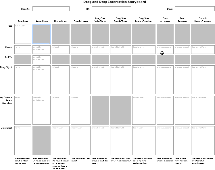
Events and Actors Reveal Interaction Storyboard Frames
So how do you use it?
Just fill in the non-gray cells with how each actor will look or behave during each event state. The interaction storyboard matrix is just a way to show different visual channels against the backdrop of event interactions. Think of it as a choreographed dance and each state being a difference scene in the play.
Feel free to download both the drag and drop template and the inline editing template.
Let me know if you find this useful.
Special thanks go to my fellow Yahoos. Matt Leacock, Kiersten Lammerding, Lance Nishihira, Eric Miraglia, Rob Aseron, Kathleen Watkins, Eric Costello, Anja Krombholz, Ericson DeJesus, Greg Rosenberg and many others...
At Yahoo! I am fortunate to work with some incredibly bright folks. We get together for brainstorming sessions to discuss interactions like these that have application all across the Yahoo! network.
When I started capturing our sessions and writing up documents for these two interactions, I was really struck with how non-trivial it was to define exactly how a drag and drop or inline edit would operate in every case.
Let me take drag and drop to illustrate my point.
With drag & drop there are at least ten interesting event states.
- Page load
- Mouse hover
- Mouse down
- Drag initiated
- Drag over valid target
- Drag over invalid target
- Drag over parent container
- Drop accepted
- Drop rejected
- Drop on parent container
- Page
- Cursor
- Tool Tip
- Drag Object
- Drag Object's Proxy (ghost of object being dragged)
- Drag Object's Parent Container
- Drop Target
So defining this in a meeting is non-trivial.
To simplify this, I created the concept of an Interaction Storyboard Matrix. For simplicity I created it as a Microsoft Excel document. Each row corresponds to an actor; each column corresponds to an event state. Each cell in the grid represents a different visual state or animation providing feedback or affordances during the interaction.
Here is what the drag and drop interaction storyboard matrix looks like:
Events and Actors Reveal Interaction Storyboard Frames
So how do you use it?
Just fill in the non-gray cells with how each actor will look or behave during each event state. The interaction storyboard matrix is just a way to show different visual channels against the backdrop of event interactions. Think of it as a choreographed dance and each state being a difference scene in the play.
Feel free to download both the drag and drop template and the inline editing template.
Let me know if you find this useful.
Special thanks go to my fellow Yahoos. Matt Leacock, Kiersten Lammerding, Lance Nishihira, Eric Miraglia, Rob Aseron, Kathleen Watkins, Eric Costello, Anja Krombholz, Ericson DeJesus, Greg Rosenberg and many others...
Popups With a Twist
If you lived through the desktop UI boom of the 80's and 90's, you will recall the history of popup windows. You will recall the rise and fall of their popularity. And now with the web we are seeing popups growing in popularity. Are we headed for the same problem? Or are these popups different? While I believe that once can create annoying popups, what we are starting to see on the web are popups with a slightly new twist.
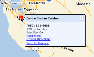
Example of a Lightweight Popup from Yahoo! Local
So here is where I want to say (with a nice, slow, southern, raspy drawl), "Back in my day, we didn't have no popups."
But in reality we did. With the advent of windowing we kind of went popup crazy. We had moved from a world of ASCII terminal based applications that went from screen to screen (or if you were clever you could tile in an area of the screen using some IBM font characters to draw the popup border and create a simulated dialog) to a nice environment with menus, windows, mice, and icons. With that sudden power applications started adding popups everywhere.
In Alan Cooper's original About Face book, he used the term, Idiot Boxes, for unnecessary dialogs that interrupt the user's flow asking pointless confirmation questions or asking for information that they system should already have.
One key design goal that I have always strived for is to minimize modes, context switches and windows for the user to manage. Direct manipulation helps to realize this goal. But another technique is to avoid going to other screens or pages to get information from the user.
In the web world, for the longest, we were plagued with two types of popups:
The use of a DIV that is absolute positioned and given a higher z-order index, styled with a title and perhaps made draggable has come into vogue of late.
And for good reasons.
On desktop apps, dialogs seem to be disruptive. In web apps, popups (when done correctly) can actually minimize the need for breaking the user's concentration by bringing in information in context quickly and easily. (Obviously abuse will not be far behind.)
In my previous post I illustrated the Hover Detail. Luke Wroblenski commented about using Hover Detail + In Context Tools to make more complex related commands readily available to the user without disrupting flow.
This is really intriguing! These really are not your father's popups!
Its the same basic idea. Just popups. But with a light twist. So what is this light twist that makes these web popups so much better than the old style? Here are some of the things that I think make them better.
Yahoo! Instant Search
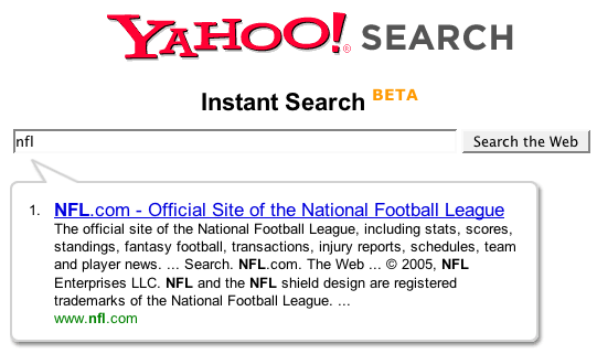
Yahoo! Instant Search Uses a Lightweight Balloon Approach to Show Shortcut Matches
Netflix
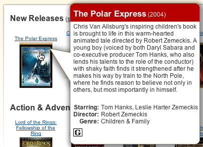
Netflix Movie Details
MarketWatch
Lightweight, Quick but Substantive. From MarketWatch. Illustrates Information & Commands in a Single In Context Popup
Example of a Lightweight Popup from Yahoo! Local
So here is where I want to say (with a nice, slow, southern, raspy drawl), "Back in my day, we didn't have no popups."
But in reality we did. With the advent of windowing we kind of went popup crazy. We had moved from a world of ASCII terminal based applications that went from screen to screen (or if you were clever you could tile in an area of the screen using some IBM font characters to draw the popup border and create a simulated dialog) to a nice environment with menus, windows, mice, and icons. With that sudden power applications started adding popups everywhere.
In Alan Cooper's original About Face book, he used the term, Idiot Boxes, for unnecessary dialogs that interrupt the user's flow asking pointless confirmation questions or asking for information that they system should already have.
One key design goal that I have always strived for is to minimize modes, context switches and windows for the user to manage. Direct manipulation helps to realize this goal. But another technique is to avoid going to other screens or pages to get information from the user.
In the web world, for the longest, we were plagued with two types of popups:
- Javascript alert box. Your basic ugly dialog box
- Javascript open window. Which created another browser window (that you could leave fairly undecorated)
- DIV based lightweight layers
- iframe based layer
The use of a DIV that is absolute positioned and given a higher z-order index, styled with a title and perhaps made draggable has come into vogue of late.
And for good reasons.
- They allow the user to input more information without leaving the current page context
- They allow the user to look at more information without leaving the current page context
On desktop apps, dialogs seem to be disruptive. In web apps, popups (when done correctly) can actually minimize the need for breaking the user's concentration by bringing in information in context quickly and easily. (Obviously abuse will not be far behind.)
In my previous post I illustrated the Hover Detail. Luke Wroblenski commented about using Hover Detail + In Context Tools to make more complex related commands readily available to the user without disrupting flow.
This is really intriguing! These really are not your father's popups!
Its the same basic idea. Just popups. But with a light twist. So what is this light twist that makes these web popups so much better than the old style? Here are some of the things that I think make them better.
- Their goal is to minimize disruption to the user
- They are virtually instantaneous. No waiting like in the old days.
- They can be styled to feel lightweight
- They can be styled to match the page they are part of (this makes them feel like they are part of the page, but yet not at the same time)
- They have enough familarity with normal popups that users know how to move and close them (hopefully!)
- They are often triggered with just a mouse hover and dismissed with a mouse out
- They remove the fear of where a link might lead me.
- They remove the need to load a new page
- They often bring information at the point of interaction and at the point of curiousity
- They remove the need for getting back to the context by using a back button
- They provide information in context-- a powerful information architecture principle.
- Couple with Ajax, they provide a world of information at the user's fingertip (or mouse point ;-)
- And they just feel great! No, seriously, after living in the land of page to page navigation it is refreshing to be able to pull content in quickly.
Yahoo! Instant Search
Yahoo! Instant Search Uses a Lightweight Balloon Approach to Show Shortcut Matches
Netflix
Netflix Movie Details
MarketWatch
Lightweight, Quick but Substantive. From MarketWatch. Illustrates Information & Commands in a Single In Context Popup
Thursday, November 10, 2005
Musings on Mouse Hover
I've been thinking a lot lately about mouse hovers. Yeh, I know I really should get out more often ;-)
A mouse hover is a really simple event. When you get a mouseover event you do someting. When you get a mouseout event you usually restore things to the original state.
Mouse hovers were virtually unheard of in the desktop user interface world. I remember writing some very sophisticated applications (games, graphical drawing packages, etc.) and only using mouse hover for some very basic operations. Tooltips & mouse coordinate feedback are two that come to mind.
It was a while before rollovers showed up. In the original Macintosh Finder and in Windows 3.1, rollovers were not used to indicate an object was actionable. It was the advent of the web and the need for discoverability that really opened the door for the lowly hover to be come to the forefront.
In the desktop world, hovers were not that immediately useful. It seemed gratuitous and redundant in those early days to do something on a mouse hover. Traditional desktop apps have always been structured around user interface controls providing the structure with data poured into this mold. Web sites & applications started with content. With hyperlinks and images embedded in the page, it was not obvious what the 'control' or navigation structure of the page was without some visual clues. Over time rollover effects that made it into the web found themselves migrating to the desktop.
Windows 95 flattened toolbars to remove the visual speed bumbs created by beveled button borders. In its place, the mouse hover showed the border and gave the essential clue that the object was clickable. As more and more folks have got used to exploring with a mouse hover, it became a more acceptable a way to discover functionality.
Ajax, DHTML and the Lowly Hover
Now that interactions are even more dense, the hover has become our friend to discoverability. We are introducing new idioms to the web space. Things like drag and drop and inline editability are not immediately expected. The hover can provide vital clues to the behavior of an application at the moment the user is curious about it. Hovers are also the lightest event for the user (they just move the mouse.)
Let's look at some places that hover is showing up more and more (not an exhaustive list!)
Hover Invitation
We can use the hover to cue the user what is going to happen next.
Inline editing
How would you know that parts of a web page's content is editable? We could be overt and just say it on the page. But that gets busy if there are lots of places that are editable. We could make everything look editable. But that also makes for a cluttered page. Hover lets us do just-in-time functionality feedback.
In flickr, hover over the photo title and you will see the color change to indicate the area has some interaction to offer. Coupled with the tooltip the user is invited to click to edit the title.

Flickr's Photo Title Before Hover
Flickr's Photo Title After Hover
Pretty obvious if the user ever hovers over the title.
In backpackit.com, the 37 Signals folks take a similar approach. They shad the area editable with a gradiated yellow background and add a lightweight inline, incontext toolset. It becomes obvious that you can edit, delete (trash can not shown below), etc. the content.

Backpackit Note - Non Editable
Backpackit Note - Showing Editability
In Yahoo's trip planner (travel.yahoo.com/trip) you get the same style of in-context toolsets on hover.

Y! Travel's Trip Planner - Itinerary Item

Y! Travel's Trip Planner - Showing Editability
Ratings
Yahoo popularized ratings. Just check out how the hover helps guide a user to rate a movie.
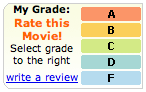
Yahoo! Movies Ratings - Not Rated
Yahoo! Movies Ratings - Invitation to Rate
By visually engaging the user in rating possibilities the user only needs to click to participate. This lightweight approach to engagement is the advantage the hover has. Hover requires little effort. The next step is just to click.
Hover is nice because it allows you to hide lots of controls and show them only as needed. Showing them in a light enough manner makes it much more engaging to participate.
One more example will suffice from Yahoo! Local's Reviews.
Yahoo! Local Review Rating - Before Hover
Yahoo! Local Review Rating - During Hover
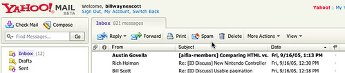
Flagging Mail
In the new Y! Mail, hovering over a message's column for flagging shows a lightly shaded flag. Clicking turns the flag on.

Yahoo! Mail (Beta) - Unflagged Mail

Yahoo! Mail (Beta) - Inviting to Flag
I think gmail's star could have been greatly improved with the addition of a hover. Although I don't believe that Google believes in the hover event at this point in time ;-)

Gmail's Star - No Hover
In all of these the hover creates an invitation, a call to action. It shows what the user can do right now, right where they are at.
I call this the Hover Invitation.
Hover Zoom/Focus
There is another use for hover. Since the mouse can indicate where I want to look, the hover can say, hey I want to focus here... I want more detail.
Getting More Detail
local.yahoo.com does this with the map. Try searching for 'restaurants' in some locale and you will see a map to the left. Hovering over the map enlarges it. Leaving the map area shrinks it back to the normal size.
Yahoo! Local Map Inset - Before Hover
Yahoo! Local Map Zoomed - After Hover
This pattern is about Mouse Focus or Mouse Zoom. In this case the hover is the interaction. While it might lead to more interactions, the Hover Invitation is a specific call to action, an invitation to click.
However, there are problems with this approach. Once the area is zoomed up it can cover other important areas, controls on the page. The user also has to move a lot further to exit the now enlarged area to get it to shrink down in size. You have to be certain that the user really wants to interact with an object to zoom on hover.
This is also common with photo organizing software. Hovering over a photo automatically enlarges it slightly.
A very slight variation on this is enlarging an area on hover to make it more apparent it will be the object selected. The Macintosh OS X Dock does this. Although with mixed results. Part of the problem is the area is just magnified. If the icon is 32x32 and it enlarges to 64x64, you still only have 32 pixels of mouse movement to traverse the object. This causes people to zoom past tools by accident.
Hover Detail
And yet another variation is the hover detail. By hovering over something I get a separate view that shows up in a lightweight popup allowing me to see or read more data about an entity. Not too much unlike a the hover zoom, but with more emphasis on letting me peek at more information without changing the page at all.
You can see an example of this in netflix.com.
Netflix Hover Detail
Also, it is used to get more of the story in news.yahoo.com.
Yahoo! News Hover Detail
Going Forward
Of course, hover will be abused. Once could imagine a page with no controls showing and they only show their action on hover. This is the idea of mystery meat interaction a wonderfully hideous approach to engagement.
But used wisely, the hover can
Use hover to create a more lightweight but engaging way to cue the user to hidden functionality. Use it as a way to provide just-in-time details. Use it to keep your page visually simpler providing what is needed when they are most curious.
A mouse hover is a really simple event. When you get a mouseover event you do someting. When you get a mouseout event you usually restore things to the original state.
Mouse hovers were virtually unheard of in the desktop user interface world. I remember writing some very sophisticated applications (games, graphical drawing packages, etc.) and only using mouse hover for some very basic operations. Tooltips & mouse coordinate feedback are two that come to mind.
It was a while before rollovers showed up. In the original Macintosh Finder and in Windows 3.1, rollovers were not used to indicate an object was actionable. It was the advent of the web and the need for discoverability that really opened the door for the lowly hover to be come to the forefront.
In the desktop world, hovers were not that immediately useful. It seemed gratuitous and redundant in those early days to do something on a mouse hover. Traditional desktop apps have always been structured around user interface controls providing the structure with data poured into this mold. Web sites & applications started with content. With hyperlinks and images embedded in the page, it was not obvious what the 'control' or navigation structure of the page was without some visual clues. Over time rollover effects that made it into the web found themselves migrating to the desktop.
Windows 95 flattened toolbars to remove the visual speed bumbs created by beveled button borders. In its place, the mouse hover showed the border and gave the essential clue that the object was clickable. As more and more folks have got used to exploring with a mouse hover, it became a more acceptable a way to discover functionality.
Ajax, DHTML and the Lowly Hover
Now that interactions are even more dense, the hover has become our friend to discoverability. We are introducing new idioms to the web space. Things like drag and drop and inline editability are not immediately expected. The hover can provide vital clues to the behavior of an application at the moment the user is curious about it. Hovers are also the lightest event for the user (they just move the mouse.)
Let's look at some places that hover is showing up more and more (not an exhaustive list!)
Hover Invitation
We can use the hover to cue the user what is going to happen next.
Inline editing
How would you know that parts of a web page's content is editable? We could be overt and just say it on the page. But that gets busy if there are lots of places that are editable. We could make everything look editable. But that also makes for a cluttered page. Hover lets us do just-in-time functionality feedback.
In flickr, hover over the photo title and you will see the color change to indicate the area has some interaction to offer. Coupled with the tooltip the user is invited to click to edit the title.
Flickr's Photo Title Before Hover
Flickr's Photo Title After Hover
Pretty obvious if the user ever hovers over the title.
In backpackit.com, the 37 Signals folks take a similar approach. They shad the area editable with a gradiated yellow background and add a lightweight inline, incontext toolset. It becomes obvious that you can edit, delete (trash can not shown below), etc. the content.
Backpackit Note - Non Editable
Backpackit Note - Showing Editability
In Yahoo's trip planner (travel.yahoo.com/trip) you get the same style of in-context toolsets on hover.
Y! Travel's Trip Planner - Itinerary Item
Y! Travel's Trip Planner - Showing Editability
Ratings
Yahoo popularized ratings. Just check out how the hover helps guide a user to rate a movie.
Yahoo! Movies Ratings - Not Rated
Yahoo! Movies Ratings - Invitation to Rate
By visually engaging the user in rating possibilities the user only needs to click to participate. This lightweight approach to engagement is the advantage the hover has. Hover requires little effort. The next step is just to click.
Hover is nice because it allows you to hide lots of controls and show them only as needed. Showing them in a light enough manner makes it much more engaging to participate.
One more example will suffice from Yahoo! Local's Reviews.
Yahoo! Local Review Rating - Before Hover
Yahoo! Local Review Rating - During Hover
Flagging Mail
In the new Y! Mail, hovering over a message's column for flagging shows a lightly shaded flag. Clicking turns the flag on.
Yahoo! Mail (Beta) - Unflagged Mail
Yahoo! Mail (Beta) - Inviting to Flag
I think gmail's star could have been greatly improved with the addition of a hover. Although I don't believe that Google believes in the hover event at this point in time ;-)
Gmail's Star - No Hover
In all of these the hover creates an invitation, a call to action. It shows what the user can do right now, right where they are at.
I call this the Hover Invitation.
Hover Zoom/Focus
There is another use for hover. Since the mouse can indicate where I want to look, the hover can say, hey I want to focus here... I want more detail.
Getting More Detail
local.yahoo.com does this with the map. Try searching for 'restaurants' in some locale and you will see a map to the left. Hovering over the map enlarges it. Leaving the map area shrinks it back to the normal size.
Yahoo! Local Map Inset - Before Hover
Yahoo! Local Map Zoomed - After Hover
This pattern is about Mouse Focus or Mouse Zoom. In this case the hover is the interaction. While it might lead to more interactions, the Hover Invitation is a specific call to action, an invitation to click.
However, there are problems with this approach. Once the area is zoomed up it can cover other important areas, controls on the page. The user also has to move a lot further to exit the now enlarged area to get it to shrink down in size. You have to be certain that the user really wants to interact with an object to zoom on hover.
This is also common with photo organizing software. Hovering over a photo automatically enlarges it slightly.
A very slight variation on this is enlarging an area on hover to make it more apparent it will be the object selected. The Macintosh OS X Dock does this. Although with mixed results. Part of the problem is the area is just magnified. If the icon is 32x32 and it enlarges to 64x64, you still only have 32 pixels of mouse movement to traverse the object. This causes people to zoom past tools by accident.
Hover Detail
And yet another variation is the hover detail. By hovering over something I get a separate view that shows up in a lightweight popup allowing me to see or read more data about an entity. Not too much unlike a the hover zoom, but with more emphasis on letting me peek at more information without changing the page at all.
You can see an example of this in netflix.com.
Netflix Hover Detail
Also, it is used to get more of the story in news.yahoo.com.
Yahoo! News Hover Detail
Going Forward
Of course, hover will be abused. Once could imagine a page with no controls showing and they only show their action on hover. This is the idea of mystery meat interaction a wonderfully hideous approach to engagement.
But used wisely, the hover can
- Engage the user at the point of interest
- Reduce clutter on the page
- Give specific previews as to what will happen if the user clicks
- Provide a lighter way to zoom in on things with little effort
Use hover to create a more lightweight but engaging way to cue the user to hidden functionality. Use it as a way to provide just-in-time details. Use it to keep your page visually simpler providing what is needed when they are most curious.
Thursday, September 22, 2005
Rich Accessibility
Confession
Ok, I'll start with a confession.
I think accessibility issues have always been an abstract concept to me.
It usually was an afterthought, something that the usability folks dinged us for. You know the text wasn't dark enough or the font was too small. It seemed to me that every experience I had with accessibility was from the negative perspective.
You see, I love rich interfaces. I love visualizations. I enjoy pushing the envelope. Somehow in my mind I just saw accessibility and richness as mutually exclusive.
Conversion
This all changed over the last two weeks. It happened almost the first time I met Victor Tsaran, Yahoo!'s Accessibility Evangelist/Manager. Victor is an incredibly bright engineer who happens to be non-sighted. If ever there was an evangelist and champion for accessibility, Victor is the man.
Victor does not come at accessibility from the negative aspect. Not at all. He approaches it with an enthusiasm, a sense of humor, and a challenge to create rich interfaces that are richly accessible.
Instead of just looking at the government mandates to comply to accessibility, what about accepting the challenge to create richer interfaces for those that need assistance? That is something that is tremendously exciting. Rich Accessibility. And there is movement afoot to make this much more possible.
The Challenge
Screen readers (one of the assistive technologies used for those without sight) parse in the page and break it down into sections, links, form controls, headers, etc. and allow the user to use shortcut keys to navigate the content. As it navigates the content the reader will use speech technology to read the content and provide as much contextual information as possible. For example, it can tell headers, links and controls from each other based on HTML markup. The speech is usually sped up considerably as the user gets proficient at understanding the speech at a high velocity. In fact, Victor can navigate most pages faster than a sighted user.
But with rich DHTML and Ajax techniques the screen readers comfortable world of page refresh and static page content goes away. What happens when content is updated dynamically? What about the lack of keyboard navigation of the custom DHMTL controls that is critical to being able to explore a rich interface? What about only supporting certain features with the mouse (e.g., drag and drop being the only avenue to perform certain tasks?)
Fortunately a lot is happening in the world of web accessibility. IBM recently donated a large amount of open source code to Mozilla to support accessibility (BTW, IE is on the game too). Ways to mark up HTML (and thus components) in a rich manner to cue screen readers that I have navigated to a tree control and its 3rd node out of 5 is currently open and has the name MyFile. And of course techniques for moving keyboard focus around. IBM, Mozilla and the screen reader companies (JAWS and Windows Eyes) are working together to make it possible to fully describe a rich interface to a non-sighted user and allow them to have a rich experience on the web.
This is an exciting time to be designing for the web! The promise is that we can design for richness for all users.
Learn about the current state of accessibility on the web or for fun try out the Firefox Screen Reader Emulator Extension. Finally, read Nate Koechley's blog, Yahoo!'s longtime champion for accessibility.
Thursday, September 15, 2005
Flock: On Ramp for Web 2.0?
Lots of buzz around Flock. The new social browser scheduled for an October release. Oh no, you say. Not another browser!
No, its not really a new browser.
Flock brilliantly chose to use the Firefox engine (Gecko engine). Flock is an open source browser (like Camino for the Mac) built by some talented guys in Palo Alto, some of which were part of the Mozilla foundation.
They keep the gecko layout engine. Its just the chrome they mess with.
So think about some of the things that really open the web up in the world of Web 2.0.
Safari 2.0 made a step in that direction by making RSS subscriptions much easier. Flock appears to go much further.
Here are some of it features:
Remember the early desktop operating systems? Did not even have disk fragmenters. Lots of utilities that are standard in the desktop OS now was once built as a little tool that got incorporated later into the OS. Is this where browsers will head? We could have stability on the layout engine (IE, Gecko, Safari being the main ones to consider) but have new browser wars that compete on functionality not just around being able to display a page and support richness.
Will IE7 have some of these concepts or did they miss the boat?
Extensions to Firefox can do some of this, but really who outside of geekdom actually installs firefox plugins or has used greasemonkey? And how many times has firefox crashed due to rogue extensions. Its seems natural that browsers will incorporate what the extensions do and will grow like desktop operating systems did.
Google has a secret Firefox project going. Aaron Boodman who built greasemonkey is working on that team. Its been rumored that google is going to unleash a new web os based on Firefox. Is it like Flock?
In an earlier post on the Come To Me Web there was some discussion about how do you get folks to adopt the power of Web 2.0. I think Flock has possibly hit on the right way to do this. The browser can be the On-Ramp for Web 2.0.
More information at ajaxian, technocrunch, wired, flock, rolandtanglao, barcamp.
No, its not really a new browser.
Flock brilliantly chose to use the Firefox engine (Gecko engine). Flock is an open source browser (like Camino for the Mac) built by some talented guys in Palo Alto, some of which were part of the Mozilla foundation.
They keep the gecko layout engine. Its just the chrome they mess with.
So think about some of the things that really open the web up in the world of Web 2.0.
- Come To Me Web. RSS Syndication
- Folksonomy.
- The tagging phenomon popularized by flickr
- The social bookmarking popularized by delicious
- Blogging
- building blogs
- locating blogs
Safari 2.0 made a step in that direction by making RSS subscriptions much easier. Flock appears to go much further.
Here are some of it features:
- sharing and tagging bookmarks. They have a partnership with delicious. They include a way to see these in what they call "bread crumbs". Bad name. More like tagged bookmarks.
- Watching lists of users and being notified as pages are bookmarked
- Blog tool that allows you to drag and drop elements from pages you surf into a shelf that you can later compose into a blog using the common blog publishing tools
- Ability to grab snippets and drop them as blockquotes in blogs.
- Flickr integration for photo sharing and dropping into blogs directly
Remember the early desktop operating systems? Did not even have disk fragmenters. Lots of utilities that are standard in the desktop OS now was once built as a little tool that got incorporated later into the OS. Is this where browsers will head? We could have stability on the layout engine (IE, Gecko, Safari being the main ones to consider) but have new browser wars that compete on functionality not just around being able to display a page and support richness.
Will IE7 have some of these concepts or did they miss the boat?
Extensions to Firefox can do some of this, but really who outside of geekdom actually installs firefox plugins or has used greasemonkey? And how many times has firefox crashed due to rogue extensions. Its seems natural that browsers will incorporate what the extensions do and will grow like desktop operating systems did.
Google has a secret Firefox project going. Aaron Boodman who built greasemonkey is working on that team. Its been rumored that google is going to unleash a new web os based on Firefox. Is it like Flock?
In an earlier post on the Come To Me Web there was some discussion about how do you get folks to adopt the power of Web 2.0. I think Flock has possibly hit on the right way to do this. The browser can be the On-Ramp for Web 2.0.
More information at ajaxian, technocrunch, wired, flock, rolandtanglao, barcamp.
Tuesday, September 13, 2005
New Yahoo! Mail Goes Beta Tomorrow
Finally going to be in limited beta release.
Ok, first disclaimer. I work for Yahoo. And Darren James, fellow Rico-man & former teammate at Sabre now works for the Y!Mail team. But, before joining he & I were avid gmail lovers. I got in very early in the gmail beta program and evangelized it to all my friends (and enemies ;-).
When I knew I was joining Yahoo, I was concerned that I would have to leave my gmail aside. Of course there is no one at Y! telling me I had to leave it. But it felt wrong to be using the competitor's product and liking it better.
Now, I knew some of the oddpost guys so I was pretty confident that it would be awesome. But would it be better than gmail? On the first day I got hooked into the new Yahoo! Mail.
I was relieved. I actually liked it better than gmail! Not that there aren't a couple of features that gmail has that I still like better. But, seriously the new Yahoo! Mail is better than gmail. I know sounds biased. But really its great.
The first version I got to use was a lot like the original oddpost mail in that it appeared in a separate window with no "browser chrome". Looked like a desktop app. Its own menus, etc. Shortly after joining, they made a decision to move it back into the chrome. Reasons included in the chrome is friendlier to tabbed browsers and popup blockers. I was nervous. Would this screw it up?
But no, due to the excellent product management & design (kudos to Greg Rosenberg!) decisions the in the chrome design is actually better.
Want to read & see some screenshots. Read Ryan Kennedy's blog about it (he works on the Yahoo! Mail web service underlying the new mail client).
Favorite features:
Update: Sign up for Beta program at: http://whatsnew.mail.yahoo.com
Ok, first disclaimer. I work for Yahoo. And Darren James, fellow Rico-man & former teammate at Sabre now works for the Y!Mail team. But, before joining he & I were avid gmail lovers. I got in very early in the gmail beta program and evangelized it to all my friends (and enemies ;-).
When I knew I was joining Yahoo, I was concerned that I would have to leave my gmail aside. Of course there is no one at Y! telling me I had to leave it. But it felt wrong to be using the competitor's product and liking it better.
Now, I knew some of the oddpost guys so I was pretty confident that it would be awesome. But would it be better than gmail? On the first day I got hooked into the new Yahoo! Mail.
I was relieved. I actually liked it better than gmail! Not that there aren't a couple of features that gmail has that I still like better. But, seriously the new Yahoo! Mail is better than gmail. I know sounds biased. But really its great.
The first version I got to use was a lot like the original oddpost mail in that it appeared in a separate window with no "browser chrome". Looked like a desktop app. Its own menus, etc. Shortly after joining, they made a decision to move it back into the chrome. Reasons included in the chrome is friendlier to tabbed browsers and popup blockers. I was nervous. Would this screw it up?
But no, due to the excellent product management & design (kudos to Greg Rosenberg!) decisions the in the chrome design is actually better.
Want to read & see some screenshots. Read Ryan Kennedy's blog about it (he works on the Yahoo! Mail web service underlying the new mail client).
Favorite features:
- Powerful, fast search with snippet view
- Tabbed search, compose windows for easy window management
- Fast auto-complete
- Drag and drop email into address book and it adds users to address book
- Endless scrolling (same concept as LiveGrid)
- Nice attachment interface
- Subject randomizer (can't think of a topic... let it pick one :-)
Update: Sign up for Beta program at: http://whatsnew.mail.yahoo.com
Friday, September 02, 2005
Rich Data = Open Data
James Governor has done an excellent job on expanding my definition of richness to more clearly include open information.
We are witnessing many tipping points. The Richness in the data dimension is not just about opening the page, it is about opening up the web as a platform.
Check out his blog.
Open Data is 3D data, Rich data is open data
We are witnessing many tipping points. The Richness in the data dimension is not just about opening the page, it is about opening up the web as a platform.
Check out his blog.
Open Data is 3D data, Rich data is open data
Tuesday, August 30, 2005
Richness: The Web in 3D
What is Richness?
Richness in terms of a user interface means that the application provides a rich interaction model, a rich visual model and richness in the data and logic it provides. This is in fact a good way to think about richness—in three dimensions: the visual dimension, the interaction dimension and the data dimension. These three dimensions provide ways for communication to happen between the user and the system. They allow the user to visualize the system, interact with it and change or find information it contains.
Axiom of Richness: An interface is only as rich as its ability to communicate in all three dimensions.
Visual Richness
First, a user interface must visually communicate with the user. We often call this the presentation or the view of an interface. It is communication that moves outward from the software to the user. Along the visual dimension we find techniques like affordances, feedback, visual styles and graphical visualization. These techniques help an application create visual richness. But the key to richness is whether there is communication happening along the visual channel. Providing cinematic effects, blinking, flashing and other bells and whistles when abused can actually reduce the richness of an application. It is the finesse along this channel that creates a rich visual experience
It is interesting to note that the web has always had the potential for some level of visual richness. Free from the more stylized approach of desktop applications and with an open visual palette, web sites and applications have tended to be more visually stunning. The visual dimension though has often been on the static side. With the introduction of cinematic effects (visual effects that are more akin to those used in the world of cinema for transitional effects), the web now has the tools for expressing visual richness along a time continuum.
(Note: for simplicity I focus on the visual dimension. In reality it can include audible clues or in the case of those visually or audibly handicapped feedback along other tools like site readers.)
Interaction Richness
Second, a user interface must allow the user to interact freely with its interface. The user must feel freedom of movement, freedom to change their mind, the ability to interact directly with objects in the interface and the capability to make small changes and see the resulting impact. These interactions combine user events with feedback in the visual dimension. Previously on the web the main events included: submitting a form or clicking a hyperlink. With DHTML and Ajax support, the granularity of events has become finer in detail. User interaction can be as minute as the motion of the mouse or as coarse as submitting a form.
But again, richness in interaction is only as good as the communication it affords. Drag and drop and hover events do not necessarily make an interface rich. It is the proper uses of interaction communication tools (events) that make a rich interaction possible.
The desktop has long provided the capacity for rich interaction. It is the advent of Ajax + DHTML that opens up the door for the same level of interaction for the web. (Of course, this also includes the world of Flash as an alternative RIA model.)
Data Richness
But the final ingredient to rich communication is what the user can do with the world of information available on the web. And more specifically how tailored the information and state is to the user. If the application can remember the user’s previous state, allow the user to perform rapid lookups in place and do validation inline (all without a page refresh) then the potential for richness is even greater. Without the ability to change and find information rapidly, visual and interaction richness are severely limited. It is like owning a sports car but not being able to drive it.
If the information is relevant and lively then the interface will have the feel of richness. This is an essential ingredient to the experience that makes the Web 2.0 a platform for the come-to-me web.
Three Degrees of Freedom
Being able to move data freely in and out of the user’s space is a key to creating a rich experience in all three dimensions. In the classic web model we had a lot of freedom along the visual dimension (sometime to our own injury :-) We had a lot of freedom along the interaction dimension... but it was limited since the sandbox was the page. Ajax broke down the wall of the data dimension-- enhancing the other dimensions along with it.
This is one way to think about richness. In 3D.
Thursday, August 25, 2005
Cell Phone Usability: Too Much Feedback
Growing up, my family had one of those boat-anchor black Ma-bell telephones that had the metallic bell. There was no voice mail back then. And generally it could ring 25 or 30 times before the circuit was released. Back then the phone was in another room. You needed the ring to let you know they were still calling and it was worthing running to answer it.
But I don't use my cell phone that way. And most folks don't use their cell phone that way.
1) It is hooked to their anatomy
2) They make a decision to either answer it quickly or ignore the call for later (or never)
3) The phone is now in public space
Given this different usage pattern, why do cell phones follow this old model... that of the ring, ring, ring? Why can't I set my phone to do abbreviated ring? I mean I use vibrate when in meetings, but at my desk I don't mind a simple one-time ring to let me know someone is calling.
Take my normal ring (say the first ring is 1.5 seconds long) and cut it in half. And that's it. No other rings. You know I am not stupid. I don't need the phone to keep ringing while I scramble to get it out of my pocket.
One argument against would be: I won't know if they are still calling if it doesn't keep ringing.
Answer: 1) I have a mental model of how long I have to answer the phone, I don't need the annoying auditory feedback, 2) The phone has lights that whirl and dance telling me the phone is ringing.
Maybe my phone is ancient. But I only have vibrate & annoying as my two options.
Oh and while I am ranting... this Samsung has a light that flashes every 5 or 10 seconds that I swear will blind you if you look at it. In fact I have to cover it up or turn it over just to sleep at night-- I thought it was a lightning flash at first... do these people use these phones?
Anybody have a better phone?
Tuesday, August 09, 2005
The Come To Me Web
Tonight I attended the BayCHI event, Are You Ready for Web 2.0? The panelist were David Sifry, Technorati; Stewart Butterfield, Flickr/Yahoo!; Paul Rademacher, HousingMaps; Thomas Vander Wal, PersonalInfoCloud.com.
Wikipedia defines Web 2.0 as:
Web 2.0 defines a newer incarnation of the World Wide Web typified by the transition from the typical website hosting HTML/XHTML pages, to a platform that provides a point of presence (sometimes known as a Web portal), from which any of the following interactions may occur: syndication, aggregation, publishing, etc.
My previous blog struggles with what to call the narrower slice of this platform that centers around rich in-page user experience vs. the old page-based model. But on to the broader topic... the Web 2.0 platform.
Here is what I heard tonight.
Stewart reminded us of Web 0.1, the days of gopher and the wonder of discovering a site. Web 1.0 moved us into browsing and consuming pages. Web 2.0 has brought about the addressability of smaller chunks or services. Meaning it or not, these became public APIs. Of course Flickr and others have formalized their APIs and allow others to create new and novel tools and services around their content. He used the quote from Tim O'Reilly, that this is an "Architecture of Participation."
Stewart also showed some of the new tools in Flickr. Things like the best photos rising to the top, a feature called interestingness. Of real interest was the concept of clustering or the ability to infer semantic meaning to a group of tags and cluster them. One example is the tag Turkey clustering around the country, the holiday and the food.
David (Technorati) showed some fascinating graphs on the blogosphere. They are tracking 15 million blogs! It has been doubling every 5.5 months over the last 30 months! There are 80,000 new blogs a day (almost one a second). And tagging is growing. Almost a third of blogs use tags with 10,000 new tags a day.
I like the phrase he used-- The attention economy.
Paul created HousingMaps.com. He called it a mashup of google and craigslist. The reference for mashup comes from remixing music by overlaying two songs with the hope that the result is somewhat pleasing. The new Web 2.0 and its open platform means mashups are possible.
Paul did a nice job with his interface for HousingMaps, but there was an interesting discussion that as some had tried to mashup his mashup the results were not so good.
But the ability to take rich services and put them together in a way the originators did not think about is an awesome power of Web 2.0.
Thomas (InfoCloud) is a fascinating guy. He has been thinking on the concept of personal information clouds that follow us around for quite some time. I especially liked his simple explanation of Web 1.0 vs. Web 2.0. The former was the I GO GET web and the latter is the COME TO ME web.
The I GO GET was about reading, consuming, printing, findability, etc.
The COME TO ME is about what we have found that we like, categories, reuse of information, re-findability, and about attraction.
The attraction part is really something to contemplate. Attraction is the ability to cause that information cloud to form around me in the websphere so that I can be hooked into relevant information. It is about preserving my time so that I spend less time finding and more time using what I have attracted. Or re-finding something.
Pulling the thoughts together, Web 2.0 is the Web on Demand. Across all of the medias the move is for deep personalization of content. RSS syndication is become more approachable to the average consumer.
But most folks have not entered into the world of Web 2.0 (outside the Bay Area-- I know I just moved from Dallas and it is a smaller community that is savvy to these concepts). So the challenge to the designer is how do we make mashups, remixes, RSS subscriptions easier to use?
One answer is providing subtle invitations to the broader Web 2.0 platform of possibilities along the a line of discovery as the user moves through his normal Web 1.0 style of navigation. Inferring what the user is interested in, offering to package similar content, helping them customize their pages with content are all important parts of this experience. It will be along the path of normal consumption that most user's will dip their toe into the Web 2.0 waters and hopefully they will be hooked.
Sunday, August 07, 2005
PIAs vs RIAs
Ok, so I have been struggling with what to call the non-rich internet application approach. You know the web that we have known and loved for all these years. In writing about and discussing it I have noticed what a pain it is to succintly point out the differences between the old model and the new.
So what really is the difference between the old and the new?
Well, the traditional web has this model:
Most of the time I just call this new web model RIAs (Rich Internet Applications). Its both short and long (ah! the beauty of an acronym!)
But what do we call this traditional, previous, older thingy?
Well it really is a page-based interaction model. Applications built with this page-based approach are really Paged Internet Applications, or PIAs. Or perhaps, they could be called Page-Based Applications (PBAs). But for symmetry (and maybe subtle confusion :-) we could talk about PIAs vs. RIAs.
What do you think? Certainly someone has to have a better idea?
BTW, I am aware of Web 1.0 vs. Web 2.0. I kind of like that but the term Web 2.0 was being used to describe web companies that started up after the dot-bomb and are thriving (like Flickr).
So what really is the difference between the old and the new?
Well, the traditional web has this model:
- The user enters information at the page level or clicks on a link to go to another page
- The page refreshes to show the result of the user’s request
- Everything is framed in the context of a page or document that has content
- The user interacts with items on the page and the feedback is immediate.
- The page does not have to refresh to complete the user’s interaction
- The page can be more like a canvas or desktop with content being objects the user interacts with
Most of the time I just call this new web model RIAs (Rich Internet Applications). Its both short and long (ah! the beauty of an acronym!)
But what do we call this traditional, previous, older thingy?
Well it really is a page-based interaction model. Applications built with this page-based approach are really Paged Internet Applications, or PIAs. Or perhaps, they could be called Page-Based Applications (PBAs). But for symmetry (and maybe subtle confusion :-) we could talk about PIAs vs. RIAs.
What do you think? Certainly someone has to have a better idea?
BTW, I am aware of Web 1.0 vs. Web 2.0. I kind of like that but the term Web 2.0 was being used to describe web companies that started up after the dot-bomb and are thriving (like Flickr).
Sunday, July 17, 2005
Changing Jobs - New Challenges
Well it is with a mixture of sadness and excitement that I had my last day at Sabre this past Friday. Sadness, because I leave behind many friends and colleagues that I greatly respect. Excitement because of the opportunities ahead.
As I told those at my farewell party, I have had an absolute blast working there over the last 3 years. It has been challenging and rewarding working to establish a user experience team as part of the normal process within Sabre. I have been fortunate to have had great folks around me. And the really good news is that the team is well positioned to continue the momentum and do greater things with the new leadership coming into that team.
My new challenge is far from Texas where Sabre is based and where I have lived most of my life. I am joining the Yahoo Platform User Experience team (in Sunnyvale, CA). I have the interesting title of Designer/Ajax Evangelist and am looking forward to some really exciting work in the days ahead.
So what was it that got me interested in moving my family across the country, entering the crazy CA real estate market and leave an incredible job at Sabre?
It really came down to a strong gut feeling. First, the job pulls from so many things I have done in the past yet reaches into a number of unknown challenges. Second, I was amazed by the team of folks involved. One of the things I look for when creating a team or joining a team is the incredible mix of passion + brilliance + humility. That is not an easy balance to strike. The secret is to realize that the ideas are a team effort and the competition is outside the organization. I am very excited about what Yahoo is doing and will be doing in the future and am thankful for the opportunity to make a contribution there.
As for Rico, the effort is growing. Darren is being given a full-time role within Sabre to work on Rico. I hopefully (given time constraints of a new job) will continue to play an important role in the Rico project. Richard Cowin will continue his role as co-collaborator with Darren. Jacques Morel is also from Sabre and has recently joined the effort. Others are starting to join as contributors and there are some exciting talks happening around ways to expand the Rico effort.
My thanks and appreciation goes to David Endicott, VP Development Sabre Airline Solutions. He is an awesome guy to work for! And thanks to Brad Jensen my former VP who brought me to Sabre with his passion for usability.
Sunday, July 10, 2005
Thin Ajax Clients - Model-View-Controller
Ok, I normally try to post just on the design side of things. But as you can tell I wear two hats: Technology and Design. This blog is on the technology side of things.
With the introduction of the LiveGrid behavior on our openrico.org site I have received a lot of good questions about how to do things like sorting, filtering, selection, editing, column re-ordering, searching, deleting, creating, etc.
In each case, the question is essentially the same. How do I sort the records since they are not in the client? Or how do I select all when I have only 10 records in the client?
The answer lies in one guiding principle: Keep as much data and logic on the server as possible and access it just in time.
We are strong believers in the software design pattern called Model-View-Controller. Essentially keep the model (data, business logic, domain objects) separate from the View (presentation, page, screen, forms) and let the Controller (events, submits, requests, interactions) drive pulling information (Model) to be presented (View) only as needed.
This results in a very thin client with little logic to maintain (read: avoid duplication on the client) and a smaller memory footprint on the client as well as avoiding having JavaScript do heavy lifting.
Lets take an example: Sorting. With the LiveGrid I have a few records in the client at any given time. If I want to sort then I would issue an Ajax request (Controller) to sort the data (Model) on the server. The response would be a small slice of the data (sorted) that gets shown in the table (View).
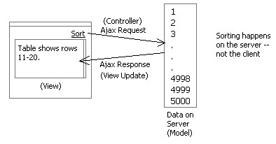
By pushing logic and data onto the server, we can implement a typical model-view-controller architecture that creates a clean separation of concerns and makes for a nice thin client.
We will open up API on the LiveGrid shortly that will make it easier to perform each of these type of functions.
With the introduction of the LiveGrid behavior on our openrico.org site I have received a lot of good questions about how to do things like sorting, filtering, selection, editing, column re-ordering, searching, deleting, creating, etc.
In each case, the question is essentially the same. How do I sort the records since they are not in the client? Or how do I select all when I have only 10 records in the client?
The answer lies in one guiding principle: Keep as much data and logic on the server as possible and access it just in time.
We are strong believers in the software design pattern called Model-View-Controller. Essentially keep the model (data, business logic, domain objects) separate from the View (presentation, page, screen, forms) and let the Controller (events, submits, requests, interactions) drive pulling information (Model) to be presented (View) only as needed.
This results in a very thin client with little logic to maintain (read: avoid duplication on the client) and a smaller memory footprint on the client as well as avoiding having JavaScript do heavy lifting.
Lets take an example: Sorting. With the LiveGrid I have a few records in the client at any given time. If I want to sort then I would issue an Ajax request (Controller) to sort the data (Model) on the server. The response would be a small slice of the data (sorted) that gets shown in the table (View).
Another example: Selection. Let's say I want to select all records. I hit some Select All link (like in gmail) and this issues an Ajax request to select all records (Controller). On the server some index list (Model) is updated to record that all rows are selected. The response comes back with the same rows being displayed (View) in the table-- except that the checkbox that is on each row gets checked based on a value set for the first (assume checkbox is first column) column of data.
By pushing logic and data onto the server, we can implement a typical model-view-controller architecture that creates a clean separation of concerns and makes for a nice thin client.
We will open up API on the LiveGrid shortly that will make it easier to perform each of these type of functions.
Sunday, July 03, 2005
Why is Sabre Supporting Rico as OpenSource?
I've been asked this question on numerous occassions. Here is my take on why it has happened.
1) Sabre Airline Solutions invested significantly in a set of standard core technology platforms built on open source technology (Java Swing, JSP/Struts, JDO, Hibernate, Spring, J2EE technologies, etc.). This rich experience with open source has created a desire among those involved to share back with the community.
2) During this investment phase a number of open-source friendly folks were hired and moved into influential positions
3) We understood that whatever innovations we had arrived at, others were probably at the same stage or would shortly be there. Why not put our stuff out and let it be a part of the early wave (for Ajax & rich internet applications) and perhaps influence how things shape up in the world. of the web Sabre has a history of innovations and so it fit with this thinking.
4) We understand that we are not really in the business of building frameworks. If we get our frameworks out to the larger community then they will only get better.
5) Those of us involved are pretty passionate folks that really get excited about innovation!
6) We have the right people at executive level that are willing to think outside the box about our how some of our software gets developed.
7) Its just great publicity.
I have been extremely pleased during my last three years at Sabre. I have had tremendous support in every endeavor I have launched. This support has been at the executive level, at the product marketing level and at the development level. I think things were just ripe for Sabre to do something like this.
Anyway that's my view on it.
Tuesday, June 28, 2005
Death to Paging! - Rico LiveGrid Released
Ok, How About a Revolution?Aren't you tired of getting a chunk of search results from Google, Yahoo, A9, product listings, real estate pages, etc.? And then having to scroll to the bottom and hit the "next page?". In the words of Andy Rooney, "I know am!" What I normally do is search, scroll through results to the bottom of the page, scroll back up to double-check, then I have to scroll back down to navigate to the next page. Seems like a lot of bother to just move through my results.
Have you ever thought that there could be a better way -- or at least an alternative to the standard google paging control?

First a Little HistoryAt Sabre, we started experimenting with managing very large data sets with HTML tables. Our in-house table component had grown very rich in features (things like inline editing, sorting, selection, multi-sort, custom editors, row re-arrangement, grouping and other desktop-like features). But one thing we were not happy with was its handling of large sets of data.
Our table supported two styles of navigation: scrolling and paging. With scrolling you could create a natural way to interact with the data-- but if you had a lot of records just the amount of HTML that was required to download to the page made it unusable once you got over 1000 records.
We supported paging early on to address this issue. The user chooses the page by selecting a specific page number or using the next/previous paging controls.
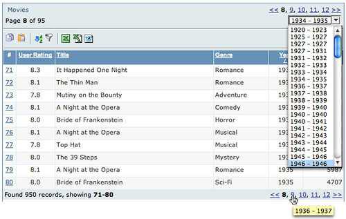
One nice feature I added was a pre-calculation of the first and last field values of each page for the sorted column. I then displayed this in a page navigation combo box.
This allowed the user to navigate to a particular part of the data without having to guess which page. Additionally, I added tooltips that showed what each page contained. This worked fairly well.
However, most clients really wanted us to make the table a scrolling table. This was not feasible due to large data sets.
The Dilema
The catalyst came when we were designing a new web application. Initially all of the design discussions pointed to tables with less than 500 records. Since the user needed to select multiple values within the table we designed the screens to use the scrolling variety of our table. However, soon after implementation started the design requirements changed (!) and now we had to deal with 10's of thousands of flights.
Now we could have moved them to our paging table. However, given the requirement for the user to move through the flights and make multiple selections before moving to the next step, we were concerned with the usability of this approach. First, would users really think their flight would still be selected after paging to the next set of results? Seeing the page refresh does not make one think everything has been kept. Second, the user really wanted scrolling tables.
Enter Ajax
So what we settled on was to take the existing paging table and turn all page and sort requests into Ajax-based requests. Our theory was that if the transition between pages was almost instanteous without a page refresh then the user would be able to 1) understand selection was persistent, 2) be able to move through the data quickly. It turned out that performance was excellent. And since it was faster there was less confusion about whether selection was maintained while paging.
Darren James (on my team) did an incredible job of squeezing more and more optimizations out of the ajax response/update. It was his work on the table, cinematic effects and drag & drop that brought about the Rico framework.
User Feedback
The users absolutely love it! They couldn't believe the responsiveness they were getting from a table in a web application. But they still had one request. They wanted to control the table by scrolling. And they wanted it to be fast even with large data sets.
A Scrolling Ajax Table
So after launching Rico (http://openrico.org) Darren, Richard Cowin and I felt that this would be the right thing to tackle. We all felt that it should start as a lightweight behavior. Behaviors in Rico are just JavaScript logic and/or layout that gets applied to raw HTML. In this case we are applying just the logic of hooking up an HTML table to any arbitrary set of data via Ajax. Other behaviors (sorting, filtering, reordering, etc.) are planned later.
Introducing LiveGrid Behavior
By applying the LiveGrid behavior, your HTML table gets connected to any size data set and it gets adorned with a scrollbar to control the navigation. The scroller becomes the replacement for the standard Previous/Next page controller bar. When dragging the scroll bar you are actually issuing ajax commands to pull the data into the table in real time! Of course we provide data caching and event buffering strategies to minimize the number of requests and smooth out the scrolling.
Death to Paging?
First, let me say that I really don't believe that paging is evil or that it is wrong in all cases. But I believe the reason that most sites have paging solutions is because 1) its easy to implement, 2) handles the problem of large sets of data and 3) it is convention.
Rarely is paging decided because it is the better choice over something like scrolling. (I should hasten to add that I do discuss some of the cons of scrolling later in this article.)
Our Pitch
So, here is what we are advocating. We would like people to start thinking about replacing the paging data model with the more inuitive scrolling data model. It is not an accident that for years this has been a good model on the desktop. And there have been a number of tables built in the desktop or applet world that do exactly what LiveGrid does-- connect up to a virtual set of data and allow you to scroll through it. In fact, I wrote a table to do this very thing in 1998 for the Java Swing framework.
So we are hoping the release of LiveGrid will create a dialogue of discussion around the best way for users to move through information on the web and in web applications. We need better ways of displaying search results, product lists, real estate listings, etc. on the web.
To help you understand some of the possible impact we provide two demos for the scrolling LiveGrid.
Pitch #1: To the Corporate World: You Can Do It on the Web!
The first example demonstrates a table with around 1000 movies accessible. Only ten are shown and possibly 30 are cached on the browser at any given time. By scrolling the table, the database is queried to return more data just in time and on-the-fly.
One of the big reasons we did not take more applications at Sabre to the web was the inability to manage in a user friendly, easy manner large sets of data in tables. The LiveGrid concept solves this problem. Think of it as GoogleGrids (aka, GoogleMaps)!
Pitch #2: To the Web World: Show Results in a Scrolling LiveGrid
I worked up a search engine example using the excellent Yahoo Search Services API. This illustrates what a search engine page could look like with the LiveGrid behavior. Its really quite fun to play with. I have demonstrated it to computer novices who are not easily enamored by technical stuff. Their response has been, "Why don't they already do it this way?"
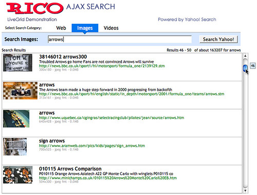
In the Yahoo Search example, we are bringing back live data from the search (usually around 35 rows for caching). Then as you scroll we are buffering as needed around you. The result is you can jump anywhere in the search data. Currently, the scroller is limited to 1000 results (the limit placed by the Yahoo Search API).
Feedback Design Considerations
We have experimented with several ideas to provide adequate feedback. During scrolling at certain points (when crossing a buffer boundary) there can be a slight delay. We plan on adding a twirling wheel (as in Firefox or Mac) just above the scrollbar and to the right of the status to indicate when the table is busy fetching data. Is this the right approach? The balance here is to not show it too often. It should be a lot like Dunstan Orchard's Live Search on his http://1976design.com/blog which waits to search when the user pauses so the number of updates is minimized.
We added a tooltip (right now it does not fade away-- thats a bug -- but I have come to like it the way it is :-) that shows which record you are currently scrolling through. Also I dynamically update the status bar to show the range of records that are being scrolled through. I think both together give enough assurance that something is happening even with a slight delay in loading data. Certainly there are other ways to provide the feeling of scrolling while waiting slightly for data to flow in.
Your Feedback
Ultimately, its everyone in the application and web community that that will judge if the time is ripe for banishing many of the ubiquitous Prev/Next Page bars in favor of the scrollbar.
I am convinced this technique has important implications in the corporate application world and has the potential to change the way we interact with many of the search results, product listings and data grids we find on the web.
We welcome your feedback!
The Demos
You can find the two demos at:
http://openrico.org/demos/livegrid
Note: This link is broken as of 2007. I will post an alternate location for the demo of the live search.http://openrico.org/yahooSearch.page
The Solution
It should be noted that besides the demos, we are providing open source code to make your tables behave in this manner. Try it, enjoy it and make your sites and applications better. Report bugs to us so that we can provide the best LiveGrid behavior possible.
Have you ever thought that there could be a better way -- or at least an alternative to the standard google paging control?
First a Little HistoryAt Sabre, we started experimenting with managing very large data sets with HTML tables. Our in-house table component had grown very rich in features (things like inline editing, sorting, selection, multi-sort, custom editors, row re-arrangement, grouping and other desktop-like features). But one thing we were not happy with was its handling of large sets of data.
Our table supported two styles of navigation: scrolling and paging. With scrolling you could create a natural way to interact with the data-- but if you had a lot of records just the amount of HTML that was required to download to the page made it unusable once you got over 1000 records.
We supported paging early on to address this issue. The user chooses the page by selecting a specific page number or using the next/previous paging controls.
One nice feature I added was a pre-calculation of the first and last field values of each page for the sorted column. I then displayed this in a page navigation combo box.
This allowed the user to navigate to a particular part of the data without having to guess which page. Additionally, I added tooltips that showed what each page contained. This worked fairly well.
However, most clients really wanted us to make the table a scrolling table. This was not feasible due to large data sets.
The Dilema
The catalyst came when we were designing a new web application. Initially all of the design discussions pointed to tables with less than 500 records. Since the user needed to select multiple values within the table we designed the screens to use the scrolling variety of our table. However, soon after implementation started the design requirements changed (!) and now we had to deal with 10's of thousands of flights.
Now we could have moved them to our paging table. However, given the requirement for the user to move through the flights and make multiple selections before moving to the next step, we were concerned with the usability of this approach. First, would users really think their flight would still be selected after paging to the next set of results? Seeing the page refresh does not make one think everything has been kept. Second, the user really wanted scrolling tables.
Enter Ajax
So what we settled on was to take the existing paging table and turn all page and sort requests into Ajax-based requests. Our theory was that if the transition between pages was almost instanteous without a page refresh then the user would be able to 1) understand selection was persistent, 2) be able to move through the data quickly. It turned out that performance was excellent. And since it was faster there was less confusion about whether selection was maintained while paging.
Darren James (on my team) did an incredible job of squeezing more and more optimizations out of the ajax response/update. It was his work on the table, cinematic effects and drag & drop that brought about the Rico framework.
User Feedback
The users absolutely love it! They couldn't believe the responsiveness they were getting from a table in a web application. But they still had one request. They wanted to control the table by scrolling. And they wanted it to be fast even with large data sets.
A Scrolling Ajax Table
So after launching Rico (http://openrico.org) Darren, Richard Cowin and I felt that this would be the right thing to tackle. We all felt that it should start as a lightweight behavior. Behaviors in Rico are just JavaScript logic and/or layout that gets applied to raw HTML. In this case we are applying just the logic of hooking up an HTML table to any arbitrary set of data via Ajax. Other behaviors (sorting, filtering, reordering, etc.) are planned later.
Introducing LiveGrid Behavior
By applying the LiveGrid behavior, your HTML table gets connected to any size data set and it gets adorned with a scrollbar to control the navigation. The scroller becomes the replacement for the standard Previous/Next page controller bar. When dragging the scroll bar you are actually issuing ajax commands to pull the data into the table in real time! Of course we provide data caching and event buffering strategies to minimize the number of requests and smooth out the scrolling.
Death to Paging?
First, let me say that I really don't believe that paging is evil or that it is wrong in all cases. But I believe the reason that most sites have paging solutions is because 1) its easy to implement, 2) handles the problem of large sets of data and 3) it is convention.
Rarely is paging decided because it is the better choice over something like scrolling. (I should hasten to add that I do discuss some of the cons of scrolling later in this article.)
Our Pitch
So, here is what we are advocating. We would like people to start thinking about replacing the paging data model with the more inuitive scrolling data model. It is not an accident that for years this has been a good model on the desktop. And there have been a number of tables built in the desktop or applet world that do exactly what LiveGrid does-- connect up to a virtual set of data and allow you to scroll through it. In fact, I wrote a table to do this very thing in 1998 for the Java Swing framework.
So we are hoping the release of LiveGrid will create a dialogue of discussion around the best way for users to move through information on the web and in web applications. We need better ways of displaying search results, product lists, real estate listings, etc. on the web.
To help you understand some of the possible impact we provide two demos for the scrolling LiveGrid.
Pitch #1: To the Corporate World: You Can Do It on the Web!
The first example demonstrates a table with around 1000 movies accessible. Only ten are shown and possibly 30 are cached on the browser at any given time. By scrolling the table, the database is queried to return more data just in time and on-the-fly.
One of the big reasons we did not take more applications at Sabre to the web was the inability to manage in a user friendly, easy manner large sets of data in tables. The LiveGrid concept solves this problem. Think of it as GoogleGrids (aka, GoogleMaps)!
Pitch #2: To the Web World: Show Results in a Scrolling LiveGrid
I worked up a search engine example using the excellent Yahoo Search Services API. This illustrates what a search engine page could look like with the LiveGrid behavior. Its really quite fun to play with. I have demonstrated it to computer novices who are not easily enamored by technical stuff. Their response has been, "Why don't they already do it this way?"
In the Yahoo Search example, we are bringing back live data from the search (usually around 35 rows for caching). Then as you scroll we are buffering as needed around you. The result is you can jump anywhere in the search data. Currently, the scroller is limited to 1000 results (the limit placed by the Yahoo Search API).
Pros
- Familiarity. Anyone who has used a PC/Mac is familar with a scrollbar
- Ease of use. Just scroll it baby.
- Control is visible along the side, not hidden at the bottom
- Shows you how much data you have and where you are in relation
- With the tooltip and the results feedback it provides you something to watch and helps you to navigate while data loads.
- I don't have to configure how much I want to see on a page. Designers decide what works best and then you can just scroll through it.
- The old problem of I have two scrollbars. One in the window around the results the other on the page itself. [Solutions: make scrollbar styled differently? Keep the complete scroller above the fold]
- If you have millions of results, you might not want to set the scroller extent to millions. The granularity of the scroll bar gets to be too small. However, it would be fascinating to actually scroll down to those last results. Anybody actually seen those? Do we even know if they exist ;-)
- Scroller extending below the page fold. Perhaps the best use is to keep the scrolled area completely above the fold. But hey, since you can scroll so fast through your data you won't miss the few extra rows of information below the fold (that you had to scroll to anyway.)
Feedback Design Considerations
We have experimented with several ideas to provide adequate feedback. During scrolling at certain points (when crossing a buffer boundary) there can be a slight delay. We plan on adding a twirling wheel (as in Firefox or Mac) just above the scrollbar and to the right of the status to indicate when the table is busy fetching data. Is this the right approach? The balance here is to not show it too often. It should be a lot like Dunstan Orchard's Live Search on his http://1976design.com/blog which waits to search when the user pauses so the number of updates is minimized.
We added a tooltip (right now it does not fade away-- thats a bug -- but I have come to like it the way it is :-) that shows which record you are currently scrolling through. Also I dynamically update the status bar to show the range of records that are being scrolled through. I think both together give enough assurance that something is happening even with a slight delay in loading data. Certainly there are other ways to provide the feeling of scrolling while waiting slightly for data to flow in.
Your Feedback
Ultimately, its everyone in the application and web community that that will judge if the time is ripe for banishing many of the ubiquitous Prev/Next Page bars in favor of the scrollbar.
I am convinced this technique has important implications in the corporate application world and has the potential to change the way we interact with many of the search results, product listings and data grids we find on the web.
We welcome your feedback!
The Demos
You can find the two demos at:
http://openrico.org/demos/livegrid
Note: This link is broken as of 2007. I will post an alternate location for the demo of the live search.
The Solution
It should be noted that besides the demos, we are providing open source code to make your tables behave in this manner. Try it, enjoy it and make your sites and applications better. Report bugs to us so that we can provide the best LiveGrid behavior possible.
Saturday, May 28, 2005
Mind Mapping Design Patterns
I have long been fascinated with design patterns.
My first real encounter was in the field of software design when the classic book, Design Patterns by the so called Gang of Four (Erich Gamma, Richard Helm, Ralph Johnson, John Vlissides).
Many of the patterns I had already been using. I just did not know to call them patterns. For example, the classic Model-View-Controller pattern had been something I had known about since reading the original Smalltalk book. It gave a clean way of designing user interfaces. Keeping the model (data), controller (events) and view (page/screen) separate from each other.
Later, when at i2 Technologies, I wrestled with creating a common user interface across our products as well as a common platform of technology. This drove me to look across all of our products. Of necessity you start to see patterns emerge. I kept thinking about coming up with a list of best practices or design patterns for interaction. But, I guess I was not clear enough in my thinking to really put it together then (1998.)
I think I was thinking more about interaction design principles than patterns.
Definitions
Ok, a few definitions are in order. Design principles are foundation concepts that help guide and shape us. Sort of a moral compass to good design. For example, the Xerox PARC adage to Keep Information in Context is a powerful design principle. It reminds us to first of present information and not just data. And to present it in proximity or in relationship with the context to interpret the data with. Style guidelines are specific rules that govern the usage of interface components, container and content. Design Patterns are best practices that express a practice in context of the user's problem focused by the design constraint.
Patterns, Patterns Everywhere
When I arrived at Sabre (Airline Solutions) to create a User Experience Team, one of the first things I did was to start a masochistic effort to evaluate about 25 of our products performing an in-depth analysis at the screen by screen level as well as noting the systemic issues. After spending a solid 4 months doing nothing but using our products, learning their quirks and looking at every screen I saw a negative set of patterns appear that I typically label anti-patterns. And as I pitched solutions I saw the same ones emerging over and over.
Now one would have thought (given my love for google since the first days it went beta) I would have googled' around for interaction design patterns. So as I later did research I found three basic sites that contain a good number of design patterns enumerated. Here they are listed in order of relevance and detail:
At Sabre we are working on an initiative to document interaction design patterns.
One of the things that frustrated me about the patterns is that they are hard to categorize. The current sites try to put them in strict categories. This works for the most part but leaves something to be desired.
I think a faceted approach would be better and hope to one day get around to that on a domain I have reserved (uipatterns.org).
Enter Mind Mapping
Have you heard of Mind Maps? Its sort of like graphically doodling what is on the brain and capturing the associations between the thoughts as they emerge. With the right tool it is a very freeing exercise in brainstorming. There are a number of software products that provide ways to mind map. My favorite is Mind Manager.
Well, I needed a new way to think about the patterns. So I took the concept of Mind Mapping and applied to a set of design patterns.
Where It Led Me
Ok, I didn't know where it would lead me. I just sort of started typing in pattern names as bubbles on the page. Then I started associating them. Soon I started thinking, "Ok, if I keep going this way I will just keep re-arranging and never get done." So I stopped and asked the question that we always as the teams we design for, "Who is the user and what is her goal?"
Duh! When I asked that question I suddenly decided to take a goal-oriented approach to the user. Each design pattern follows roughly the same pattern:
So I created one bubble just for the User and one just for the Designer.
I also added a third bubble for Design Principles. Just ignore that for this discussion.
User's Goals
As I looked at the goals I started seeing just a smaller set of basic goals. Appropriate patterns that address the goal can be added as leaf nodes in the mind map.
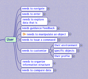
As I began to fill in each node, I discovered that this was a very natural way to express the organization of the design patterns.
Notice on the right hand side of the white bubbles I placed some gray bubbles that express a constraint. On the left is goal leading up to it and a constraint on the right choosing the right patterns.
Designer's Contraints
On the designer side I started listing constraints that were governing the patterns. These are patterns that are primarily driven by the constraints. In many ways these are patterns that do not apply specifically to a goal.
Practical Outcome of this Exercise
What this mind map arrived at was a way to find patterns based on the user's goals and based on design constraints. These are the two factors we as designers use in going to our toolbox. The other categorizations are useful but don't match my mental model of how I find a pattern for usage.
What would this look like on a patterns site? Well besides providing text search and faceted search, a pattern finder wizard could lead a designer to ideas on solving a problem (or show him we are missing patterns for this problem.) Its a pattern itself. The TroubleShooter pattern. Like the Microsoft Hardware Troubleshooter Wizard.
See the Mind Map
Want to view the whole mind map? You can download the map file but you will need the free viewer from Mind Jet. Download the viewer and the map file. Install the viewer and open the map file. You can expand, collapse nodes, zoom and print.
My first real encounter was in the field of software design when the classic book, Design Patterns by the so called Gang of Four (Erich Gamma, Richard Helm, Ralph Johnson, John Vlissides).
Many of the patterns I had already been using. I just did not know to call them patterns. For example, the classic Model-View-Controller pattern had been something I had known about since reading the original Smalltalk book. It gave a clean way of designing user interfaces. Keeping the model (data), controller (events) and view (page/screen) separate from each other.
Later, when at i2 Technologies, I wrestled with creating a common user interface across our products as well as a common platform of technology. This drove me to look across all of our products. Of necessity you start to see patterns emerge. I kept thinking about coming up with a list of best practices or design patterns for interaction. But, I guess I was not clear enough in my thinking to really put it together then (1998.)
I think I was thinking more about interaction design principles than patterns.
Definitions
Ok, a few definitions are in order. Design principles are foundation concepts that help guide and shape us. Sort of a moral compass to good design. For example, the Xerox PARC adage to Keep Information in Context is a powerful design principle. It reminds us to first of present information and not just data. And to present it in proximity or in relationship with the context to interpret the data with. Style guidelines are specific rules that govern the usage of interface components, container and content. Design Patterns are best practices that express a practice in context of the user's problem focused by the design constraint.
Patterns, Patterns Everywhere
When I arrived at Sabre (Airline Solutions) to create a User Experience Team, one of the first things I did was to start a masochistic effort to evaluate about 25 of our products performing an in-depth analysis at the screen by screen level as well as noting the systemic issues. After spending a solid 4 months doing nothing but using our products, learning their quirks and looking at every screen I saw a negative set of patterns appear that I typically label anti-patterns. And as I pitched solutions I saw the same ones emerging over and over.
Now one would have thought (given my love for google since the first days it went beta) I would have googled' around for interaction design patterns. So as I later did research I found three basic sites that contain a good number of design patterns enumerated. Here they are listed in order of relevance and detail:
- Welie's Interaction Design Patterns
- Tidwell's UI Patterns & Techniques
- Laakso's User Interface Design Patterns
At Sabre we are working on an initiative to document interaction design patterns.
One of the things that frustrated me about the patterns is that they are hard to categorize. The current sites try to put them in strict categories. This works for the most part but leaves something to be desired.
I think a faceted approach would be better and hope to one day get around to that on a domain I have reserved (uipatterns.org).
Enter Mind Mapping
Have you heard of Mind Maps? Its sort of like graphically doodling what is on the brain and capturing the associations between the thoughts as they emerge. With the right tool it is a very freeing exercise in brainstorming. There are a number of software products that provide ways to mind map. My favorite is Mind Manager.
Well, I needed a new way to think about the patterns. So I took the concept of Mind Mapping and applied to a set of design patterns.
Where It Led Me
Ok, I didn't know where it would lead me. I just sort of started typing in pattern names as bubbles on the page. Then I started associating them. Soon I started thinking, "Ok, if I keep going this way I will just keep re-arranging and never get done." So I stopped and asked the question that we always as the teams we design for, "Who is the user and what is her goal?"
Duh! When I asked that question I suddenly decided to take a goal-oriented approach to the user. Each design pattern follows roughly the same pattern:
- Pattern Name
- Problem
- Use When
- Solution
- Examples
So I created one bubble just for the User and one just for the Designer.
I also added a third bubble for Design Principles. Just ignore that for this discussion.
User's Goals
As I looked at the goals I started seeing just a smaller set of basic goals. Appropriate patterns that address the goal can be added as leaf nodes in the mind map.
As I began to fill in each node, I discovered that this was a very natural way to express the organization of the design patterns.
Notice on the right hand side of the white bubbles I placed some gray bubbles that express a constraint. On the left is goal leading up to it and a constraint on the right choosing the right patterns.
Designer's Contraints
On the designer side I started listing constraints that were governing the patterns. These are patterns that are primarily driven by the constraints. In many ways these are patterns that do not apply specifically to a goal.
Practical Outcome of this Exercise
What this mind map arrived at was a way to find patterns based on the user's goals and based on design constraints. These are the two factors we as designers use in going to our toolbox. The other categorizations are useful but don't match my mental model of how I find a pattern for usage.
What would this look like on a patterns site? Well besides providing text search and faceted search, a pattern finder wizard could lead a designer to ideas on solving a problem (or show him we are missing patterns for this problem.) Its a pattern itself. The TroubleShooter pattern. Like the Microsoft Hardware Troubleshooter Wizard.
See the Mind Map
Want to view the whole mind map? You can download the map file but you will need the free viewer from Mind Jet. Download the viewer and the map file. Install the viewer and open the map file. You can expand, collapse nodes, zoom and print.
Subscribe to:
Posts (Atom)