Thursday, December 02, 2010
Check out the new Netflix Tech Blog
Lots of interesting technical stuff happening to get movies to your living room, mobile devices & browser. You can read about the technical side at techblog.netflix.com.
Monday, November 15, 2010
New - Social Systems Engineering Team at Netflix
Michael Hart is now leading a new Social Systems Engineering Team here at Netflix. He has a couple of immediate openings. Here is a partial from the job description:
Netflix is the leading online movie and TV service, reaching almost 17 million households in the US and Canada and growing over 50% in the last year. Many of the other fastest growing companies today have achieved that growth in part by leveraging Facebook's social graph. As a founding member of the new Social Systems engineering team at Netflix, you'll be challenged with helping us leverage the social graph to propel Netflix's growth even higher.
I am really excited to see what Michael and his team will accomplish with this new dimension of the Netflix experience. Wouldn't it be a blast to be a part of this team? If you are interested apply for the job here.
Tuesday, November 02, 2010
Back at Netflix and Hiring
I am back at Netflix!
I am hiring (naturally). I am specifically looking for some talented user interface engineers to join my team. My team builds the experience for acquiring new members. We are at a critical phase as we expand internationally while supporting a wide range of devices. You can check out the job posting here.
I can't think of a better recommendation for Netflix than the fact that I have returned :-D
Why would I return? First a little about why I left.
In my previous position at Netflix the team had gotten large (15+) and was on a growth path to be 25 or 30. I no longer could be involved in the details as my group spanned every part of the Netflix business. It was a fantastic position -- really a dream job. But at the end of the day I needed to be more a part of the solution.
So I left Netflix and became the VP of Engineering & UX at Meebo. Meebo is really a stellar place. But after just a couple of months I realized I had moved in the wrong direction. And it became clear to me that all of the positions opening to me where at a level that mostly dealt with the organizational challenges with some limited high level strategy. So while Meebo was really a great place to work I knew that I had to figure out what level I wanted to work at.
After that I started consulting. During that phase I learned a lot about myself and how I want to spend my time. Consulting was especially rewarding as I had some amazing clients (PayPal, Adobe, Rypple and BagCheck to name a few). I got to do product strategy consulting, UX design (lots of wireframing) and JavaScript development. The most rewarding part was being hands on solving problems. And of course working with Theresa Neil (my co-author) was a blast.
During that time I was presented with a lot of really great opportunities by companies I respect deeply. After I started considering full time employment again I realized that I was happiest at Netflix. And coincidentally I had been giving recommendations to Netflix on people that I could recommend for a new role there. Then it dawned on me, why not offer myself for that role? And that is what I did.
My new role is much more focused than my previous role. I am the Director of ECommerce UI Engineering. Instead of leading all of the user interface engineers at Netflix, I am leading a smaller (but growing team) that is focused on solving specific problems on the marketing/customer acquisition/account side of the house. The cool thing is the solutions our team fields directly impact the growth of Netflix & the dollars that come in the door. Plus I am able to get much more involved in the day to day work of the product.
The bottom line: My recommendation couldn't be stronger for coming to Netflix. I believed in it so much that I decided to return. It's an amazing brand and we are poised for more amazing growth.
So want to join me? Check out the job description. Is that you or anyone you know? If so don't hesitate to apply or ping me at bscott _at_ netflix _dot_ com.
Tuesday, September 28, 2010
Snap, Annotate & Share Workflow Tools
Commonly I just want to grab a screenshot or wireframe and annotate it and share it with others for commenting on.
If you are snapping, annotating & sharing something that has a public URL then BounceApp by the Zurb guys is pretty cool. Notable App takes it further, but there are no free plans at the moment and it is limited to snapshots of public URLs. But for that space it is the quickest snap, annotate & share tool I have seen.
But what I have been using of late is two tools to accomplish flow. Little Snapper and Tiny Grab. I like Little Snapper because I don't mess with filenames. And it has a simple interface like iPhoto. And I like TinyGrab because you can drag any image to it and it uploads it to the cloud and creates a tiny url link on your clipboard.
Here is my workflow.
Then all I have to do is just paste that URL into email, etc.
Then to take it one more step. In gmail, go to Settings: Lab and turn on Insert Images. This provides an image button in the email editor. You can then pick from URL and paste in the URL that was on the clipboard.
This allows me to quickly grab a snapshot, annotate it and share it without messing with file names, etc. Here is a quick video of the annotate & share part of the workflow:
You can also use HipChat or CampFire in this process if you need to also do a lot of collaboration back and forth on an annotated snapshot.
I am curious. What do you use to snap, annotate & share (and collaborate)?
Update. @balsamiq reminded me of Skitch. I hadn't tried Skitch in a couple of years. Looks very promising. All in one tool. I didn't like the way it stored your snaps (as history). Also I wish it just copied a short URL to my clipboard like Tiny Grab. Don't want to go to the website and pick one of 6 different ways to share just for the most common case.
If you are snapping, annotating & sharing something that has a public URL then BounceApp by the Zurb guys is pretty cool. Notable App takes it further, but there are no free plans at the moment and it is limited to snapshots of public URLs. But for that space it is the quickest snap, annotate & share tool I have seen.
But what I have been using of late is two tools to accomplish flow. Little Snapper and Tiny Grab. I like Little Snapper because I don't mess with filenames. And it has a simple interface like iPhoto. And I like TinyGrab because you can drag any image to it and it uploads it to the cloud and creates a tiny url link on your clipboard.
Here is my workflow.
- Snap an area with little snapper. No filenames needed. Image displays in Little Snapper (which looks a lot like iPhoto).
- In Little Snapper I edit the snapshot.
- I use the annotation tools to mark up the snapshot.
- Then I drag the annotated image to either the TinyGrab app in the dock or the TinyGrab tool in the upper right area of the system menu.
Then all I have to do is just paste that URL into email, etc.
Then to take it one more step. In gmail, go to Settings: Lab and turn on Insert Images. This provides an image button in the email editor. You can then pick from URL and paste in the URL that was on the clipboard.
This allows me to quickly grab a snapshot, annotate it and share it without messing with file names, etc. Here is a quick video of the annotate & share part of the workflow:
You can also use HipChat or CampFire in this process if you need to also do a lot of collaboration back and forth on an annotated snapshot.
I am curious. What do you use to snap, annotate & share (and collaborate)?
Update. @balsamiq reminded me of Skitch. I hadn't tried Skitch in a couple of years. Looks very promising. All in one tool. I didn't like the way it stored your snaps (as history). Also I wish it just copied a short URL to my clipboard like Tiny Grab. Don't want to go to the website and pick one of 6 different ways to share just for the most common case.
Tuesday, August 10, 2010
Togetherville Hiring Interaction Designer
I love the folks at Togetherville. They are the "facebook for kids". Mandeep Dhillon and the team are passionate about a safe, fun environment for kids to engage with one another.
Here's a great opportunity! How about joining their team as an interaction designer? If you want to be part of changing the social landscape for the web, here is a place you can do it (and have fun in the process).
Don't believe me? Earlier in the year when Togetherville needed to rethink a lot of the social interaction I suggested Tangible-UX as a great partner. They got involved and it has been one of their favorite projects.
Check out the posting over on the Togetherville blog.
Sunday, June 27, 2010
Zurb's 110 Interesting Moments for BounceApp.com
In our book and often in our talks we discuss a technique for thinking through and documenting detailed interactions in a user experience. Just arrange the interesting moments in a grid. List the "actors" (user interface elements) vertically and the events horizontally. The cells in the grid become the interesting moments.
With the classic example from the of drag and drop there are at least 96 interesting moments (6 actors X 16 events = 96 interesting moments).

About a month back I gave a talk at Zurb, a northern California design firm, in which I discussed this technique. On Friday I was pleasantly surprised to see they had already taken the idea and used it in a new product they announced last week -- BounceApp -- which was featured on TechCrunch.
Check out their article on 110 Interactions for Editing Annotations on Bounceapp.com.
Nice application of the grid.
With the classic example from the of drag and drop there are at least 96 interesting moments (6 actors X 16 events = 96 interesting moments).
About a month back I gave a talk at Zurb, a northern California design firm, in which I discussed this technique. On Friday I was pleasantly surprised to see they had already taken the idea and used it in a new product they announced last week -- BounceApp -- which was featured on TechCrunch.
Check out their article on 110 Interactions for Editing Annotations on Bounceapp.com.
Nice application of the grid.
Friday, May 14, 2010
Workshop in HD Video: Designing Web Interfaces
A couple of months back Theresa Neil & I filmed a combined workshop on the material from Designing Web Interfaces plus Theresa's material on application patterns, screen patterns and ui controls.
This is a beautifully recorded workshop by O'Reilly Media filmed at the Images in Motion Studio in Sonoma. The workshop is over 4 hours long and broken down into 11 smaller, digestible segments. A full camera crew, HD video and lots of great post production conspire to create a video series I am proud of.
Here is a sample of the material posted on youtube.
To appreciate in all of its HD glory visit our video site on O'Reilly Media. The full 4 hours is only $79. You can get it and show it to your whole team.
Friday, April 09, 2010
Inline Form Validation
At the last Web App Masters Tour Luke Wroblewski gave a great talk on Forms in Action (quick plug -- you can hear him again in Minneapolis, Philadelphia or Seattle as the tour continues in those cities as well as myself and others!)
Luke brought out that on the good side more forms have added interactivity to form field validation. Error prevention is an important design principle. An ounce of error prevention is worth a pound of error handling design and code.
But on the bad side some forms are actually hurting the experience by either being too aggressive or trying to be too clever in input assistance.
I stumbled across two examples to add to Luke's collection. Both come from a very useful tool Its Deductible. I highly recommend the tool for what it does as it encourages me to donate more items and allows me to accurately take them off my taxes each year. Big fan. But two not so good experiences in their forms.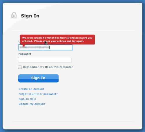
Its Deductible Error Message on Login Screen
I entered the wrong account name and got a message bubble warning me about it. Good things about it:
Its Deductible Date Input Handling
Don't even think about entering slashes or not giving 2 digits for the month, 2 digits for the day and 4 for the year. Anything except typing 02092009 will fail.
Here is what went wrong.
It is obvious there was some effort put into assisting me in entering a date correctly. But unfortunately it took me about 45 seconds to figure out their algorithm and enter the date in exactly the way they wanted me too.
BTW, You can use SCOTT for a 10% discount on the talks in Minneapolis.
Luke brought out that on the good side more forms have added interactivity to form field validation. Error prevention is an important design principle. An ounce of error prevention is worth a pound of error handling design and code.
But on the bad side some forms are actually hurting the experience by either being too aggressive or trying to be too clever in input assistance.
I stumbled across two examples to add to Luke's collection. Both come from a very useful tool Its Deductible. I highly recommend the tool for what it does as it encourages me to donate more items and allows me to accurately take them off my taxes each year. Big fan. But two not so good experiences in their forms.
Not Clearing Error Message
Its Deductible Error Message on Login Screen
I entered the wrong account name and got a message bubble warning me about it. Good things about it:
- The bubble is clearly worded.
- Red color got my attention.
- Is nicely placed
Draconian Date Input Handling
How many times have I entered a date in a web form? So I just need to know are you expecting month/day/year format and whether I should type the slashes or not. However watch the video and see how poorly I entered the date!Its Deductible Date Input Handling
Don't even think about entering slashes or not giving 2 digits for the month, 2 digits for the day and 4 for the year. Anything except typing 02092009 will fail.
Here is what went wrong.
- You have to enter 2 digits for the month, 2 digits for the day and four digits for the year. Why? Next bullet point...
- You can't enter 'slashes'. If you do you get two slashes! And when you submit it won't like that.
It is obvious there was some effort put into assisting me in entering a date correctly. But unfortunately it took me about 45 seconds to figure out their algorithm and enter the date in exactly the way they wanted me too.
BTW, You can use SCOTT for a 10% discount on the talks in Minneapolis.
Thursday, April 08, 2010
Designing with Lenses - Slides - CHIFOO 4/7/2010
Had a great time last night presenting at CHIFOO in Portland. Lovely facility at the White Stag Block, University of Oregon. Thanks Leo Frishberg for the wonderful hospitality. This was the first time I have given a talk on design lenses so was curious how it would be received. I was really happy with the positive feedback.
Here are the slides from last night.
The biggest takeaways for me were:
Here are the slides from last night.
Designing With Lenses - CHIFOO
View more presentations from Bill Scott.
The biggest takeaways for me were:
- The idea of lenses is a great way to mentally frame design principles
- There is a strong interest in us curating these principles
- There is still some tinkering on how broad the lenses should be (lumping vs. splitting). The analogy of a camera lens was used by Ann Marcus. Narrow the lens and get the details but lose more of the context. Widen and you get less detail but a broader application.
- That lenses can serve (as patterns do) to inform not just designers but all involved in product design as a common vocabulary and repository for examples.
Let me know what you think.
You can follow the lens project on the @uxlenses twitter feed. Or visit the designingwithlenses.com site directly.
Tuesday, April 06, 2010
Speaking at CHIFOO on Design Lenses
Looking forward to a quick jaunt up to Portland tomorrow and back home again Thursday morning. This is my week between Netflix and Meebo and it has actually shaped up to be quite busy. But I am excited to be giving a new talk on Lenses.
Since the CHIFOO site seems to be down at the moment, here are the details of the talk:
In this talk, I will introduce the idea of design lenses and discuss several lens inspired from fields of study as diverse as theater, magic, game design, storytelling, Shaker furniture, motion graphics, and comics for inspiration in designing rich, interactive interfaces. By teasing out some of the key takeaways from each of these disciplines, a fresh light can be shed on our own corner of the design universe.
Join us at 7pm at the University of Oregon's White Stag Block.
Since the CHIFOO site seems to be down at the moment, here are the details of the talk:
Designing with Lenses: Lessons from Other Design Crafts.
In any field of design, designers can enhance their craft by studying the work of others. Through the careful exercise of breaking down real-world solutions into their underlying principles and patterns, previous lessons can be applied to new sets of problems we encounter. Designing for web interfaces is no different. By necessity we are constantly searching for inspiration and practical guidance in solving the problems we face as designers each day. A powerful approach is to capture these lessons into "design lenses". A design lens allows you to view the user experience through the eyes of a single design principle. Lenses were originally created for game design but are just as powerful for user experience design.In this talk, I will introduce the idea of design lenses and discuss several lens inspired from fields of study as diverse as theater, magic, game design, storytelling, Shaker furniture, motion graphics, and comics for inspiration in designing rich, interactive interfaces. By teasing out some of the key takeaways from each of these disciplines, a fresh light can be shed on our own corner of the design universe.
Join us at 7pm at the University of Oregon's White Stag Block.
UX Booth Article on Design Lenses
I recently started documenting lenses that I find useful on a new site Designing with Lenses. Though it only has 3 lenses to start with, more lenses are coming in the months ahead.
To get the whole scoop, go read the introductory article Designing with Lenses over on UX Booth.
This article is part of a series of posts written by the speakers of UX Lx, The premier UX conference in Lisbon, Portugal; happening on May 12th–14th. There's a great lineup of speakers and Portugal is absolutely beautiful, so head over to the conference site. You can enter UXBOOTH2010 for a 10% discount.
To get updates on new lenses follow my uxlenses twitter feed here.
I will also be talking on this subject at CHIFOO in Portland tomorrow night (April 7 at 7pm). Join me if you can!
Friday, April 02, 2010
Animation Rules! Notes from Talk - Chet Haase & Romain Guy
I met Chet at the 360|Flex conference. We were on a panel together and talked about the UX of animation. Chet works on the Flex SDK especially focused on the animation/transition parts of the toolkit. Romain works on the UI toolkit for Android (including animation)
He & Romain spent some time last year studying the excellent book The Illusion of Life about Disney Animation by a couple of the masters of animation. The book discusses 12 rules of animation. They extracted a few principles from the book that apply directly to animating user experiences and shared them in the talk Animation Rules! they gave last year at Devoxx in Belgium.
They also mention Timing for Animation, another book I have on my shelf.
Some of the takeaways from the rules of animation:
This is just a summary. So make sure you watch the talk at Chet's blog.
He & Romain spent some time last year studying the excellent book The Illusion of Life about Disney Animation by a couple of the masters of animation. The book discusses 12 rules of animation. They extracted a few principles from the book that apply directly to animating user experiences and shared them in the talk Animation Rules! they gave last year at Devoxx in Belgium.
They also mention Timing for Animation, another book I have on my shelf.
Some of the takeaways from the rules of animation:
- Squash & Stretch. Lifelike objects deform in reaction to gravity & collision
- Anticipation. Short actions just before the main one. Give hints to the user about what will or may happen.
- Staging. Clearly communicate to the audience what is happening (poses, camera views, lighting, focus). Emphasize the important elements. Avoid too much noise.
- Follow through, overlapping action. Realistic body physics. We are not rigid bodies.
- Using Slow in & out.
- Using Arcs in motion.
- Secondary actions. Actions which emphasize or complement the main.
- Timing. Careful timing of actions for realism, impact & effect.
- Exaggeration. Making actions more lively, more obvious, more entertaining.
- Solid drawing. Drawing has to be solid before you can animate well.
- Appeal. Believable, appealing characters that the audience can enjoy.
Chet & Romain's Proposed Rules for GUI Animation:
- Timed: Fast, realistic & appropriate
- Designed: Use animations for good, not evil
- Smooth: Don't make your users hate animations
- Transitioning: Bring the users along
- Realistic: Motion, timing, interactions.
- Anticipatory: Hint what may happen
- Simple: Help the user, don't confuse them.
Tuesday, March 16, 2010
WAM Tour in San Diego - Come Join Me!
 I am excited to be part of the Web App Masters Tour that kicks off in San Diego next week, then heads eastward to Minneapolis in April and then on to Philadelphia in June and finally bounces back west to Seattle in July.
Next week I will be in the illustrious company of some real luminaries: Jared Spool, Stephen P. Anderson, Hagan Rivers, Christian Crumlish, Ken Kellogg, Luke Wroblewski and Doug Bowman.
If you can make it next week (3/23-3/24) I have a special discount offer: from now until 3/18 you can get $300 off the conference by using the promo code SCOTT at the tour site.
Monday, March 08, 2010
I am Hiring Again (Yes Again!). UI Engineers for TV & Web Site Experience
As of today 3/8/10 I am actively looking for two more user interface engineers to join my team. (I filled the previous posting with 2 engineers!)
Since late last year we have expanded the number of user interface engineers working on new, upcoming TV experiences. What is especially exciting about this area is the chance to utilize the latest technologies (HTML5, CSS Animations, and other Webkit goodness). We call this the "10 ft UI team" in reference to how far away from the TV the average person sits. Compared to the 2 ft experience with our desktops. In particular I am looking for an Sr. User Interface Engineer that gets jazzed about creating a fully cinematic, rich, fast experience in a 100% JavaScript client app that will be used by millions of Netflix members in their living rooms! How can you not get excited about that?
In addition, I am also searching for a user interface engineer for our main web site experience. Over the next year our main site experience will continue to change (most likely in some significant ways). With our site moving to the cloud, expanding into the international marketplace and our experience moving to multiple devices there are a number of challenges ahead. For this role you need to really understand cross-browser issues, know how to wield JavaScript and tame CSS to field numerous member experiences in our A/B testing framework. This is a senior role (as are all of the roles on my team). You will need to understand the principles of good, simple, clean design. As we continue to refactor the underlying infrastructure you will also need to be able to get your hands dirty in the Java/JSP layer as well. This means you can't just be an "HTML hack". No, you need to have a solid set of computer science skills. The perfect profile is usually someone who has at some point worked in enterprise web applications but more recently been developing public consumer web sites with an interesting mix of UI challenges they have had to solve. However, don't let that persona keep you from pinging me. I love to be surprised.
Netflix is a great place to work. We pay well. We work hard. We play hard. And we do have work/life balance! Check out our culture as explained by our CEO, Reed Hastings:
I will post the official job description in the next day or so.
Feel free to contact me at my email: bscott (netflix)
Friday, March 05, 2010
Microsoft Courier Interesting Moments & Design Patterns

I culled numerous screenshots from the video posted on Engadget in their article: Microsoft's Courier Digital Journal and have organized these into 17 sets on my Designing Web Interfaces flickr site. Each corresponds to an interaction pattern with individual keyframes to call out the interesting moments.The 17 patterns
- Toss object onto another object. Opens a contact on a map.
- Hand swipe to change view. Finger flips pages, hand flips apps/views.
- Pinch closed to go to overview. Pinch closed to go from single view to multi-view.
- Tap button. Just as in iphone/ipad.
- Draw bound box to make handwritten notes into object. Interesting. Box a to do list. Then it is an object. Can toss contact on it to send the list to them.
- Pinch and spread. Open up a stack.
- Toss to add to page. Same as tossing object onto another object above, just a convention to add elements to a blank page by tossing them there.
- Flip over objects and make notes on back. Writing on the back is a cool idea.
- Hand swipe up to go back to other views (apps).
- Pull down Tool Area as Shade. Nice effect of the tool surface area pulled out further in the center. Looks like a fabric curtain shade being pulled down.
- Toss to save page objects.
- Tap Pen for Radial/Pie Menu. The pie menu!
- Hand Swipe to widen a view (1 page to 2 page). Interesting. A view/app is open on the right. Pulling it over to the left pane opens it fully. You pull with full hand swipe.
- Pull up page corner for configuration. This reveals a color/pattern swatch (stack of pages). Nice animations.
- Pull open folding tool palette. Like a folding room divider, it unfolds with tools.
- Send page (folds like origami and then sent flying). Take a page. Say send it. The page folds up into something similar to a postcard. Write the address (with the pen) on it and send it.
- Drag to Pocket. In the middle between the two panes you can drag items to the "pocket", flip pages, etc. and then drag them out. Reminiscent of trays in picasso, yahoo photos or just the clipboard.. Nice simple implementation.
- 2 individual panes. Perfect for book reading. Perfect for master/detail pattern (which is being exploited in the ipad as well).
- Pen, finger & hand gestures. Little wider input vocabulary as you advance in skills.
- Even more physicality than iPad (or at least it appears so if the video is really a true representation). When objects are selected, they move upward to a higher plane and float above the other elements. Using the z-index is a clever way to represent selection. When the elements break free of "flatland" they wiggle/wave like a flag as they move into position. The page that gets mailed, transforms itself into a postcard through a series of origami style folding.
- The pocket is really clever. Store stuff in the binder/gutter and move around then pull it out.
- The language of object on object meaning is also richer than the iPad (will the normal consumer understand this?)
- The use of the pie menu with the pen is a good idea. Pie menus have been shown to be efficient and seem natural in this interface.
- Returning to the pen. Being able to use the pen for finer pixel level manipulation is good (again, this is not as simple as just the finger, but provides more capabilities). Also being able to input with the pen (hopefully they nail this) should be faster than the keyboard for short spurts (don't have to leave the surface to begin writing).
- Gobbling while surfing. I am not sure if my former colleague Karon Weber has been involved in this project (she works on touch based interfaces at Microsoft with Bill Buxton). We did the Yahoo! Teachers project together and she & Samantha Tripodi designed the gobbler which I built. The premise was easily grabbing content from around the web and dropping it into "wells/objects". In the Courier this is made simpler by tossing into the right pane (the receptacle for the drop). The tossing seems pretty effortless and the landing target is huge (can you say Fitts law?)
Monday, February 08, 2010
iPad Interesting Moments
 To familiarize myself with the iPad UX interactions I studied the Steve Job's video as well as Luke Wroblewski's post on the various multi-touch patterns introduced by the iPad.
I find it helpful to take these interactions and "slow them down" as a series of keyframe screenshots. Doing so gives you a chance to appreciate the care that went into designing each of these interactions.
You can find the fruit of my labor thus far at my Designing Web Interfaces flickr site. I will add more in the days ahead.
A quick observation. There is a longer delay than I expected when initiating a swipe (like a page flip) or activating an edit (like editing in email). In the case of the swipe there does have to be some movement first to discern the swipe event. In the case of the edit activation it seems the delay makes the interaction feel right (a tap is the tap down and pull up just like the mouse click is a mouse down + mouse up... the up part is sloppier with the finger). Also see the delay of items being selected for delete.
Another observation that I am unsure about may just be an artifact of capturing snapshots from the video. There appears to be blurring of images at various stages in the swiping transitions which would indicate faster motion. You can see this effect in flipping photos and zooming the map. Again without having access to an iPad this may just be some artifacts of the capture process... but this would be a good way to make a transition feel faster (speeding up gets blurred as well as moving fast; slowing down gets clearer as well as actually slowing down). [Update: Martin Polley pointed me to an article by Keith Lang on Blur the New Black that could be helpful in understanding this. [Update to the update: I am fairly convinced this is an artifact of the video capture process. However, blurring is a good way to smooth animation.]
The use of real world style transitions (flipping bookcase over, flipping pages, spreading stacks, rotating orientation, collecting selected elements into stacks) work extremely well with a multi-touch interface. I am using my physical body not a mechanical mouse so the response should feel more real world. This is also what Apple mentions in their UX guidelines.
Here is the quote from Apple's iPad Human Interface Guidelines:
Whenever possible, add a realistic, physical dimension to your application. The more true to life your application looks and behaves, the easier it is for people to understand how it works and the more they enjoy using it.Thoughts?
As you work on adding realistic touches to your application, don’t feel you must strive for scrupulous accuracy. Often, an amplified or enhanced portrayal of something can seem more real, and convey more meaning, than a faithful likeness. As you design objects and scenes, think of them as opportunities to communicate with your users and to express the essence of your application.
Use animation to further enhance realism in your application. In general, it’s more important to strive for accuracy in movement than in appearance. People sometimes feel disoriented when they see movement that appears to defy physical laws. As much as possible, make sure your virtual views and controls mimic the behavior of the physical objects and controls they resemble. Convincing animation heightens people’s impression of your application as a tangible, physical realm in which they want to spend time.
Monday, January 04, 2010
YANNI - Yet Another Ninja Needed Immediately!
UPDATE! I have hired 2 Engineers! So this role is filled. However, I have another opportunity... read it here.
Another new opportunity at Netflix as of today (1/4/2010)!


But if you are interested please contact me at the email shown on the t-shirt. You can find more out about this position at the Netflix Jobs site.
Several notes about this position:
But if you are interested please contact me at the email shown on the t-shirt. You can find more out about this position at the Netflix Jobs site.
Several notes about this position:
- Will focus on the acquisition/non member side of the web site.
- Exciting new opportunity as we move to our first international offering.
- Not a User Experience Designer role, but a Web User Interface Engineering Ninja. Expert level in DHTML and general Computer Science skills required.
- Not a remote position and not relocating internationally (but will relocate the right candidate within the US).
- Part of the User Interface Engineering Team and as such reports to me.
Subscribe to:
Posts (Atom)