But what little I have seen, I really like.
Fluid Context
This is the terminology they use to describe the principle Xerox PARC described as focus + context, or information in context. At Xerox, they produced the hyperbolic tree, the fisheye and the lens approach as ways to dynamically show the current focus within the larger context of data.
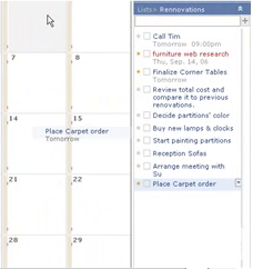
In Scrybe, they use this approach in their calendar application.
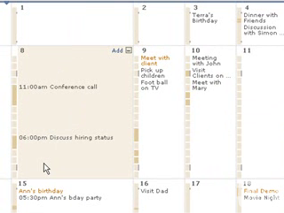
This is the same approach Laszlo took in their calendar demo application
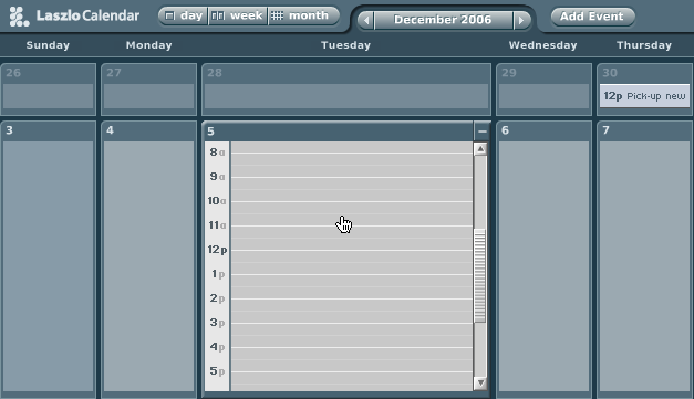
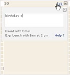
But there are a lot of nice touches they make to the calendar:
- Simple add button within the expanded context
- Busy/Free timeline legend for each expanded context
- Very simple drag drop for moving events around
 |  |
GlobalTimez
I like the fact that time zone visualization is integrated into the product. Almost all calendar pickers, date pickers, etc. seemed to assume that user never goes anywhere else or doesn't work with folks in other time zones around the world. Though it is simple, it really helps in scheduling meetings around the globe. They integrate it with the date picker, a timezone map and within the timeline in the calendar.
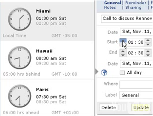
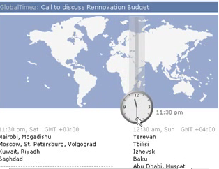
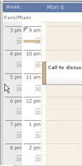
Why is this important? Again you have the information within the context you need it. Minimize flow interruptions is a key principle.
The TODO list looks simple, you can drag tasks to calendar days to assign it a date... I like the touch of you drag it to the day, the tooltip tells you what date it registered and when you drop it it flies back to the todo list with the date associate. Nice touch.
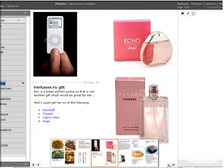
Thought Pad
This seems like a nice tool for gathering your thoughts as you surf the web. The idea is to make it easy to collect while you are in the flow of surfing. This is the theme of their products... How do people work, what is their flow, how do we keep them in the flow.
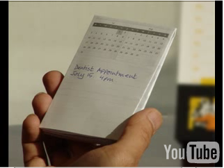
Paper Integration
Yep, you heard it right. They make it easy to print out your calendar, appointments, tasks and take it with you on paper. This is so often overlooked. When I worked at Sabre I recall a conversation with Quantas Airlines. One of their big gripes with our incredibly detailed scheduling application was with what it printed out. It turns out that a lot of the users of the schedule got a printout and it went with them all over the airport. We had never considered how to format (nor had the gantt component vendor) the schedule for convenient paper transport!
So, I haven't used it yet. Might be different mileage once I get into the beta.
But the bottom line principles I see at play are:
- Keep the user in the flow.
- Bring tools into the user's context
- Keep information in context
- Tie information to interactivity
- Make all objects on the screen intuitively interactive
- Be nuanced in your simplicity (some animations, but extremely well done)
You can see more photos on flickr.
