NOTE: This blog has been moved to http://www.looksgoodworkswell.com

Showing posts with label coolstuff. Show all posts

Friday, October 16, 2009

Mental Note Cards - Stephen Anderson


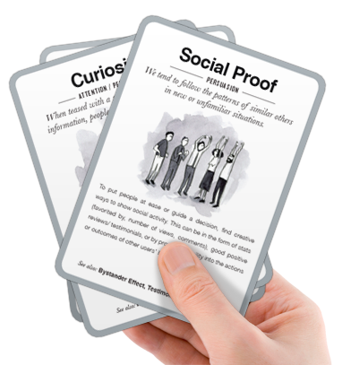
I mentioned a great talk a while back by Stephen P. Anderson. In that talk Stephen teased us with a project he had started for capturing design principles/patterns in a deck of cards. The good news is you can actually pre-order a set now at a discounted rate! Already ordered mine.

Check it out at getmentalnotes.com. He also is offering a preview set of 7 cards in PDF format.

Tuesday, February 10, 2009

Oodles of Screencasts Available for Designing Web Interfaces Book

Last Friday night I uploaded about 390 interaction movies (screencasts). I have been collecting examples (good and bad) that illustrate various patterns and finally took the time to get them out on the Flickr Designing Web Interfaces site.

Details can be found on the Designing Web Interfaces blog.

Wednesday, April 30, 2008

Omnigraffle Wireframe Stencil for the iPhone

Theresa Neil has recently been designing an iPhone application. In the process she created a wireframe stencil for OmniGraffle to make her life easier. Thought I would pass along.

OmniGraffle iPhone Wireframe Stencil

You can find the stencil at Graffletopia

Update: Now on her blog.

Saturday, September 08, 2007

Why Protoscript?

Ok, the last thing in my mind when I created Protoscript was for it to be YAT (yet another toolkit).

I have been asked several times what really makes this different than toolkits like jQuery. And what is the compelling reason that someone would use Protoscript.

The motivation is straightforward:
  • Prototyping is too hard for non-techies
The reasons Protoscript can help solve some of the difficulties with prototyping are as follows:
  • Simplifying how we express interactions is a good thing
  • Behavior injection is a powerful iterative design tool
  • Plug-in Behaviors guarantee a growing set of prototyping solutions
  • By focusing on prototyping, things get simpler
Prototyping is Too Hard for Non-Techies
The end goal of Protoscript is a simple GUI that will allow non-techies to:
  • Go to any web page
  • Sprinkle simple to complex interactions onto that page
  • Do all this without writing code, but simply through an intuitive interface
I am a huge proponent of breaking down the barriers for the non-techies among us to be able to do what us techie geeks can do.

I have been fortunate to work with some awesome talent, many of which do not have the skills, the time or patience to prototype in Javascript.

Do I want to exclude them from the party? No.

If I can let more team members literally play with a working site and tease out better interactions then I have raised the state of the art (even if ever so slightly).

Simplifying how we express interactions is a good thing
By allowing an interaction to be expressed in a consistent, stylized declarative fashion (JSON) a whole set of goodness becomes available:
  • Widely variant interactions captured with same simple syntax
  • Nested syntax communicates the relationship between behaviors, events, callbacks & attributes
  • Non-programmers can read Protoscript better than JavaScript code. jQuery comes the closest to making Javascript readable by non-programmers (see discussion below on Protoscript and jQuery).
  • It is a lot easier to write a GUI tool that reads and writes JSON than it is to read/write Javascript. (This is why so many tools use XML or JSON since they are declarative formats)
  • JSON can be sent over the wire. This means a simple REST service could serve up and/or save JSON to remote services.
  • JSON is easier to parse
  • JSON is easy to write out to a database or as a flat file
Behavior Injection is a Powerful Iterative Design Tool
The Protoscripter bookmarklet is the first step in providing behavior injection. It allows you to popup the bookmarklet on any web page and type or paste in Protoscript code to inject interactions. (You can get it from the Protoscript Home page.)

Here is a fun example of this... Watch as I experiment with burritophile.org (mind you this is a contrived example)


Beyond the bookmarklet, it should be straightforward to create a Greasemonkey script that loads Protoscript (Alex Russell's suggestion) or a Firebug extension that adds prototyping to Firebug (Steve Souders led the way with YSlow) or a full on Firefox extension that brings palettes of behaviors to a page and adds smart element selection to make behavior injection simple.

And of course the extensions also open the door for being able to save the configuration to your desktop and recall/edit as needed.

Plug-in Behaviors guarantee a growing set of prototyping solutions.
Non-partisan, extensible plug in architecture allow an ever-growing set of interactions. Out of the box I support YUI as the behavior set (behaviors, events, callbacks and attributes) and jQuery as the selector mechanism (supports CSS selector syntax and XPath). But Protoscript allows you to add any number of new behaviors, write your own behavior set on other Javascript toolkits and plug in a different selector query mechanism.

This means that Protoscript is really not in opposition to tools like jQuery. I really like jQuery. I have always been a fan of syntactical sugar. It lessons the cognitive load when writing code.

jQuery has a powerful chaining and filtering mechanism that allows you to control the scope of elements you are applying behavior to.

Some of the advantages of Protoscript over jQuery for prototyping are:
  • In jQuery, behaviors are passed parameters and since they can vary in the number of parameters that get passed to them it is not easy to parse, stylize of guess at what must be passed. Protoscript promotes the parameters to be attributes in the JSON thus making the syntax the same across all behavior plugins. Since they are attributes they can also be read by external gui tools to automatically create a GUI interface
  • Protoscript uses a nested syntax instead of a single line of chained code. This allows protoscript to express chained behavior, changing scope and attaching behaviors & events (both can be done easily in jQuery). Where the JSON syntax gives a novel twist is now you can express in one interaction set a number of serial as well as chained actions.
  • Event expression is richer in JSON since you can express multiple events in serial fashion along with multiple callbacks thus capturing the forking nature of interaction as a tree instead of a single list.
Now I hasten to add that I do not believe Protoscript in anyway replaces jQuery. That in my mind is wrong and missing the point. Heck, I wrap jQuery and use it for my query selection (but not for behaviors, callbacks, etc. in the YUI reference implementation). jQuery does more in raw power than Protoscript ever aims to do.

Quite simply I am focused on prototyping. jQuery certainly can be used for prototyping. I just think that for all the reasons above it made sense for me to take a different approach.

By focusing on prototyping things got simpler
Protoscript just says, hey what if we did not try to everything that you need to do write a full-blown application... but instead focused on what you need to do to prototype.

When I looked at it that way it simplified the building blocks and the way you might hook them together.

The design of the JSON syntax was actually driven by the way I imagined the prototyping GUI tool would look like. That is certainly a different approach than most toolkits take. And the only reason I could take that approach was because of the laser focus on prototyping.

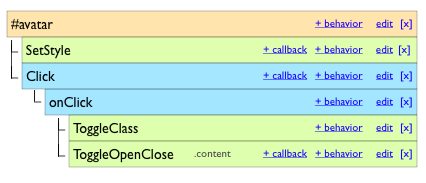
one possible concept of protoscript gui

Doesn't this make sense?
Look, I have created this and plan on continuing to grow and expand its capabilities. I have no aspirations to replace what anyone else is doing. I have struggled with this problem for over 25 years and especially the few years trying to bring richness to the web.

I have tried to make this as non-partisan as possible.

Hopefully others will create behaviors around their favorite toolkits (or adapters to their behavior sets) so that the GUI tools built for this will be able to seamlessly use them as well.


Thursday, September 06, 2007

Announcing Protoscript


Wow. It has actually been 2 months since my last post. Nope. I have not fallen off the planet. This has been one of the craziest times I have experienced in a long time so while I have had a lot to chat about I have not had the time to blog coherently.

One of the projects I have been working on is a way to make it easier for all of the non-techies (as well as techies) to be able to experiment with various interactions on a web page in lightweight manner.

By lightweight, I mean to say a way to take an existing web page or a prototype of a web page and "sprinkle" rich behaviors to play with concepts. Ideally you should be able to express an interaction in a declarative manner without having to write JavaScript directly (but not kept from it if you need to). And even more ideally you should be able to build up the "legos" of interaction in simple GUI tool embedded in the browser so that you are not encumbered with even a simple syntax to type in.

So back in July, I was slated to give a talk at the Ajax Experience. I promised a few months before that I would have 2 new talks. One on Anti-Patterns (yes I owe several blog posts on that one) and the other on prototyping.

The problem was exactly one week before both talks I had literally had not time to put those talks together. So I dropped out for a few days to create a very early version of what is now protoscript. The good news was that it was actually fully functioning and I gave a peek of it at the conference.

I got a lot of good feedback from the talk and went back and rewrote it a couple of times, changed up some of my approach, moved to a plug-in style architecture, etc.

So, ok, what is protoscript?


Protoscript is a simplified scripting language for creating Ajax style prototypes for the Web. With Protoscript it's easy to bring interface elements to life. Simply connect them to behaviors and events to create complex interactions.

The key abstraction that came out of my thinking was to express everything as objects (think HTML elements), behaviors (think patterns) and events (both events and callbacks).

In some ways it is similar to jQuery. And in fact I use jQuery for the selecting of elements. Protoscript, however, is a very stylized way to describe interactions. This makes it ideal as a building block.

For example, since the language is so simple (It is actually in JSON format) it makes it easier to extend to multiple toolkits (currently I use YUI, but I have built a simple example with Mootools), add new behaviors and events and even more importantly be able to build GUI tools on top of it.

As a first hack I created Protoscripter a bookmarklet that brings a GUI interface to any web page allowing you to play with protoscript (without any installation, other than the bookmarklet) and experiment with interactions.

I have been careful about pushing protoscript out because of this layering approach. Ideally I would have the whole stack. I would have a complete GUI as a FF extension allowing designers, product marketing or web devs to quickly sprinkle interactions onto their prototypes and quickly iterate to the best design. Well that is not reality. I have invested about 2-3 weeks of time so far and feel I have gotten it to the right level to release to the public.

There are 31 behaviors, 40+ live demos, a simple GUI tool (protoscripter). The scripting engine seems to be pretty solid (knock on wood). I have a full wiki with full documentation on all those behaviors. The code is over in Google Code in a repository ready for open source contribution.

So to kick it off I am giving a talk this morning at the Rich Web Experience here in San Jose. You can get a PDF version of my talk here: Prototype Presentation.

And most importantly start checking out prototoscript.com (right now the best experience is in Firefox).

Wednesday, January 24, 2007

Slideshare

My friends Rashmi Sihni & Jonathan Boutelle recently released a really cool product, slideshare.

Simple idea. Think youtube for presentations. Upload a PPT or PDF, it converts it to individual slides that can be bookmarked, linked to from a blog, tagged, commented on, etc. Cracks open presentations so they can be searched and really makes it easy to find.

You can see one of my talks here:


Hopefully they will support keynote in the future as well as some ways to handle animations/transitions. But even without this it's a great place to find recent talks.

Thursday, December 21, 2006

In the Flow: Scrybe

Someone pointed me to a new product that is in limited beta release. It's called Scrybe. And all I really have right now is the YouTube video demo of the product (on their main page).

But what little I have seen, I really like.

Fluid Context
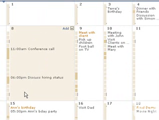
This is the terminology they use to describe the principle Xerox PARC described as focus + context, or information in context. At Xerox, they produced the hyperbolic tree, the fisheye and the lens approach as ways to dynamically show the current focus within the larger context of data.

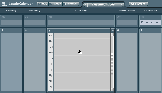
In Scrybe, they use this approach in their calendar application.

Scrybe Calendar Fisheye

This is the same approach Laszlo took in their calendar demo application

Laszlo Calendar Fisheye

But there are a lot of nice touches they make to the calendar:
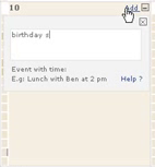
  • Simple add button within the expanded context
  • Busy/Free timeline legend for each expanded context
  • Very simple drag drop for moving events around

Scrybe Calendar Addevent

Scrybe Calendar Dragevent

GlobalTimez
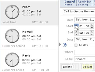
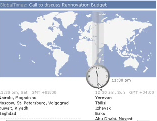
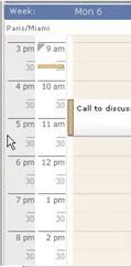
I like the fact that time zone visualization is integrated into the product. Almost all calendar pickers, date pickers, etc. seemed to assume that user never goes anywhere else or doesn't work with folks in other time zones around the world. Though it is simple, it really helps in scheduling meetings around the globe. They integrate it with the date picker, a timezone map and within the timeline in the calendar.

Scrybe Calendar Timezone

Scrybe Calendar Timezone Map

Scrybe Calendar Timezone Strip

Why is this important? Again you have the information within the context you need it. Minimize flow interruptions is a key principle.

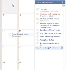
The TODO list looks simple, you can drag tasks to calendar days to assign it a date... I like the touch of you drag it to the day, the tooltip tells you what date it registered and when you drop it it flies back to the todo list with the date associate. Nice touch.

Scrybe Todo Drag 2

Thought Pad
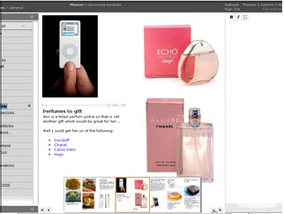
This seems like a nice tool for gathering your thoughts as you surf the web. The idea is to make it easy to collect while you are in the flow of surfing. This is the theme of their products... How do people work, what is their flow, how do we keep them in the flow.

Scrybe Thoughtpad

Paper Integration
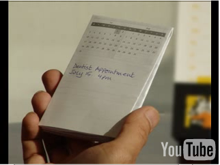
Yep, you heard it right. They make it easy to print out your calendar, appointments, tasks and take it with you on paper. This is so often overlooked. When I worked at Sabre I recall a conversation with Quantas Airlines. One of their big gripes with our incredibly detailed scheduling application was with what it printed out. It turns out that a lot of the users of the schedule got a printout and it went with them all over the airport. We had never considered how to format (nor had the gantt component vendor) the schedule for convenient paper transport!

Scrybe Paper

So, I haven't used it yet. Might be different mileage once I get into the beta.

But the bottom line principles I see at play are:
  • Keep the user in the flow.
  • Bring tools into the user's context
  • Keep information in context
  • Tie information to interactivity
  • Make all objects on the screen intuitively interactive
  • Be nuanced in your simplicity (some animations, but extremely well done)


You can see more photos on flickr.

Tuesday, December 19, 2006

Me on Google Earth!

Ok, the ultimate vanity search :-)

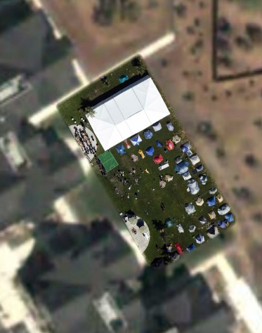
Back at Foo Camp, O'Reilly contracted to have a plane fly over and take 3" resolution images for inclusion in Google Earth. It happened on Saturday, the first full day of camp.

O'Reilly Foo Campus

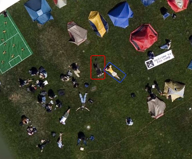
Gregor Hohpe from Google & I decided it would be cool to lay out on the lawn and let the plane get a good look at us sprawled out on the campus. I tried to convince him to lay with his legs together and his hands spread out above in the form of a Y (for Yahoo!) but he didn't bite ;-)

Here's a closeup shot of us on the campus. I am the one outlined in red, Greg is in blue.

Bill at Foo Camp 2006

If you care to check out the Foo Camp shot, it's located at:

Latitude: 38°24'40.46"N; Longitude: 122°50'25.59"W

Wednesday, November 22, 2006

Foo Lessons: Kamishibai

Back in the summer I had the opportunity to attend Foo Camp '06 at the O'Reilly offices in Sebastapol, CA. Foo Camp is a loosely organized gathering of folks that O'Reilly invites to flock together for a weekend of discussions, impromptu sessions, etc. Obviously a lot of interesting people (writer/producer of MacGyver series, engineering creator of the Osborne Computer, flickr folks, Jeff Bezos of Amazon fame, and so on...).

One of the interesting talks that I attended was on the Japanese Storycard Theater. Dave Battino billed it as PowerPoint for People.


It's based on traditional Japanese picture-card dramas called kamishibai (paper theater).
Today's kamishibai has evolved from a form of street-storytelling which was popular throughout Japan from the 1920's into the 1950's.

The kamishibai storyteller was also a candy seller. Riding a bicycle equipped with a small stage for showing the story cards, he would enter a village or neighborhood, dismount and loudly strike together two wooden clappers or allow a lucky child to do so. The sound was a signal for children to run from their homes and gather around him for story time. Those who bought candy got to stand nearest to the stage. Then, in a dramatic manner, he would start to tell 2-3 kamishibai episodes. He would not tell the whole story! The stories were told as continuing serials, that is, he would always stop at an exciting moment, leaving the children impatient for his next visit.

From: http://www.kamishibai.com/background.htm

The idea is really simple. A story is a simple stack of large illustrated story cards. The stack is presented so that the front card facing the audience is the current place in the story. On the back of the last card of the deck is the dialog for the illustration on the front card.

Really simple idea. Instead of having to twist your neck to read the text, you simply glance down at the dialog and a miniture version of the illustration. The trick is placing the dialog at the correct location in the deck instead of directly on the back of the card it goes with.

Why is this important?

The Power of Engagement
It allows you the storyteller to stay engaged with the user. Making eyes with the audience is a powerful principle. Think of how many times you have seen a presentation (I have done it many times myself) where the presenter is constantly twisting their neck or turning their back to the audience to see the presentation. It's easy to lose interest while their back is turned. Watching kids respond to a kamishibai presentation versus a typical library book reading lets you see the benefit of this approach. Kamishibai keeps the kids attention, may book readings lose the attention as the reader cranes their neck to read the story. With kamishibai, the storyteller can concentrate on the drama-- the story instead of the technology.

In the world of conference speaking some of the problem is in the very way that conference presentation technology is arranged. Singers have long employed speaker technology arranged in front of them (monitors) that allow the singer to hear themselves and therefore perform more confidently. This would be a nice addition for presentations. Projecting the same material along the back of the auditorium would allow presenters to always face their audience and receive the assurance that the right material is being displayed, timing their talk with the material (this is done in some venues, but rare at conferences.)

The Beauty of Simplicity
Now I use a lot of technology in my presentations. I employ embedded movies and animation. I like this. And based on feedback, others have enjoyed this approach. But there is an argument to be made for simple presentations. Dick Hardt of Sxip Identity has a wonderfully simple presentation called Who's the Dick on My Site. It just employs single words or phrases that are perfectly timed with his talk. During the talk, Dick does not look at his presentation. He simply talks and the presentation reinforces his story.

I work with Karon Weber a designer at Yahoo! (formerly of Pixar). One of the techniques that Karon has employed in presenting her designs at Yahoo! is to use large (and I mean large, at least 4'x6') poster boards each telling part of the story. Instead of wireframes locked inside a computer, they are set free in this large format. In our current war room for a product we are working on it is fully decorated with these large poster boards. It of course does not dispense with the electronic (they are the source for the poster boards), but it makes the presentation of these ideas completely accessible to anyone who walks into the room (or hallway).

The beauty of this approach is that it is highly practical and completely simple. It is focused on telling a story. It is in the spirit of Kamishibai.

The Power of Good Transitions
When Dave Battino told us a story in the Foo class, I really enjoyed how he transitioned between cards in the story. If there was a quick sequence of action, he would rapidly switch the card. If the hero was in trouble and he wanted to build suspense he would slowly...drag...change...cards... Sometimes the slide was left to right, sometimes it was over the top. But it was effective. How many presenters have gotten enamoured with transitions between their slides and pulled out all of the stops. "Hey, it's in Powerpoint, why should I use the fizzling, spiraling, flipping effect??" Yet, with just a quick flip or a slow drag, the story was enhanced in the kamishibai method--not the emphasis. In my talks on cinematic effects I have talked a lot about the temptation to over emphasize these effects. Making transitions too slow, too long, too vivid, etc. I have often advocated the "cut in half" rule I learned from a member of the Motion Graphics community...

Take the effect, transition, luminence change you have enstated and cut the effect in half.

Transitions are for enhanced communication and engagement... Not for the sake of the effect alone.

Happy Story Telling!

Monday, April 03, 2006

ALE - Ajax Linking and Embedding

Just a quick note. Check out Zimbra's spec for ALE.

Its like OLE (Object Linking and Embedding in the Microsoft Office World-- the technology that allows you to embed excel docs in a word doc, etc.) Only ALE uses iframes that are ALE-enabled that can load ALE-aware components.

The applications for this are for richer blogs, wikis and personalized pages. It also seems applicable to apps like Writely to incorporate. Also it could be used in lieu of badges on blogs, allowing rich interaction to be embedded in a blog page.

I like the move to componentize functionality in the front end and make the back end service oriented. Makes for a clean architecture.

Technorati Tags: , ,

Thursday, September 15, 2005

Flock: On Ramp for Web 2.0?

Lots of buzz around Flock. The new social browser scheduled for an October release. Oh no, you say. Not another browser!

No, its not really a new browser.

Flock brilliantly chose to use the Firefox engine (Gecko engine). Flock is an open source browser (like Camino for the Mac) built by some talented guys in Palo Alto, some of which were part of the Mozilla foundation.

They keep the gecko layout engine. Its just the chrome they mess with.

So think about some of the things that really open the web up in the world of Web 2.0.
  • Come To Me Web. RSS Syndication
  • Folksonomy.
    • The tagging phenomon popularized by flickr
    • The social bookmarking popularized by delicious
  • Blogging
    • building blogs
    • locating blogs
Now imagine a browser that makes it easier to do these things. Think about functionality added to the chrome that creates a web 2.0 access ramp for the average user.

Safari 2.0 made a step in that direction by making RSS subscriptions much easier. Flock appears to go much further.

Here are some of it features:
  • sharing and tagging bookmarks. They have a partnership with delicious. They include a way to see these in what they call "bread crumbs". Bad name. More like tagged bookmarks.
  • Watching lists of users and being notified as pages are bookmarked
  • Blog tool that allows you to drag and drop elements from pages you surf into a shelf that you can later compose into a blog using the common blog publishing tools
  • Ability to grab snippets and drop them as blockquotes in blogs.
  • Flickr integration for photo sharing and dropping into blogs directly
DejaVu
Remember the early desktop operating systems? Did not even have disk fragmenters. Lots of utilities that are standard in the desktop OS now was once built as a little tool that got incorporated later into the OS. Is this where browsers will head? We could have stability on the layout engine (IE, Gecko, Safari being the main ones to consider) but have new browser wars that compete on functionality not just around being able to display a page and support richness.

Will IE7 have some of these concepts or did they miss the boat?

Extensions to Firefox can do some of this, but really who outside of geekdom actually installs firefox plugins or has used greasemonkey? And how many times has firefox crashed due to rogue extensions. Its seems natural that browsers will incorporate what the extensions do and will grow like desktop operating systems did.

Google has a secret Firefox project going. Aaron Boodman who built greasemonkey is working on that team. Its been rumored that google is going to unleash a new web os based on Firefox. Is it like Flock?

In an earlier post on the Come To Me Web there was some discussion about how do you get folks to adopt the power of Web 2.0. I think Flock has possibly hit on the right way to do this. The browser can be the On-Ramp for Web 2.0.

More information at ajaxian, technocrunch, wired, flock, rolandtanglao, barcamp.

Tuesday, September 13, 2005

New Yahoo! Mail Goes Beta Tomorrow

Finally going to be in limited beta release.

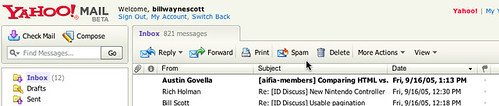
Yahoo Mail Beta

Ok, first disclaimer. I work for Yahoo. And Darren James, fellow Rico-man & former teammate at Sabre now works for the Y!Mail team. But, before joining he & I were avid gmail lovers. I got in very early in the gmail beta program and evangelized it to all my friends (and enemies ;-).

When I knew I was joining Yahoo, I was concerned that I would have to leave my gmail aside. Of course there is no one at Y! telling me I had to leave it. But it felt wrong to be using the competitor's product and liking it better.

Now, I knew some of the oddpost guys so I was pretty confident that it would be awesome. But would it be better than gmail? On the first day I got hooked into the new Yahoo! Mail.

I was relieved. I actually liked it better than gmail! Not that there aren't a couple of features that gmail has that I still like better. But, seriously the new Yahoo! Mail is better than gmail. I know sounds biased. But really its great.

The first version I got to use was a lot like the original oddpost mail in that it appeared in a separate window with no "browser chrome". Looked like a desktop app. Its own menus, etc. Shortly after joining, they made a decision to move it back into the chrome. Reasons included in the chrome is friendlier to tabbed browsers and popup blockers. I was nervous. Would this screw it up?

But no, due to the excellent product management & design (kudos to Greg Rosenberg!) decisions the in the chrome design is actually better.

Want to read & see some screenshots. Read Ryan Kennedy's blog about it (he works on the Yahoo! Mail web service underlying the new mail client).

Favorite features:
  • Powerful, fast search with snippet view
  • Tabbed search, compose windows for easy window management
  • Fast auto-complete
  • Drag and drop email into address book and it adds users to address book
  • Endless scrolling (same concept as LiveGrid)
  • Nice attachment interface
  • Subject randomizer (can't think of a topic... let it pick one :-)
Watch for the expanding beta and give it a whirl. I think you will agree that it is the best web mail client available.

Update: Sign up for Beta program at: http://whatsnew.mail.yahoo.com

Sunday, August 07, 2005

PIAs vs RIAs

Ok, so I have been struggling with what to call the non-rich internet application approach. You know the web that we have known and loved for all these years. In writing about and discussing it I have noticed what a pain it is to succintly point out the differences between the old model and the new.

So what really is the difference between the old and the new?

Well, the traditional web has this model:

  • The user enters information at the page level or clicks on a link to go to another page
  • The page refreshes to show the result of the user’s request
  • Everything is framed in the context of a page or document that has content
And the new web (I know its really not new) has this model:
  • The user interacts with items on the page and the feedback is immediate.
  • The page does not have to refresh to complete the user’s interaction
  • The page can be more like a canvas or desktop with content being objects the user interacts with

Most of the time I just call this new web model RIAs (Rich Internet Applications). Its both short and long (ah! the beauty of an acronym!)

But what do we call this traditional, previous, older thingy?

Well it really is a page-based interaction model. Applications built with this page-based approach are really Paged Internet Applications, or PIAs. Or perhaps, they could be called Page-Based Applications (PBAs). But for symmetry (and maybe subtle confusion :-) we could talk about PIAs vs. RIAs.

What do you think? Certainly someone has to have a better idea?

BTW, I am aware of Web 1.0 vs. Web 2.0. I kind of like that but the term Web 2.0 was being used to describe web companies that started up after the dot-bomb and are thriving (like Flickr).

Tuesday, June 28, 2005

Death to Paging! - Rico LiveGrid Released

Ok, How About a Revolution?Aren't you tired of getting a chunk of search results from Google, Yahoo, A9, product listings, real estate pages, etc.? And then having to scroll to the bottom and hit the "next page?". In the words of Andy Rooney, "I know am!" What I normally do is search, scroll through results to the bottom of the page, scroll back up to double-check, then I have to scroll back down to navigate to the next page. Seems like a lot of bother to just move through my results.

Have you ever thought that there could be a better way -- or at least an alternative to the standard google paging control?


First a Little HistoryAt Sabre, we started experimenting with managing very large data sets with HTML tables. Our in-house table component had grown very rich in features (things like inline editing, sorting, selection, multi-sort, custom editors, row re-arrangement, grouping and other desktop-like features). But one thing we were not happy with was its handling of large sets of data.

Our table supported two styles of navigation: scrolling and paging. With scrolling you could create a natural way to interact with the data-- but if you had a lot of records just the amount of HTML that was required to download to the page made it unusable once you got over 1000 records.

We supported paging early on to address this issue. The user chooses the page by selecting a specific page number or using the next/previous paging controls.
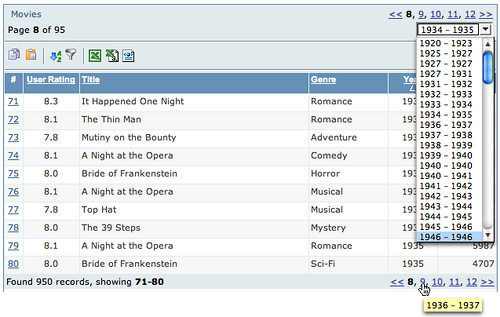


One nice feature I added was a pre-calculation of the first and last field values of each page for the sorted column. I then displayed this in a page navigation combo box.

This allowed the user to navigate to a particular part of the data without having to guess which page. Additionally, I added tooltips that showed what each page contained. This worked fairly well.

However, most clients really wanted us to make the table a scrolling table. This was not feasible due to large data sets.

The Dilema
The catalyst came when we were designing a new web application. Initially all of the design discussions pointed to tables with less than 500 records. Since the user needed to select multiple values within the table we designed the screens to use the scrolling variety of our table. However, soon after implementation started the design requirements changed (!) and now we had to deal with 10's of thousands of flights.
Now we could have moved them to our paging table. However, given the requirement for the user to move through the flights and make multiple selections before moving to the next step, we were concerned with the usability of this approach. First, would users really think their flight would still be selected after paging to the next set of results? Seeing the page refresh does not make one think everything has been kept. Second, the user really wanted scrolling tables.

Enter Ajax
So what we settled on was to take the existing paging table and turn all page and sort requests into Ajax-based requests. Our theory was that if the transition between pages was almost instanteous without a page refresh then the user would be able to 1) understand selection was persistent, 2) be able to move through the data quickly. It turned out that performance was excellent. And since it was faster there was less confusion about whether selection was maintained while paging.
Darren James (on my team) did an incredible job of squeezing more and more optimizations out of the ajax response/update. It was his work on the table, cinematic effects and drag & drop that brought about the Rico framework.

User Feedback
The users absolutely love it! They couldn't believe the responsiveness they were getting from a table in a web application. But they still had one request. They wanted to control the table by scrolling. And they wanted it to be fast even with large data sets.

A Scrolling Ajax Table
So after launching Rico (http://openrico.org) Darren, Richard Cowin and I felt that this would be the right thing to tackle. We all felt that it should start as a lightweight behavior. Behaviors in Rico are just JavaScript logic and/or layout that gets applied to raw HTML. In this case we are applying just the logic of hooking up an HTML table to any arbitrary set of data via Ajax. Other behaviors (sorting, filtering, reordering, etc.) are planned later.

Introducing LiveGrid Behavior
By applying the LiveGrid behavior, your HTML table gets connected to any size data set and it gets adorned with a scrollbar to control the navigation. The scroller becomes the replacement for the standard Previous/Next page controller bar. When dragging the scroll bar you are actually issuing ajax commands to pull the data into the table in real time! Of course we provide data caching and event buffering strategies to minimize the number of requests and smooth out the scrolling.

Death to Paging?
First, let me say that I really don't believe that paging is evil or that it is wrong in all cases. But I believe the reason that most sites have paging solutions is because 1) its easy to implement, 2) handles the problem of large sets of data and 3) it is convention.

Rarely is paging decided because it is the better choice over something like scrolling. (I should hasten to add that I do discuss some of the cons of scrolling later in this article.)

Our Pitch
So, here is what we are advocating. We would like people to start thinking about replacing the paging data model with the more inuitive scrolling data model. It is not an accident that for years this has been a good model on the desktop. And there have been a number of tables built in the desktop or applet world that do exactly what LiveGrid does-- connect up to a virtual set of data and allow you to scroll through it. In fact, I wrote a table to do this very thing in 1998 for the Java Swing framework.

So we are hoping the release of LiveGrid will create a dialogue of discussion around the best way for users to move through information on the web and in web applications. We need better ways of displaying search results, product lists, real estate listings, etc. on the web.

To help you understand some of the possible impact we provide two demos for the scrolling LiveGrid.

Pitch #1: To the Corporate World: You Can Do It on the Web!
The first example demonstrates a table with around 1000 movies accessible. Only ten are shown and possibly 30 are cached on the browser at any given time. By scrolling the table, the database is queried to return more data just in time and on-the-fly.


One of the big reasons we did not take more applications at Sabre to the web was the inability to manage in a user friendly, easy manner large sets of data in tables. The LiveGrid concept solves this problem. Think of it as GoogleGrids (aka, GoogleMaps)!

Pitch #2: To the Web World: Show Results in a Scrolling LiveGrid
I worked up a search engine example using the excellent Yahoo Search Services API. This illustrates what a search engine page could look like with the LiveGrid behavior. Its really quite fun to play with. I have demonstrated it to computer novices who are not easily enamored by technical stuff. Their response has been, "Why don't they already do it this way?"
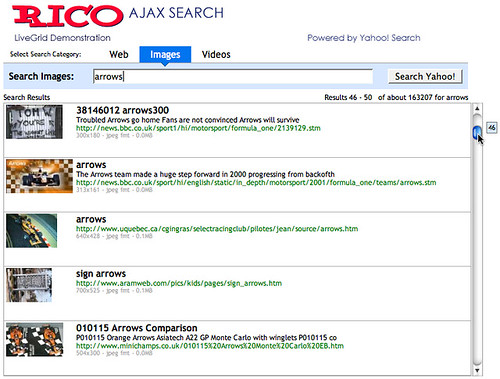

In the Yahoo Search example, we are bringing back live data from the search (usually around 35 rows for caching). Then as you scroll we are buffering as needed around you. The result is you can jump anywhere in the search data. Currently, the scroller is limited to 1000 results (the limit placed by the Yahoo Search API).

Pros
  • Familiarity. Anyone who has used a PC/Mac is familar with a scrollbar
  • Ease of use. Just scroll it baby.
  • Control is visible along the side, not hidden at the bottom
  • Shows you how much data you have and where you are in relation
  • With the tooltip and the results feedback it provides you something to watch and helps you to navigate while data loads.
  • I don't have to configure how much I want to see on a page. Designers decide what works best and then you can just scroll through it.
Cons
  • The old problem of I have two scrollbars. One in the window around the results the other on the page itself. [Solutions: make scrollbar styled differently? Keep the complete scroller above the fold]
  • If you have millions of results, you might not want to set the scroller extent to millions. The granularity of the scroll bar gets to be too small. However, it would be fascinating to actually scroll down to those last results. Anybody actually seen those? Do we even know if they exist ;-)
  • Scroller extending below the page fold. Perhaps the best use is to keep the scrolled area completely above the fold. But hey, since you can scroll so fast through your data you won't miss the few extra rows of information below the fold (that you had to scroll to anyway.)

Feedback Design Considerations
We have experimented with several ideas to provide adequate feedback. During scrolling at certain points (when crossing a buffer boundary) there can be a slight delay. We plan on adding a twirling wheel (as in Firefox or Mac) just above the scrollbar and to the right of the status to indicate when the table is busy fetching data. Is this the right approach? The balance here is to not show it too often. It should be a lot like Dunstan Orchard's Live Search on his http://1976design.com/blog which waits to search when the user pauses so the number of updates is minimized.

We added a tooltip (right now it does not fade away-- thats a bug -- but I have come to like it the way it is :-) that shows which record you are currently scrolling through. Also I dynamically update the status bar to show the range of records that are being scrolled through. I think both together give enough assurance that something is happening even with a slight delay in loading data. Certainly there are other ways to provide the feeling of scrolling while waiting slightly for data to flow in.

Your Feedback
Ultimately, its everyone in the application and web community that that will judge if the time is ripe for banishing many of the ubiquitous Prev/Next Page bars in favor of the scrollbar.
I am convinced this technique has important implications in the corporate application world and has the potential to change the way we interact with many of the search results, product listings and data grids we find on the web.

We welcome your feedback!

The Demos
You can find the two demos at:

http://openrico.org/demos/livegrid

Note: This link is broken as of 2007. I will post an alternate location for the demo of the live search. http://openrico.org/yahooSearch.page

The Solution
It should be noted that besides the demos, we are providing open source code to make your tables behave in this manner. Try it, enjoy it and make your sites and applications better. Report bugs to us so that we can provide the best LiveGrid behavior possible.