One of the challenges with the carousel is clearly delineating that there is more content hidden behind those back and forth arrows. There are a number of ways to cue the user that there is more content. You could:
- Show a series of dots that reveal where you are (like in ifilm.com below).
- Works best for a small set of data.
- Good for doubling as navigation.
- Only good for showing "1 of n" items, not "n of many"

- Provide paging text. Something like "Showing 4 of 8"
- Have to read to determine where you are
- So 90's ;-)
- Enable/Disable arrows when you reach beginning or end
- Can be subtle depending on how it is done
- Not always obvious to the user
- Does not help when you are wrapping the content (since you need to keep the arrows enabled for wrapping)
- Use a small preview of thumbnails (like the dots approach above) and show where you are in the set. Same issues as with dots.
Another approach that seems to bear out well in testing is to expose a little of the content before and after the visible items.
- Works well for image content (since you will only get an edge it needs to be easily recognized as part of content from another page).
- At a glance you know there is more to come
- Makes you want to click on the next to get the full view of what is hinted at

This kind of teaser pattern can be found in lots of places.
One place that came to mind was in children's books. You know the technique. You are on a page spread and just to the edge of the page is a teaser. In What Do You Do with a Tail Like This? (Caldecott Honor Book)
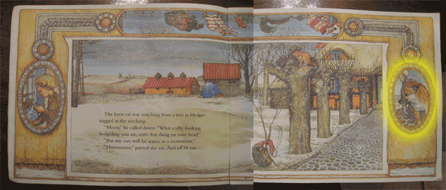
Another example is from the excellent book by Jan Brett, The Hat
Each page has some very clever visual clues as to what is going on elsewhere in parallel with the story; as well as what comes next. Here are two page spreads. Notice the rightmost image (I have highlighted in yellow) that clues you to who comes next in the story. In this case you know the dog comes into play. You can see in the second spread this is in fact the case. (Other things are going on too. On the left the oval picture is telling what is happening with the little girl at the same time; the topmost illustration of the clothesline tells what is happening to all the clothes as they are blown off the line).


While not as entertaining as the book, this new feature is part of the 0.5.5 release of the carousel.
Enjoy.
3 comments:
Hm, don't the arrows show already that ther's more to come? You could also just deactivate the left arrow for the first panel and the right arrow in the last one.. I see no point in showing a small part of the next image when there are already the arrows.
Probably not the best way to illustrate since I made the arrows so prominent.
But you could imagine layering the arrows over the revealed content in a translucent layer. Then you get them acting as controls (in a sense) but have the cue for the arrows.
The point of "teasing" with content is that it "invites" the user to look at the additional content.
But even in my example, it is really obvious that there is more content due to the visual nature of images.
The other time when this is possibly more useful is when you are showing only one item and want to clue that there are other items in the list.
But yes, for a given application it might be enough to:
- simply remove the arrows (we are doing this on my produce at yahoo
- disable the arrows (but often too subtle)
Hi Bill, i'm trying to use a vertical carousel, but displaying three thumbnails in a row, by 5 thumbnails high column. Is it possible such a thing (3 thumbs on a row x 5 thumbs on a col ) ? Thanks for your answer.
Post a Comment