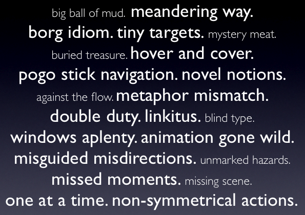
Sometimes it is most instructive to look at design patterns in reverse-- as a set of anti-patterns. In this talk, I am exploring the common mistakes that designers & developers make when attempting to craft a rich web experience. There are a bunch of counter-examples from consumer facing web sites (both inside & outside of Yahoo!) as well as from enterprise web applications.
The anti-patterns explored are:
- meandering way
- borg idiom
- tiny targets
- hover and cover
- pogo stick navigation
- novel notions
- metaphor mismatch
- double duty
- linkitus
- windows aplenty
- animation gone wild
- misguided misdirections
- missed moments
- one at a time
- non-symmetrical actions
- Ajax Experience, San Francisco, CA
- Yahoo! Design Expo, Sunnyvale, CA
- Rich Web Experience, San Jose CA
- Ajax World, Santa Clara, CA
No comments:
Post a Comment