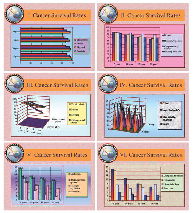
Edward Tufte calls the clutter that often obscures charts or visualizations chartjunk.
Usually it's meaningless colors or styles that hinder rather than help clarify the actual meaning of the chart. But what happens when chartjunk meets high-tech? It gets even more useless. During the CNN coverage for the Iowa Caucus, Anderson Cooper introduced "The Magic Pie Chart". This has got to be one of the silliest abuses of technology I have seen in a long, long time. I can't wait to see what the networks come up with for the 2008 General Election.
What I love is how the technology completely takes over. It pops out and looks like it could hurt someone. Then it obscures the rest of the panelists. And finally Anderson is so enamored with trying to keep it from bursting again that he is using all his brain cycles to keep the 3D virtual pie chart on that silly piece of cardboard.
Here is a more traditional example of chartjunk from Tufte's site.

4 comments:
That is indeed hilarious. Mind you, it's a good example of how poorly regarded information design is as a discipline. I would think that whoever came up with the graphics was a "graphic designer" (these days usually just called a "designer") who may well have had lots of "design training" - yet none of it relevant to the job at hand.
It is ridiculous, but on the other hand, it's an attempt to introduce interactivity as opposed to just standing up in front of a chart and pointing at it.
Hear, hear! I almost had to turn off the TV when Anderson started playing with it and totally ignoring his panelists.
And yet, here we are, all talking about it (which I think was rather the point). I am personally not so troubled by a group taking a try at some new things every once in awhile. And while I agree that this didn't really work all that well, that's sort of how experiments work out sometimes.
It's also worth pointing out that at least part of the problem was AC's fascination with it, which is a function of it's novelty. The same things were probably said about the weatherman using a green screen when that was first developed.
Post a Comment