Besides being a good example of the One at a Time Anti-Pattern it is also a good example of the Pogo Stick Anti-Pattern (I first heard this term from Jared Spool). I define it as:
Requiring the user to go down a level or two, perform an operation, come back to the top and then have to go back down again. The name comes from hopping up and down through the site.
In the Google Blogger example I described the process of deleting comments requiring a multi-step process:

Pogo Sticking in Google Blogger
It takes three page refreshes to complete the operation and return to where you started.
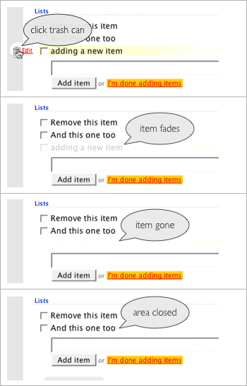
Compare this to the way you can delete in Backpackit.

Backpackit provides an in page one step delete
What to do about delete confirmation?
- Don't provide one. If the item is trivial (like an item in a list) you can just let the user delete it without bothering them with an idiot box (pointless confirmation).
- Provide one. In Google Reader they use the standard Alert mechanism. This is less than desirable since depending on the operating system the confirmation can appear far away from the deleted item. On the Mac, the alert slides out under the title bar which forces the user to move the mouse far away from the delete operation. Another approach is to provide a lightweight overlay (with a DIV or iFrame) to confirm the delete. They can appear quickly and in context with the operation.
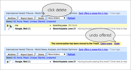
- Provide an Undo. Google does this in several of its products. In Google Mail if you delete a mail message you get a chance to undo the delete.

Deleting mail messages can be undone in Google Mail
This is a clever way to present a one-time undo by tying it to status messaging (along with contextual help).
By using a direct In Page Action pattern, the Pogo Stick Anti-Pattern can often be eliminated.
Blogged with the Flock Browser
5 comments:
While I've got no problem with removing unnecessary steps, I'm mildly surprised that you say removing either an undo or a confirm from a non-recoverable operation like a delete would be a good idea. Surely something rather more trivial (and recoverable) would be a better candidate for this? Personally, I spec undos for all such operations.
Did I say that? I just re-read the article and I don't see that I said anything about removing an undo or confirm for non-recoverable operations.
As I said, if the operation is trivial you don't need a confirm nor would you need an undo.
For non-trivial operations the undo is desirable over the confirmation. The confirmation is necessary if there is no undo.
For trivial operations you don't need either -- however, the undo is usually benign so it would be good to offer it.
The reality however is that undo is not always trivial to implement so the confirmation becomes the simpler solution with real-world deadlines.
What I hate, despise and did I mention dislike is having 'idiot boxes' popping up for the obvious. In my next blog article I will show an example of that.
[sorry if this is a dupe - Blogger's giving me problems]
Ah yes, sorry, I was reading a bit too much into the Backpackit example screenshots.
Looking forward to the 'idiot boxes' for the obvious...!
I like your thought about not over-doing it with the undo interaction if the item being removed/deleted is trivial.
Good choice on the using Gmail as an example of an undo interaction; I find myself using it frequently; I know it's there and it's quick and easy to use when I've made a mistake, but doesn't clutter or shift the interface when I don't need it.
I think Gmail was the web app I first encountered a super-useful undo operation and loved the idea!
Hey Bill, great post! I think that there is one other option that is a momentary cancel - so if you want to delete an item you know that there is X seconds before the delete will actually occur and the UI gives you a chance to undo in that time. I wrote a post on this a while back (http://blogs.nitobi.com/dave/?p=200) looking at deleting tags on flickr - I mean seriously do I really need a confirmation to delete a tag on Flickr!
Post a Comment