Theresa Neil has recently been designing an iPhone application. In the process she created a wireframe stencil for OmniGraffle to make her life easier. Thought I would pass along.
You can find the stencil at Graffletopia
Update: Now on her blog.
NOTE: This blog has been moved to http://www.looksgoodworkswell.com
Thoughts on experience design & engineering
Wednesday, April 30, 2008
Tuesday, April 29, 2008
Netflix Jobs - Two Positions Open (4/29/08)
Update: Both positions have been filled.
Sr. Web UI Engineer
At Netflix I have an immediate opening on my team. This is an exciting opportunity to ply your amazing web development/engineering talents to one of the most recognized brands on the Web! In this position you would join an absolutely amazing team of Web UI engineers at an exciting time in Netflix history.
We are currently refactoring the entire Web UI layer. As a team member you would be responsible for specific areas of the site and participate in moving our site to latest Web standards (think unobtrusive javascript, layered semantic markup, hijax, etc.), working to improve client performance (think yslow and beyond) and working to realize lots of new approaches to our interface.
Over the last few months we also have been growing the design team and our team works very closely with both product management & design to create cutting edge solutions.
Here is the job. Don't hesitate to contact me if you are interested. Email me at: b DOT scott _AT_ yahoo dot COM.
Sr. Software Engineer -- Open APIs
Michael Hart, our Director of Open APIs and Community is looking for an Open APIs Sr. Software Engineer. This is an incredible role. Netflix is in the midst of opening up a suite of developer APIs and you can help make this happen. Get in now and shape the way developers all over hack and mashup Netflix!
If you are interested drop me a note at the email I referenced above.
--
Bill
Wednesday, April 02, 2008
Anti-Pattern: Idiot Boxes - Yahoo! Photos
In Alan Cooper's About Face 3 book he states a simple principle:
Don't stop the proceedings with idiocy.
In the context of flow he describes the scenario:
One form of excise is so prevalent that it deserves special attention. In the previous chapter, we introduced the concept of flow, whereby a person enters a highly productive mental state by working in harmony with her tools. ... Interrupting a user's flow for no good reason is stopping the proceedings with idiocy and is one of the most disruptive forms of excise.
I call this the Idiot Box Anti-Pattern.
One of the clearest examples of this was with the Yahoo! Photos 3.0 product (which has been replaced by flickr).
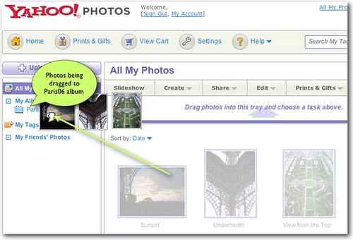
What follows are two idiot boxes. The first asks the user if they really meant to carefully select three photos, drag them carefully over the album and drop them there? :-D
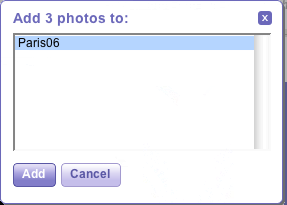
The second one tells them that the system really put the photos where you dragged them to.
Now feedback is good. But only in carefully measured doses. This is overkill. But simply removing the idiot boxes leaves you with an interface that has no feedback. What we need is more nuanced feedback during a few of the drag and drop interesting moments.
The first moment is when dragging over a valid target (the photo album). A simple highlighting of the album (there are many options, this is just the simplest) on drag over would let you know you are successfully targeting the album and that it is receptive to photos being dropped there.
The second is immediately after the photos are dropped into the album. A simple feedback would be to always show the number of photos in the album. Once the drop occurs update the tally beside the album and perhaps temporarily spotlight the change area.
On the drop there is no feedback in context. Instead two back-to-back idiot boxes are displayed
A revised design uses highlighting, running tally and spotlighting (fade technique) to give appropriate feedback
Using an interesting moments grid is a nice way to think about every possible place you can engage the user. Just in time feedback, in context is a powerful way to engage a user and eliminate heavy-handed approaches -- like idiot boxes.
Blogged with the Flock Browser
Labels:
antipatterns,
design,
patterns,
usability,
userexperience
Subscribe to:
Posts (Atom)