Luke brought out that on the good side more forms have added interactivity to form field validation. Error prevention is an important design principle. An ounce of error prevention is worth a pound of error handling design and code.
But on the bad side some forms are actually hurting the experience by either being too aggressive or trying to be too clever in input assistance.
I stumbled across two examples to add to Luke's collection. Both come from a very useful tool Its Deductible. I highly recommend the tool for what it does as it encourages me to donate more items and allows me to accurately take them off my taxes each year. Big fan. But two not so good experiences in their forms.
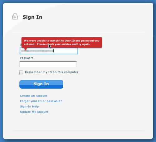
Not Clearing Error Message

Its Deductible Error Message on Login Screen
I entered the wrong account name and got a message bubble warning me about it. Good things about it:
- The bubble is clearly worded.
- Red color got my attention.
- Is nicely placed
Draconian Date Input Handling
How many times have I entered a date in a web form? So I just need to know are you expecting month/day/year format and whether I should type the slashes or not. However watch the video and see how poorly I entered the date!Its Deductible Date Input Handling
Don't even think about entering slashes or not giving 2 digits for the month, 2 digits for the day and 4 for the year. Anything except typing 02092009 will fail.
Here is what went wrong.
- You have to enter 2 digits for the month, 2 digits for the day and four digits for the year. Why? Next bullet point...
- You can't enter 'slashes'. If you do you get two slashes! And when you submit it won't like that.
It is obvious there was some effort put into assisting me in entering a date correctly. But unfortunately it took me about 45 seconds to figure out their algorithm and enter the date in exactly the way they wanted me too.
BTW, You can use SCOTT for a 10% discount on the talks in Minneapolis.
3 comments:
I think single-field date inputs like this are pretty much doomed in any case. They need either to be very forgiving (eg allowing any delimiter between numbers, using today's date to correctly interpret input, etc.), or be supported by a calendar control.
In terms of preventing errors, ye olde day, month, year dropdowns are probably the safest option I think.
I hereby nominate "Draconian Date Input Handling" as a candidate for the Blog Post Section Header of The Week Award.
Loved your video of battling to fill in the date field. So recognisable, so annoying for you.
Aspects I liked:
- annoying persistent error message
- several attempts to work out the correct format.
I'm guessing that you didn't notice the hint about the correct date format. Watching the video, it's obvious that the hint is there - but when filling in the form, you were doubtless focusing mainly on your input and the label for the field, thus rendering the hint invisible. (I call this the 'narrow focus' effect). Maybe I'm wrong, but I've seen this a lot in usability tests.
I'm also guessing that some programmer is rather proud of the nifty in-line validation. Hmmm. Wouldn't it have been a nicer user experience if that programmer had invested time in more intelligent validations instead? For example, accepting a wider variety of report formats?
You may be interested in the slides from my uxlx workshop: "Label placement in forms - and other timeconsuming forms controversies" where I have some more material about the narrow focus effect and what it means for label placement. Available from my LinkedIN profile or on Slideshare.
Post a Comment