A mouse hover is a really simple event. When you get a mouseover event you do someting. When you get a mouseout event you usually restore things to the original state.
Mouse hovers were virtually unheard of in the desktop user interface world. I remember writing some very sophisticated applications (games, graphical drawing packages, etc.) and only using mouse hover for some very basic operations. Tooltips & mouse coordinate feedback are two that come to mind.
It was a while before rollovers showed up. In the original Macintosh Finder and in Windows 3.1, rollovers were not used to indicate an object was actionable. It was the advent of the web and the need for discoverability that really opened the door for the lowly hover to be come to the forefront.
In the desktop world, hovers were not that immediately useful. It seemed gratuitous and redundant in those early days to do something on a mouse hover. Traditional desktop apps have always been structured around user interface controls providing the structure with data poured into this mold. Web sites & applications started with content. With hyperlinks and images embedded in the page, it was not obvious what the 'control' or navigation structure of the page was without some visual clues. Over time rollover effects that made it into the web found themselves migrating to the desktop.
Windows 95 flattened toolbars to remove the visual speed bumbs created by beveled button borders. In its place, the mouse hover showed the border and gave the essential clue that the object was clickable. As more and more folks have got used to exploring with a mouse hover, it became a more acceptable a way to discover functionality.
Ajax, DHTML and the Lowly Hover
Now that interactions are even more dense, the hover has become our friend to discoverability. We are introducing new idioms to the web space. Things like drag and drop and inline editability are not immediately expected. The hover can provide vital clues to the behavior of an application at the moment the user is curious about it. Hovers are also the lightest event for the user (they just move the mouse.)
Let's look at some places that hover is showing up more and more (not an exhaustive list!)
Hover Invitation
We can use the hover to cue the user what is going to happen next.
Inline editing
How would you know that parts of a web page's content is editable? We could be overt and just say it on the page. But that gets busy if there are lots of places that are editable. We could make everything look editable. But that also makes for a cluttered page. Hover lets us do just-in-time functionality feedback.
In flickr, hover over the photo title and you will see the color change to indicate the area has some interaction to offer. Coupled with the tooltip the user is invited to click to edit the title.

Flickr's Photo Title Before Hover

Flickr's Photo Title After Hover
Pretty obvious if the user ever hovers over the title.
In backpackit.com, the 37 Signals folks take a similar approach. They shad the area editable with a gradiated yellow background and add a lightweight inline, incontext toolset. It becomes obvious that you can edit, delete (trash can not shown below), etc. the content.

Backpackit Note - Non Editable

Backpackit Note - Showing Editability
In Yahoo's trip planner (travel.yahoo.com/trip) you get the same style of in-context toolsets on hover.

Y! Travel's Trip Planner - Itinerary Item

Y! Travel's Trip Planner - Showing Editability
Ratings
Yahoo popularized ratings. Just check out how the hover helps guide a user to rate a movie.

Yahoo! Movies Ratings - Not Rated

Yahoo! Movies Ratings - Invitation to Rate
By visually engaging the user in rating possibilities the user only needs to click to participate. This lightweight approach to engagement is the advantage the hover has. Hover requires little effort. The next step is just to click.
Hover is nice because it allows you to hide lots of controls and show them only as needed. Showing them in a light enough manner makes it much more engaging to participate.
One more example will suffice from Yahoo! Local's Reviews.

Yahoo! Local Review Rating - Before Hover
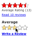
Yahoo! Local Review Rating - During Hover
Flagging Mail
In the new Y! Mail, hovering over a message's column for flagging shows a lightly shaded flag. Clicking turns the flag on.

Yahoo! Mail (Beta) - Unflagged Mail

Yahoo! Mail (Beta) - Inviting to Flag
I think gmail's star could have been greatly improved with the addition of a hover. Although I don't believe that Google believes in the hover event at this point in time ;-)
Gmail's Star - No Hover
In all of these the hover creates an invitation, a call to action. It shows what the user can do right now, right where they are at.
I call this the Hover Invitation.
Hover Zoom/Focus
There is another use for hover. Since the mouse can indicate where I want to look, the hover can say, hey I want to focus here... I want more detail.
Getting More Detail
local.yahoo.com does this with the map. Try searching for 'restaurants' in some locale and you will see a map to the left. Hovering over the map enlarges it. Leaving the map area shrinks it back to the normal size.
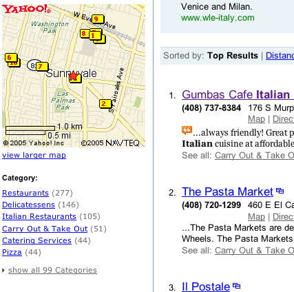
Yahoo! Local Map Inset - Before Hover
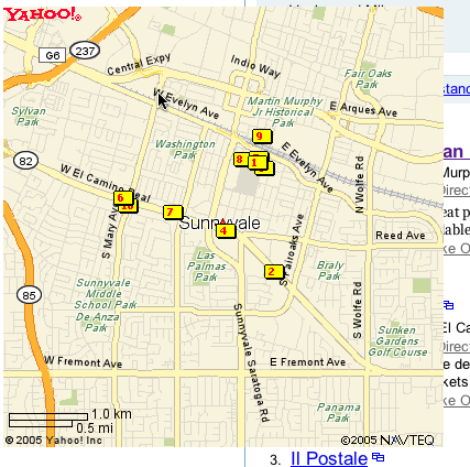
Yahoo! Local Map Zoomed - After Hover
This pattern is about Mouse Focus or Mouse Zoom. In this case the hover is the interaction. While it might lead to more interactions, the Hover Invitation is a specific call to action, an invitation to click.
However, there are problems with this approach. Once the area is zoomed up it can cover other important areas, controls on the page. The user also has to move a lot further to exit the now enlarged area to get it to shrink down in size. You have to be certain that the user really wants to interact with an object to zoom on hover.
This is also common with photo organizing software. Hovering over a photo automatically enlarges it slightly.
A very slight variation on this is enlarging an area on hover to make it more apparent it will be the object selected. The Macintosh OS X Dock does this. Although with mixed results. Part of the problem is the area is just magnified. If the icon is 32x32 and it enlarges to 64x64, you still only have 32 pixels of mouse movement to traverse the object. This causes people to zoom past tools by accident.
Hover Detail
And yet another variation is the hover detail. By hovering over something I get a separate view that shows up in a lightweight popup allowing me to see or read more data about an entity. Not too much unlike a the hover zoom, but with more emphasis on letting me peek at more information without changing the page at all.
You can see an example of this in netflix.com.
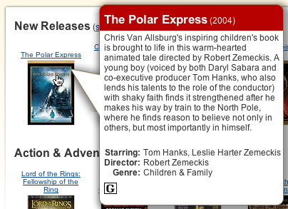
Netflix Hover Detail
Also, it is used to get more of the story in news.yahoo.com.
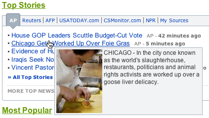
Yahoo! News Hover Detail
Going Forward
Of course, hover will be abused. Once could imagine a page with no controls showing and they only show their action on hover. This is the idea of mystery meat interaction a wonderfully hideous approach to engagement.
But used wisely, the hover can
- Engage the user at the point of interest
- Reduce clutter on the page
- Give specific previews as to what will happen if the user clicks
- Provide a lighter way to zoom in on things with little effort
Use hover to create a more lightweight but engaging way to cue the user to hidden functionality. Use it as a way to provide just-in-time details. Use it to keep your page visually simpler providing what is needed when they are most curious.
29 comments:
Sweet. You bring up a point that I should have made about the most obvious thing that the hover gives you-- reducing the need to switch pages or switch context.
Being able to do more and more inline really keeps the footprint light and makes the experience much more enjoyable.
The other point is the whole measure of "click weight" or how much effort a user must exert to perform tasks is much lighter with hover techniques.
"It was a while before rollovers showed up. In the original Macintosh Finder and in Windows 3.1, rollovers were not used to indicate an object was actionable."
First, what are you talking about? Since the original Mac, the cursor has changed to an I-beam when it's over editable text, or a hand when it's over something you can drag to move, etc. There's been GUI feedback indicating the actions a user can perform with a mouse for a long, long time.
Second, actionable means "providing grounds for legal action." I take it that's not exactly what you meant... :)
Anonymous,
By rollovers, I meant the object itself responding visually to a hover event.
Changing the mouse cursor is not a "rollover". The term was coined in the web world to indicate the feeling that something had been rolled over by the way it responded to the mouse event.
I am certainly aware of the I-Beam cursor and other component level events. Having written Macintosh components, X-Windows components, Tcl components, Motif components, Java components and DHMTL components I am very familiar with all of the mouse states and various cursor changes available. And the i-beam was way before the macintosh, back before the Lisa and back to the days of Xerox/Parc.
The point of the article was to discuss more complex hover events and not to be an exact history lesson on 'mouseover'.
On your second statement, I guess I can just say "wow, lighten up dude!" Yep the dictionary defines it exactly as you stated it. But others in my field use this term the same way I stated it.
Jakob Nielsen is just one example: "ensure that users know what they can do and that they can recognize actionable user interface elements."
In the computer field we have the luxury of creating operational words. It is one of the joys of my field. Don't rob me of the joy ;-)
Good article. Definitely a very useful tool.
The Yahoo! Top Stories are just plain links and I could see them being clicked immediately without a user exploring them and triggering the hover effect.
Any thoughts on hover affordance?
I think the idea on providing the hover details for the links was to allow you to scan through headlines and see if you really wanted to drill down. You can still click through and avoid the hover.
The interesting thing about this the impact on ad revenue. I can't comment on the impact, as I don't have that information. But it raises a larger issue about the potential of less page views in ajax applications. Since ad revenue models use page views as a metric for pricing you could see the potential for trouble. I personally believe that a happy user will frequent the site more and thus help generate more revenue.
I am glad that Y! is trying to do what is best for the user and putting some trust in how it will work out. [Disclaimer: I do not have intimate knowledge of the ad revenue model so I cannot say whether revenues went up or down based on this feature]
Ah, the issue of affordances. Its interesting that in our research feedback seems to be more important than an affordance. But yes there should be affordances that clue something is actionable (hah! used that word again). However too many affordances can make the interface busy. This would be a good blog article...
What about people who can't use a mouse, or have trouble controlling it well?
mar,
Excellent point. This raises the whole issue of accessibility.
In the Y! Local example you can alternatively click on the links below the map (big text section) or do the hover/click action.
However, what it does not do is allow you to tab through the items (or arrow through them). This is the root issue.
Ideally, you would tab through the results and the "focus" of the tabbing operation would provide a hover. Hitting tab would focus the next item.
Open question... Perhaps a Space bar after focus would bring up hover information?
Ideas?
James Govenor pointed me to his excellent article on Ambient Micro Search.
I encourage everyone to read this. Great stuff!
I agree that feedback is more important than affordance. It is also easy to get affordance-happy by adding icons everywhere leaving the visitor baffled.
But the feedback on links has to be immediate since a visitor expects to click on it and instantly go somewhere else.
In our research, we've found that the underlined link is one of the few affordances recognized by all.
The link is the most basic and fundamental interactions on the web. It's what created the web.
To add different hover behaviors to links without adequate consideration of affordance might result in missed opportunities for both the visitor and the business.
Thanks for an interesting article.
You might want to check http://www.dontclick.it - website that actually doesn't need (more than the entry) mouseclick. A really interesting clickless UI, lots of hover there..
Nice post Bill. I have it up at Usability In The News.
I noticed that your right column on the blog dropped down to the bottom. In case you don't know, the reason is that one of you images is too wide or there is a very long URL in the article.
I hope that helps.
Bob
Thanks Jared. Will read your article.
I hate to rag on blogger. But you know it doesn't have trackbacks. Moving to Haloscan would lose all of my comments. So I have added blogger's backlinks. A poor excuse for trackback... but anyway will have to do for now.
And thanks Bob. Yeh I knew I should have set the width... alas on FF/Mac it was working right even though it was to wide. Will fix! Thanks.
No, there is no general way to make tooltips appear just with the keyboard. However, despite a near-complete absence of advice on this topic (since the advice usually comes from fanboy-type visual designers), you can and should style the :focus, :active, and :focus:active states of your links (or anything else).
Do look at the Nice Titles extension, which gives huge link tooltips.
:hover can be applied to nearly anything in HTML, though IE/Win doesn't support it. Nonetheless, there are some pleasant (also some unpleasant) effects that can be produced that way.
"It was a while before rollovers showed up. In the original Macintosh Finder and in Windows 3.1, rollovers were not used to indicate an object was actionable. It was the advent of the web..."
Bill, I acknowledge that this article isn't intended to be "an exact history lesson," but I can't resist pointing out that Mac OS used to have an excellent UI feedback feature called "Balloon Help" that provided context-sensitive information for nearly everything (including unclickable items like the desktop and greyed-out menu items).
The first time I saw Balloon Help was in System 7, which came out in May of 1991, but from what I understand Mac OS had Balloon Help from the beginning.
Thanks for the excellent link. I stand corrected. Duh! I have even used it as an example in discussions. The correction is appreciated.
And thanks for the excellent link. As an aside it would be nice to find a careful history of the various mouse events. Its kind of one of the things we don't think a lot about historically.
Also, there is probably a need to discuss the difference between mouse cursor change (I-beam style), hover popup (balloon, details, etc.) and rollover effects.
In the discussion on hover, it is interesting to question just how long a delay should occur between mouseover and the popup. It seems that help requires a short delay and information that is invitational should be immediate.
Probably not thinking of all the nuances, perhaps others have written up some research on this.
Thanks!
I ran across this photographer's portfolio site randomly, it has a slightly new idea about using hover that I like:
http://www.rodneysmith.com/portfolio.php
In this case, hover behavior helps keep the interface simple...
Ben,
Interesting link. As you know one of the problems with trying to show images enlarged on hover in context is avoiding trapping the user in a mode where they can't get to other photos.
This does a nice since they only show the enlargement when over the photo and not when on the generous white space. They also cleverly pick left or right to show the photo based on the mouse position.
Bill - thanks for this article! Your critics of GMail interface made me reconsider the design of my own webapp, more specifically the "Flag it" AJAX-buttons for entries which were not hover-glorified until now.
However, I haven't found an easy and elegant way to achieve this effect with CSS :hover selector and JS roll-overs are just so 90's! The catch here is that hovered button remains hovered even when its state has already changed and user can only see the result when he moves the mouse away.
As I see it, Yahoo! Local rating system uses JS onmouseover/onmouseout events successfully - but only for JS-enabled browsers! And others get a simple form with 5 radio fields - no hovers at all!
Could you please share your ideas on this issue? Myself, I have tried sending JS MouseOut event, replacing "hovered" image with a "new state" image etc - but nothing worked as expected.
Apparently, there's only one trouble-free way: use JS if available, use :hover if N/A or below required version. Needless to say, it will result in heaps of code, multiply to the number of rows.
Hi Bill, I really enjoyed your thoughts on "Popups With a Twist" and "Musings on Mouse Hover". I found them while searching for leads on implementing a Netflix like mouseover technique to reveal more information to our readers. I haven't been able to find any tutorials yet, might you be able to recommend any? Accessibility is important as well.
Thanks for your insightful articles,
Corl
corl@earthlink.net
Keep your eye on the yuiblog.com. In the next release of the Yahoo! UI library you will see code that makes it simple to implement this. I will see if we can cook up a direct example to simulated the netflix or yahoo news hover detail.
Cheers,
Bill
Just to gratuitously pile on to the history corrections, it wasn't Windows 95 that "flattened toolbars to remove the visual speed bumbs created by beveled button borders". It was Internet Explorer 4.0 for Windows that did that (to both itself and Windows Explorer), followed by Office 97 then Windows 98.
In my experience, ~95% of uses of mouseover are inappropriate. (For example, Mac OS X demonstrates that mouseovers aren't necessary for toolbars.) Showing something on mouseover is good when the resulting lack of discoverability isn't as bad as the extra clutter and distraction of showing it all the time. Tooltips and zooming maps are good examples; making links look like links is not.
Hi, After reading all the enthusiasm about hover features I feel a bit like a traitor.
Im new to XP and forgetting that "fools rush in....."
I found an option to turn on the feature where the hovering cursor would bring the window into focus. This seemed neat so I turned it ON. That wasnt clever and I really want to turn it OFF again but cant remember how to find the option. None of my friends have any knowledge of it and nor does F1
I hope someone here likes a challenge and will help.
Regards, Mickey
Do you have the code for a simple mouse over?
Bill,
I just ran across this insightful post and I read in your comment on 4/13/2006 12:03 PM that you would be creating "a direct example to simulated the netflix or yahoo news hover detail". Where can I find this example?
Thanks!
You can find some great examples at developer.yahoo.com/yui under the Container library.
Great article. I was wonder , how do you make it visually clear that a certain area is "mouse-hovera-BLE". In others words , how do we communicate to the users that they can mouse hover on certain objects and how do we attract them to do that ?
is hover the same as onmouseover or onmouse out, or both?
does hover apply to just the text, or to the space around it?
i can't get hover to work the same in firefox and ie.
Post a Comment