Google Suggest
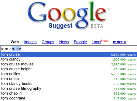
Google Suggest was an early demonstration of the concept of Live Search. As the user types in the Google search box, the top search terms that match the user's input are shown in a drop down. If I am looking for 'Tom Cruise' only 5 characters are required to match this search term ('tom c').

I have never used Google Suggests for anything more than a demonstration of how live search works. I rarely need help in finding search terms based on four or five characters I have typed. Don't get me wrong, I think it is wonderful code, snappy response and perhaps has some purpose. I just have never found it personally useful. I mean if I am going to look up Tom Cruise, I perhaps might find it useful that it completes it for me and spells it correctly. But I think I know how to spell Tom's name.
Here are a few thoughts I have on this.
- If I am typing a term I probably already know the term I am typing
- The drop down can be annoying as it distracts me from typing
- It is really only useful for common searches. Since I find myself typing fairly qualified search terms; and there the suggestions start to trail off rapidly (at the end of the long tail)
- Once I find matching terms I just get a second pile of results. So in essence I have searched twice.
- The usefulness seems to be if I just want to see what is hot that starts with a few characters ;-)
If you have found Google Suggests useful please let me know. I am sure I am missing something. I would love to understand common use cases in which this is the case.
Yahoo! Instant Search
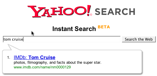
Yahoo!'s Instant Search takes a different twist on this. A balloon popup shows up with a single best match (based on Yahoo! Shortcuts). Kind of like a 'google suggests' for 'feeling lucky' only your lucky day is on Yahoo!
Typing 'tom cruise' yields the following:

Ok, the difference here is a candidate result is shown based on what I have typed. But here are the caveats.
- I have to type fairly specific, complete search terms. 'tom c' does not cut it. 'tom cruise' does. And do I really want the imdb database result for Tom? Interestingly, the Y! Shortcut is his fan page, which is what I was looking for in this case.
- The balloon can be distracting since I am personally conditioned to multiple results to look at. Giving me just one seems to make me think harder about whether this is the right place to go. I tend to compare results before picking a term to drill into.
- With the balloon in place, hitting enter just takes me to the results. Which seems reasonable but there is amiguity about where I am going when I hit Enter. Ctrl+Enter is supposed to go to the link in the balloon. But on the Mac with Firefox it does not seem to work.
It is interesting that the instant search provides a nice interface for those with screen readers. The popup triggers visibility and is read by the reader. Those without sight can know the best result found instantly. Nice side effect.
Now I am on the fence overall about its narrowing capability vs. the distraction it causes me. For popular items it seems to have a 50/50 chance finding me exactly what I want. However, I tend to be someone who is searching for more obscure items so to me it is distracting (though cool!) The fact that it narrows to 1 item causes it to have this sharp distinction between distraction vs. narrowing.
Do you like or not? If I understand correctly, it did well in user tests. What say ye?
Kayak Auto Complete
Kayak.com is a good example of live auto complete. Say the user is wanting to fly into New York city. They seem to remember that the airport they want is called LaGuardia (not sure how to spell it or what the airport code is). When I type 'New Y' I get the following results:

Ok, this is nice. I hate remembering the airport code. And I hate having to go to another page to find out that the site could not figure out what I meant. Jakob Nielsen states as one of his ten usability principles, Error Prevention. Providing the feedback instantaneously to cue me to what the system thinks is great. Saves me time and makes me feel like I am narrowing in on the right thing. This probably ties in with Jared Spool's research on The Confidence Game which shows that users are happy to click and click as long as they feel confident they are reaching their goal. Here I have the best of both worlds. Raise my confidence and do it with the minimal effort!
Hey Travelocity, FareChase, Orbitz, Hotwire, Expedia-- this is good stuff! Get this feature in your sites!
Without a question this helped me narrow to my result and did not distract me.
Of course I have compared apples and oranges. Both Google & Yahoo are dealing with an enormous body of information that it is trying to give you instantaneous feedback on during your typing. Much to infer. Kayak has an extremely limited (though hard to remember) set of data. Perfect for an instantaneous narrowing opportunity.
Yahoo! Mail & Why it Dumped LiveSearch
The new Yahoo! Mail Beta (still in limited release--and no I can't get you in the beta! :-) has a nice search box for finding content in your mail. It works extremely well. When you search for some content you thought came into your mail messages, the results show snippets of the conversations with the matched text highlighted.


Now you will notice that the search box has a little "Go" button beside it (and when activated, the an inline progress indicator shows). So how can I call this live search? Well it really isn't. However, they started with a live search in the Alpha version. The user would type a few characters and then the search would trigger. However, when the product went beta they went with a more traditional "submit" model. In other words instead of key events (or losing focus) implicitly triggering a search, the user has to now hit the "Go" button to get a search initiated. Why the change?
The primary reason was performance. Supporting the scale of users within the Yahoo! Mail network would be an enormous hit on servers. However, I think there is also something to be learned from this on the user experience side.
Now this is not scientific. It is my observation. But when confronted with a live search box that will return results (not suggestions) I immediately expect a button to trigger it. So at first I am a little unsure. Ok, that can be worked around by learning the interface. But next as I start to type a string, say "liberty mutual", it would start matching 'liber' finding things about liberals, liberality, liberty and so on. Now it starts changing as I continue to type. I get through the first word 'liberty' and now I find mail that discusses liberty in the U.S. and elsewhere as well as finding an email from my insurance company. Finally I type the whole thing in and get what I am looking for.
Now here is the point. How helpful was the constant feedback loop?
Did the feedback help me narrow to the message I am looking for or did it distract me during the task of entering what the term I knew I was going to type?
I vote that it was distracting.
I feel like I am in a race with the instantaneous search engine to get my term in before it starts returning the wrong results :-(
Thankfully it was replaced by this more traditional (yet Ajax-based) solution.
Amazon Zuggests
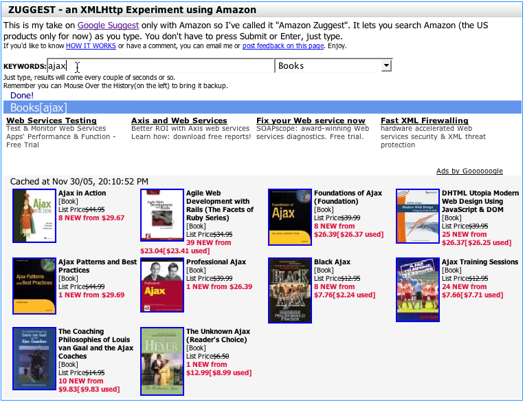
Using the Amazon API, Francis Shanahan created a way (Amazon Zuggests) to search amazon using the similar approach of Google Suggests and Yahoo! Instant Search.

This is really nice since it shows the results to my search terms as I type. Since the results usually have cover thumbnails and some text, it is easy to use it to explore to find books on a topic without ever leaving the page.
But does it really help me narrow quickly? Well, yes & no. Since it seems to not try to search too fast (on my pausing to type) I don't get into the race I felt like in the early Y! Mail Alpha. I can type a word, say "football." What I get back is a bunch of books on football for NFL and college. What I really want is college football. So I continue typing, adding the word "college". Now I get a bunch of college football results.
By not narrowing too quickly (to one result as with Y! Instant Search) and not trying to return results to fast (like Y! Mail Alpha did), the feedback loop is nice and allows me to refine by typing keywords.
Summary or What I Think I Have Learned So Far
- The results are direct results-- not indirect results (as is the case with Google Suggests)
- The results are narrowing and not diverging (as in the case of showing more search terms in Google Suggests)
- The results are narrowing and not distracting (as was the case with Y! Mail Alpha, Google Suggests and potentially Y! Instant Search)
So I am interested in feedback. What other general rules am I thinking of? What other examples come to mind? What do you like or hate about live search examples?
Feedback appreciated.
12 comments:
We did a similar search function in Ajax as Francis Shanahan, without the pictures, which I think make it to slow.
I agree that Google's implentation was actually quite useless and not a "search" feature at all. It was more of a typing assitant.
One fantastic implementation you should check out is David Watanabe's Inquisitor plugin for Safari's search bar. It embodies all of your summary ideas, and is fast and unobtrusive.
...and in fact, Watanabe's got a web-based version of Inquisitor that works almost identically to the Safari plugin, though it's not configurable.
Live search works in many cases as a combo-box replacement, like your airport example. We've implemented a simple - yet surprisingly popular - phone number lookup live search on our intranet. A huge advantage over a combo box is searching first name, last name, userid, etc., all at once, transparently to the user.
I generally considered google's suggest more as a marketing tool. Great for research, and helps you improve your keyword density. It shows you what "Google is looking for". It's often been discussed on SEO forums as a great assistant to help you target the right phrases. Although it's definitely geared toward the "head", and not the "tail" of SE Optimizing.
olof,
Thanks can you give us a pointer to your example?
Thanks Andrew, I forgot about the inquistor.
That is a nice implementation of previewing results helping you to narrow on a solution.
David,
Do you have an example you can share. I did not spot what you were referring to on your site.
bill, sorry, it was more of an experiement done for testing some ajax possibilities, it didn't even become an alpha.
I think that del.icio.us's implementation of this in helping users choose tags is a nice complement to the use of folksonomies.
Great post Bill...only just come across it.
My take is that Google Suggest was a great way for some developers to say what is possible, and it's become a great way for users to say what they want...the Genie is certainly out of the bottle.
But for me the key thing is to see the whole set-up as 'david' describes, as a combo-box replacement. That might seem obvious, but what's interesting is that there is therefore no reason why different people can't have different values in their 'combo replacements'.
In a way this is already done in browsers that give you previously entered values when you are filling in a form. But they are all mixed up with all the other values you've entered in other fields. In a blog I wrote last year, I showed how to use the values from Google Suggest as a list of tags to choose from when posting an entry to del.icio.us.
But using Google Suggest was just an example, since as I explain in the blog, there is no reason why doctors couldn't use a set of tags from a medical site, sports fans use a set of tags from a sports site, and so on.
This is all part of putting users, not servers, at the centre of the web!
Answers.com also has a great implementation for this live search feature
Post a Comment