Designing with Patterns Workshop
I will be giving a 3 hour workshop on Wednesday afternoon (May 20) starting at 2pm. Here is the planned agenda:
- Pattern Overview
- Survey of Pattern Libraries
- Design Principles
- Principle One: Make it Direct
- Exercise: It's a Drag
- Present Solutions
- Principle Two: Keep it Lightweight
- Principle Three: Stay on the Page
- Principle Four: Provide an Invitation
- Principle Five: Use Transitions
- Principle Six: React Immediately
- Exercise 2: Button Mayhem
- Present Solutions
- Q & A
In every field of design one of the first things students must do is learn from the work of others. They study and break down real-world examples in order to understand the underlying principles and patterns that make for successful design. Then they are able to apply these learnings to their own set of problems. Designing for web interfaces is no different. We are constantly searching for inspiration and practical guidance in solving the problems we face as designers each day. One approach to curating and applying solutions is through the idea of design patterns. Design patterns define a solution in the context of a real world problem.
In this workshop, Bill Scott will discuss the rationale behind patterns, present a number of excellent pattern libraries for your consideration (20+), and then dive deep into 100+ examples from around the web that illustrate good interaction techniques (design patterns) as well as the not so good (anti-patterns) all organized as a set of six design principles. The main idea of the workshop is to expose you to lots and lots of real world examples and discuss the nuances and best practices that can be distilled from the them. In addition there will be time for two group exercises -- both actual problems that are currently being worked on at Netflix.
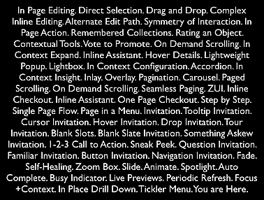
Many patterns are discussed. Here are the main ones:

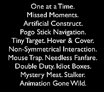
You can learn from the bad examples as well. Along the way, anti-patterns are pointed out. The anti-patterns discussed are:

I will also be presenting Bringing Design to Life which explores what designers should know about interface engineering and ways for engineering & design to work in synch to bring design to production.
No comments:
Post a Comment