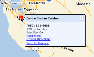
Example of a Lightweight Popup from Yahoo! Local
So here is where I want to say (with a nice, slow, southern, raspy drawl), "Back in my day, we didn't have no popups."
But in reality we did. With the advent of windowing we kind of went popup crazy. We had moved from a world of ASCII terminal based applications that went from screen to screen (or if you were clever you could tile in an area of the screen using some IBM font characters to draw the popup border and create a simulated dialog) to a nice environment with menus, windows, mice, and icons. With that sudden power applications started adding popups everywhere.
In Alan Cooper's original About Face book, he used the term, Idiot Boxes, for unnecessary dialogs that interrupt the user's flow asking pointless confirmation questions or asking for information that they system should already have.
One key design goal that I have always strived for is to minimize modes, context switches and windows for the user to manage. Direct manipulation helps to realize this goal. But another technique is to avoid going to other screens or pages to get information from the user.
In the web world, for the longest, we were plagued with two types of popups:
- Javascript alert box. Your basic ugly dialog box
- Javascript open window. Which created another browser window (that you could leave fairly undecorated)
- DIV based lightweight layers
- iframe based layer
The use of a DIV that is absolute positioned and given a higher z-order index, styled with a title and perhaps made draggable has come into vogue of late.
And for good reasons.
- They allow the user to input more information without leaving the current page context
- They allow the user to look at more information without leaving the current page context
On desktop apps, dialogs seem to be disruptive. In web apps, popups (when done correctly) can actually minimize the need for breaking the user's concentration by bringing in information in context quickly and easily. (Obviously abuse will not be far behind.)
In my previous post I illustrated the Hover Detail. Luke Wroblenski commented about using Hover Detail + In Context Tools to make more complex related commands readily available to the user without disrupting flow.
This is really intriguing! These really are not your father's popups!
Its the same basic idea. Just popups. But with a light twist. So what is this light twist that makes these web popups so much better than the old style? Here are some of the things that I think make them better.
- Their goal is to minimize disruption to the user
- They are virtually instantaneous. No waiting like in the old days.
- They can be styled to feel lightweight
- They can be styled to match the page they are part of (this makes them feel like they are part of the page, but yet not at the same time)
- They have enough familarity with normal popups that users know how to move and close them (hopefully!)
- They are often triggered with just a mouse hover and dismissed with a mouse out
- They remove the fear of where a link might lead me.
- They remove the need to load a new page
- They often bring information at the point of interaction and at the point of curiousity
- They remove the need for getting back to the context by using a back button
- They provide information in context-- a powerful information architecture principle.
- Couple with Ajax, they provide a world of information at the user's fingertip (or mouse point ;-)
- And they just feel great! No, seriously, after living in the land of page to page navigation it is refreshing to be able to pull content in quickly.
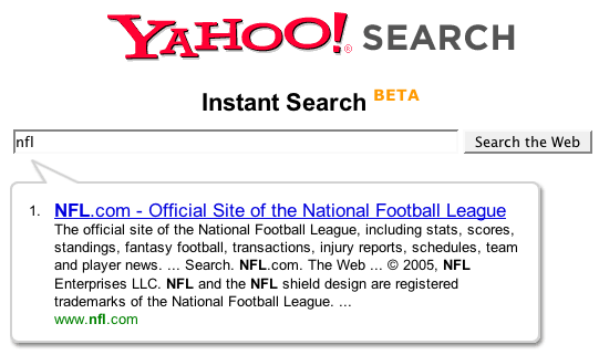
Yahoo! Instant Search

Yahoo! Instant Search Uses a Lightweight Balloon Approach to Show Shortcut Matches
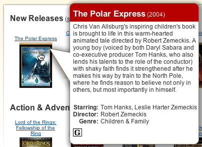
Netflix

Netflix Movie Details
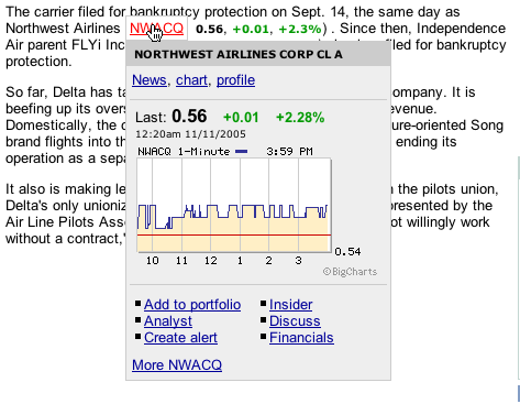
MarketWatch

Lightweight, Quick but Substantive. From MarketWatch. Illustrates Information & Commands in a Single In Context Popup
4 comments:
I tryed to mach a hover search from a tooltip function, and while the usability of the thing at the mo is v poor, I think that being able to offer 'value added' services to some links - like being able to search the site referred to in the link - is useful.
Why? Well, a link referred to in a page has lots of context, and some users will be minded to search a site base don the context/stuff they've been reading around where the link is displayed.
True, speech balloons and the like are becoming very popular. Another improvement of modern popups is partial transparency, a useful concept for longer lived popups.
A neat way to make transparency flexible is with another modcon: the slider. I've been toying with the idea of a popup-slider combo, with a special case near zero, so that instead of disappearing, it shows just an outline.
Bill, great series of posts btw.
Microsoft are using contextual hovers in their new Office product suite: http://blogs.msdn.com/jensenh/archive/2005/10/06/477801.aspx
One question from a novice. How does one do that? I would like to learn how to utilize that feature.
Thank you.
Post a Comment