She finishes up the article with a stab at redesigning the carmax.com search example more as a true car finder using a pattern I tend to call Refining Search. Others have called it a Faceted Search. Theresa describes it as an Ultra Rich Search. The best example of this is in kayak.com and roost.com (which has an absolutely superb house finding tool).

Theresa applied a real-time, iterative filter refinement ala roost.com
Where this type of patterns is really useful is when there is a large body of items that have clear facets (like size, color, brand, flight time, price, #bedrooms, texture, etc.). The mistake that most people make when implementing a refining search is not following some simple rules:
Refine in real-time
Clicking a bunch of check boxes or changing text parameters and then having to scroll down and find the Submit button is a ridiculous exercise to put the user through. The user is in an exploration flow. Don't break their flow with needless hunting for the submit button. What is the purpose? Hunting for product or hunting for your interface elements?
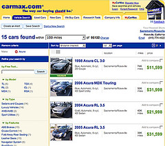
This is the ebay model. While it does a good utilitarian job of refinement... it is painful to experience.
eBay requires you to hit the submit and get a refresh to see next iteration
Avoid one-at-a-time experience
Some choose to avoid real-time filtering since it can be noisy to continue to refresh the display on each click (I talk about this as an Anti-Pattern, called One-At-A-Time-- forcing users to wait for updates on each click.) This is easily resolved by waiting to trigger the search until the user has not clicked for some small amount of time. With this mechanism you can click, click, click, pause... then search instead of click...search..click...search...click...search. We employed this technique on Yahoo! for Teachers.
In Y! Teachers you can click multiple filters without a reload. Waits for activity to stop.
Keep it smooth
Use Ajax or other in-page remote scripting to smooth out the load. Don't refresh the page! You will break the user's flow. The page will probably bounce back to the top. It will suck. Don't do it! Use a simple progress animation overlayed lightly on the content area to direct their attention to where the results will be.
Make the filters easy to Tweak
Try to avoid making the user type in values. Use sliders where it makes sense. The problem with sliders is the granularity of control and dexterity it requires to manipulate them. But if the values are large (like house prices) or there may be confusion about how to input the data (like using comma or not or whether to include the last 3 zeroes on house prices) a slider can avoid the ambiguity.
Make the filter controls easy to manipulate
Using simple check box on/off is the simplest approach to binary filters. You can visually treat them to make them not so busy... but keeping it looking like a checkbox is good since it is easy to understand.
Roost provides nice filters that are easy to work with
Keep the Context
Watch out for too many collapsible areas. Don't use accordions. Nobody wants to have to open an close each area one at a time to do filtering. And you need to see the full context to know how you have it filtered.
Y! Autos Car Finders uses large, klunky collapsible areas partly to hide a very large set of filters
Make it easy undo filtering
Just an undo all filters is a nice way to start a search over.

Roost has a simple reset
Provide a way to save & compare items for later
Being able to select items that get found, save them for comparison later is powerful for product choices. Roost lets you "highlight" properties. It remembers all hightlighted properties and at any time you can choose to view only those you have saved in this manner.

Blogged with Flock
8 comments:
Wow, I really disagree. Doing anything on a form without the user getting to decide when to submit breaks the basic model of how the web works.
While your simple guidelines would fix most of the problems associated with real time filtering (wait after click being the most grievous) they aren't without technical issues. Latency plague even the best web-apps built be the world's best: Google. It's going to affect yours.
Nice post!
(long time lurker)
No problem with your disagreement.
Maybe you did not catch what I meant. When you specifically have filtering criteria and the results are in close proximity you can easily know the user is changing criteria. So you can wait for inactivity to decide when to re-filter. This is not a technically hard solution. We solved this on the yahoo teachers product as well as a number of other products I have observed around the web.
This is the same approach as live search, live suggest and various forms of in page editing. A submit button is not "always needed."
I did not say that a submit button is not needed. I often preach about it being needed as a familiar construct to bridge new idioms (like in page editing) and old idioms (forms, ala flickr title editing).
I said that if you can get a timely response and the filters are such that they are easy to change then it makes sense to forego the submit button.
My examples stand. Compare how laborious it is to change the filters in ebay vs roost.
Again, one size does not fit all. You will find counter examples that won't match this recommendation.
Also, I don't think you caught that this is working on real sites: Kayak.com, farechase.yahoo.com, roost.com and beta.teachers.yahoo.com (although you need a login for it since it is in private beta).
NEVER, design a poor experience because you worry about performance. Do the due diligence of testing for performance if it could be an issue... but choose the best design for the user then modify for reality.
Another thing to consider... I mentioned the one-at-a-time anti-pattern. That is specifically due to the plague of latency so I am well aware of latency issues and how they can change an interface.
Latency has to be considered...
The wonderful All the Web from Yahoo! search that never made it to full live production combined live suggest & live search into a dynamic UI that did not wait on a submit button. It was responsive -- however there were scaling problems. The same was true with Microsoft's Live Search (original had scroll bars that dynamically loaded more results) but it hammered the servers.
It is really a trade off. Kayak & Roost feel that this interface is so integral they are willing to pay for extra servers and the architecture to support it to create this wonderful experience. Not every situation would this be true (all the web, live search, etc.)
A couple of very important issues are missed here regarding sliders.
1 The range that the slider manipulates can radically change depending upon other interdependent classifications. For instance...if you pick a six bedroom house vs no choice of bedroom, the scale that the price slider covers changes radically. The difference is important to manage and should in fact lead you to find an alternative if the variance is too great.
2 The one arm slider is often the result of misperceptions and an assumed perspective in the use cases considered. That I am looking for a 2 bedroom house, in no way implies that I would also be interested in an 8 bedroom house. Including user controls for both ends of the spectrum is helpful. While I appreciate the business rational of the up sell, it hardly contributes positively to the user experience.
Hi - nice post - thanks for taking the time to write it!
One thing about sliders: I observed user tests last year in which people were shown Kayak and given a task in which they could use the sliders. Very few understood them, and those that did use them later said they preferred drop-downs with ranges in them (we showed them another travel site for this purpose).
Of course, user research can be misleading, but over 10 days with 38 people, professionally facilitated, I decided not to implement sliders until they are better understood.
looks like your videos have been knocked off youtube.
Mark & Gilgongo,
Both excellent comments about sliders.
I agree that wherever possible a straightforward drop down or simple text input works well.
I wonder if others have some data that disputes the fact that users prefer text or drop downs over sliders.
Another example of refining search here:
www.omio.com/deals
I think it actually obeys every one of Bill's recommendations, although it does have several sets of filters (so maybe it doesn't quite fulfil 'Keep the context')
I'd like to hear opinions on controls for selecting values:
1) Kayak.com - check box to display the category
2) Sears.com (appliances - get to "top freezer refrigerators" and the faceted search appears) - check box to narrow by the category
A subtle difference...
3) Roost.com (property types) - like Sears, but with an additional "View all" checkbox
Post a Comment