NOTE: This blog has been moved to http://www.looksgoodworkswell.com

Thursday, December 21, 2006

In the Flow: Scrybe

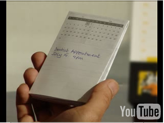
Someone pointed me to a new product that is in limited beta release. It's called Scrybe. And all I really have right now is the YouTube video demo of the product (on their main page).

But what little I have seen, I really like.

Fluid Context
This is the terminology they use to describe the principle Xerox PARC described as focus + context, or information in context. At Xerox, they produced the hyperbolic tree, the fisheye and the lens approach as ways to dynamically show the current focus within the larger context of data.

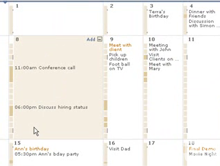
In Scrybe, they use this approach in their calendar application.

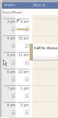
Scrybe Calendar Fisheye

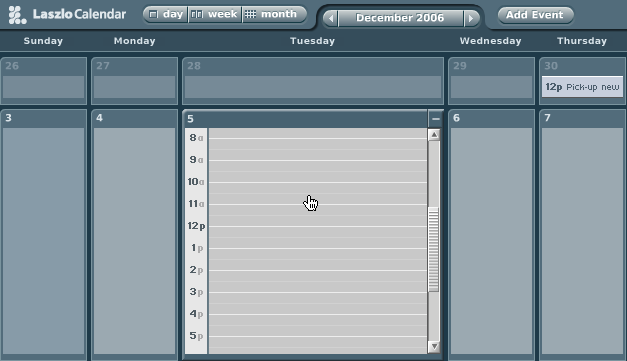
This is the same approach Laszlo took in their calendar demo application

Laszlo Calendar Fisheye

But there are a lot of nice touches they make to the calendar:
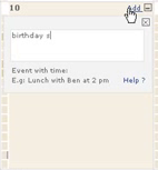
  • Simple add button within the expanded context
  • Busy/Free timeline legend for each expanded context
  • Very simple drag drop for moving events around

Scrybe Calendar Addevent

Scrybe Calendar Dragevent

GlobalTimez
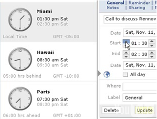
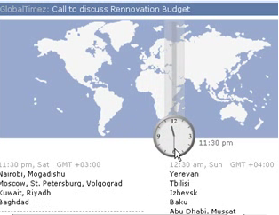
I like the fact that time zone visualization is integrated into the product. Almost all calendar pickers, date pickers, etc. seemed to assume that user never goes anywhere else or doesn't work with folks in other time zones around the world. Though it is simple, it really helps in scheduling meetings around the globe. They integrate it with the date picker, a timezone map and within the timeline in the calendar.

Scrybe Calendar Timezone

Scrybe Calendar Timezone Map

Scrybe Calendar Timezone Strip

Why is this important? Again you have the information within the context you need it. Minimize flow interruptions is a key principle.

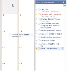
The TODO list looks simple, you can drag tasks to calendar days to assign it a date... I like the touch of you drag it to the day, the tooltip tells you what date it registered and when you drop it it flies back to the todo list with the date associate. Nice touch.

Scrybe Todo Drag 2

Thought Pad
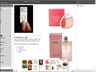
This seems like a nice tool for gathering your thoughts as you surf the web. The idea is to make it easy to collect while you are in the flow of surfing. This is the theme of their products... How do people work, what is their flow, how do we keep them in the flow.

Scrybe Thoughtpad

Paper Integration
Yep, you heard it right. They make it easy to print out your calendar, appointments, tasks and take it with you on paper. This is so often overlooked. When I worked at Sabre I recall a conversation with Quantas Airlines. One of their big gripes with our incredibly detailed scheduling application was with what it printed out. It turns out that a lot of the users of the schedule got a printout and it went with them all over the airport. We had never considered how to format (nor had the gantt component vendor) the schedule for convenient paper transport!

Scrybe Paper

So, I haven't used it yet. Might be different mileage once I get into the beta.

But the bottom line principles I see at play are:
  • Keep the user in the flow.
  • Bring tools into the user's context
  • Keep information in context
  • Tie information to interactivity
  • Make all objects on the screen intuitively interactive
  • Be nuanced in your simplicity (some animations, but extremely well done)


You can see more photos on flickr.

Tuesday, December 19, 2006

Me on Google Earth!

Ok, the ultimate vanity search :-)

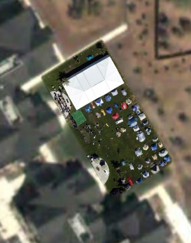
Back at Foo Camp, O'Reilly contracted to have a plane fly over and take 3" resolution images for inclusion in Google Earth. It happened on Saturday, the first full day of camp.

O'Reilly Foo Campus

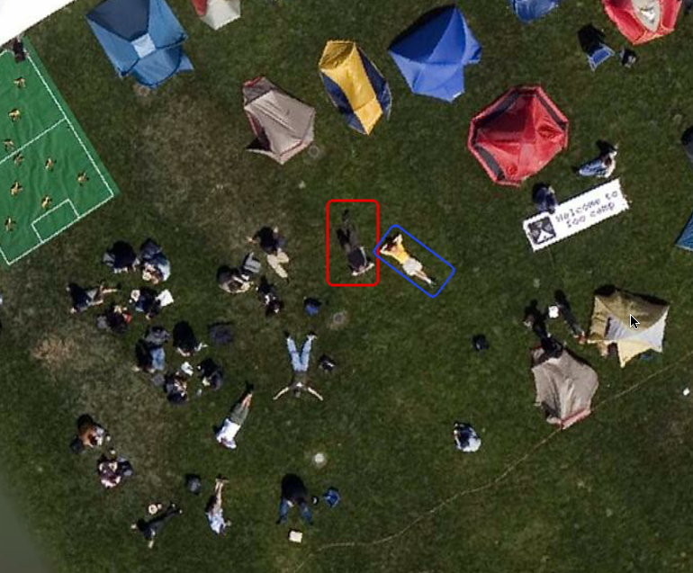
Gregor Hohpe from Google & I decided it would be cool to lay out on the lawn and let the plane get a good look at us sprawled out on the campus. I tried to convince him to lay with his legs together and his hands spread out above in the form of a Y (for Yahoo!) but he didn't bite ;-)

Here's a closeup shot of us on the campus. I am the one outlined in red, Greg is in blue.

Bill at Foo Camp 2006

If you care to check out the Foo Camp shot, it's located at:

Latitude: 38°24'40.46"N; Longitude: 122°50'25.59"W

Wednesday, November 22, 2006

Foo Lessons: Kamishibai

Back in the summer I had the opportunity to attend Foo Camp '06 at the O'Reilly offices in Sebastapol, CA. Foo Camp is a loosely organized gathering of folks that O'Reilly invites to flock together for a weekend of discussions, impromptu sessions, etc. Obviously a lot of interesting people (writer/producer of MacGyver series, engineering creator of the Osborne Computer, flickr folks, Jeff Bezos of Amazon fame, and so on...).

One of the interesting talks that I attended was on the Japanese Storycard Theater. Dave Battino billed it as PowerPoint for People.


It's based on traditional Japanese picture-card dramas called kamishibai (paper theater).
Today's kamishibai has evolved from a form of street-storytelling which was popular throughout Japan from the 1920's into the 1950's.

The kamishibai storyteller was also a candy seller. Riding a bicycle equipped with a small stage for showing the story cards, he would enter a village or neighborhood, dismount and loudly strike together two wooden clappers or allow a lucky child to do so. The sound was a signal for children to run from their homes and gather around him for story time. Those who bought candy got to stand nearest to the stage. Then, in a dramatic manner, he would start to tell 2-3 kamishibai episodes. He would not tell the whole story! The stories were told as continuing serials, that is, he would always stop at an exciting moment, leaving the children impatient for his next visit.

From: http://www.kamishibai.com/background.htm

The idea is really simple. A story is a simple stack of large illustrated story cards. The stack is presented so that the front card facing the audience is the current place in the story. On the back of the last card of the deck is the dialog for the illustration on the front card.

Really simple idea. Instead of having to twist your neck to read the text, you simply glance down at the dialog and a miniture version of the illustration. The trick is placing the dialog at the correct location in the deck instead of directly on the back of the card it goes with.

Why is this important?

The Power of Engagement
It allows you the storyteller to stay engaged with the user. Making eyes with the audience is a powerful principle. Think of how many times you have seen a presentation (I have done it many times myself) where the presenter is constantly twisting their neck or turning their back to the audience to see the presentation. It's easy to lose interest while their back is turned. Watching kids respond to a kamishibai presentation versus a typical library book reading lets you see the benefit of this approach. Kamishibai keeps the kids attention, may book readings lose the attention as the reader cranes their neck to read the story. With kamishibai, the storyteller can concentrate on the drama-- the story instead of the technology.

In the world of conference speaking some of the problem is in the very way that conference presentation technology is arranged. Singers have long employed speaker technology arranged in front of them (monitors) that allow the singer to hear themselves and therefore perform more confidently. This would be a nice addition for presentations. Projecting the same material along the back of the auditorium would allow presenters to always face their audience and receive the assurance that the right material is being displayed, timing their talk with the material (this is done in some venues, but rare at conferences.)

The Beauty of Simplicity
Now I use a lot of technology in my presentations. I employ embedded movies and animation. I like this. And based on feedback, others have enjoyed this approach. But there is an argument to be made for simple presentations. Dick Hardt of Sxip Identity has a wonderfully simple presentation called Who's the Dick on My Site. It just employs single words or phrases that are perfectly timed with his talk. During the talk, Dick does not look at his presentation. He simply talks and the presentation reinforces his story.

I work with Karon Weber a designer at Yahoo! (formerly of Pixar). One of the techniques that Karon has employed in presenting her designs at Yahoo! is to use large (and I mean large, at least 4'x6') poster boards each telling part of the story. Instead of wireframes locked inside a computer, they are set free in this large format. In our current war room for a product we are working on it is fully decorated with these large poster boards. It of course does not dispense with the electronic (they are the source for the poster boards), but it makes the presentation of these ideas completely accessible to anyone who walks into the room (or hallway).

The beauty of this approach is that it is highly practical and completely simple. It is focused on telling a story. It is in the spirit of Kamishibai.

The Power of Good Transitions
When Dave Battino told us a story in the Foo class, I really enjoyed how he transitioned between cards in the story. If there was a quick sequence of action, he would rapidly switch the card. If the hero was in trouble and he wanted to build suspense he would slowly...drag...change...cards... Sometimes the slide was left to right, sometimes it was over the top. But it was effective. How many presenters have gotten enamoured with transitions between their slides and pulled out all of the stops. "Hey, it's in Powerpoint, why should I use the fizzling, spiraling, flipping effect??" Yet, with just a quick flip or a slow drag, the story was enhanced in the kamishibai method--not the emphasis. In my talks on cinematic effects I have talked a lot about the temptation to over emphasize these effects. Making transitions too slow, too long, too vivid, etc. I have often advocated the "cut in half" rule I learned from a member of the Motion Graphics community...

Take the effect, transition, luminence change you have enstated and cut the effect in half.

Transitions are for enhanced communication and engagement... Not for the sake of the effect alone.

Happy Story Telling!

Tuesday, November 21, 2006

Pattern Library: Interactive Games

Eelke Folmer, a professor in the Computer Science & Engineering Department at the University of Nevada, dropped me a note about his work on a pattern library for game usability & game accessibility.

You can find the two libraries at:

http://usability.eelke.com
http://accessibility.eelke.com

Some of the interesting patterns include: Freelook (giving the user freedom to look around independent of where they are currently heading), Instant Replay (allowing users to lengthen their enjoyment of a particularly exciting accomplishment, and Playground (which allows users to experiment without the fear of death.)

Freelook is just a good pattern for any web application. Let the user have freedom to explore the interface without having to directly leave the mode they are in. This could be accomplished on a web site by things as simple as lightweight tour modes (employing lightbox effects).

Instant Replay may not be as applicable to a web application but it follows the principle of letting users get the fullest enjoyment from an interface.

I think Playground definitely has its place in applications. The user needs to feel that they can experiment with their interface without the "fear of death." Which means the user should be able to experiment with the interface without getting into a mode they cannot return from (captured!) or committing a command they cannot reverse (death!) Obviously this is challenging as it requires some level of undo or intelligently placed confirmations (in contrast to idiot boxes that tell the user the obvious) preventing the user from falling off of a cliff.

Friday, October 13, 2006

Question: How has your background influenced you as a web designer?

As you probably know (if you read much of my blog) I tend to focus narrowly on the world of user experience and user interface engineering. My passion is building great user experiences with a special emphasis on the web.

I was having a hallway conversation at UI11 with Joshua Porter. Lots of fascinating discussion (during which my voice finally played itself down to a rasp). But one of the things that I took away was a renewed interest in reading outside my field for inspiration for my field. You know learning from other crafts to inspire my craft. (In a separate article I will publish my reading list.)

I had started thinking along this line earlier in the year. In fact, Brian Kromrey (Yahoo!) and I were tentatively planning to convene a panel of Yahoo! interaction designers carefully chosen to represent very different design backgrounds. Backgrounds in design from gaming, industrial, motion graphics, theatre, software, comics, and so on. We had tentatively called it, "A Different Box of Tools." Since most of us did not start out as interaction designers/information architects/web designers our craft is certainly enriched by this varied tapestry.

How has your former design training influenced:
  • The way you solve problems?
  • The way you document solutions?
  • The way you communicate design?
I'll go first.

Solving Design Problems
My strong background in software architecture led to a passion for clear vocabulary and a deep appreciation in the powerful nature of patterns. The famous Design Patterns book for software was formative in the way I thought about solving problems. No surprise that patterns make up a lot of the way I approach design today.

My exposure to the agile community (eXtreme Programming in particular) reinforced the principles of simplicity, iterative problem solving, and pairwise-thinking. Not surprising that I value doing the simple thing first, communicating via the design in the simplest manner to start with and adding the effects as needed to tune the interface. Iterative problem solving is key to good interaction design. Having the user and other stakeholders early in the loop and rapidly iterating to a solution is critical. Pairwise programming (although I confess the religious adherants of this practice almost made me loathe this approach) can be seen as a reason that I latched onto Alan Coopers "designing in pairs" approach so easily.

Documenting Solutions & Communicating Design
Agile software approaches taught me the lesson to only document what others will read :-) Another way of stating this is who are the users of your documentation? That will determine what and how you document. This has influenced me in trying to keep documentation simple or create tools that make it feel more lightweight. My engineering background also taught me what developers need in documentation, so my background has helped me create solutions that can bridge the gap between design and development.

That's enough for me. Now it's your turn!

Share Your Lessons
So why not share? How about stepping up and telling me how your passion for art or your training as a clown or your training as an architect has crafted your craft. We could all learn an amazing amount from each other.

The Best Way to Communicate Patterns

Pleased ignore if you already syndicate the yuiblog.com.

But for those who don't, check out the five-part series by Jenifer Tidwell, Luke Wroblewski, Martijn van Welie, James Reffell and myself as we answer the question, "What is the best way to communicate design patterns?"

Tuesday, October 10, 2006

Wanted: Pattern Curator for Yahoo! Library

As many of you know one of my jobs at Yahoo! has been as Yahoo! Design Pattern Curator. My main contribution in this role has been (along with the incredible help of Erin Malone, Annette Leong, Leslie Wang, David Gan, Greg Rosenberg, Jay Bergesen, Ben Clemens, Kiersten Lammerding and Lance Nishihira -- to name a few) to launch the public Yahoo! Design Pattern Library. (Of course I must also mention the incredible work of Matt Leacock, Erin Malone and Chanel Wheeler in launching the internal pattern library before I joined Yahoo!)

The library has meant a lot to various folks in the community. I have heard over and over at various talks I have given the gratitude to Yahoo! for opening up the pattern library to the public. As an example, recently in Portugal I had several design/engineering teams personally thank me for this library.

The library has also attracted some great talent to Yahoo! We have heard consistently from recruits coming into Yahoo! that the library was a big attraction to their checking Yahoo! out.

The job involves working with properties/sites across Yahoo! evangelizing the internal and external adoption of patterns. If this excites you, then we have the perfect job for you! Or perhaps you can recommend that perfect person...

Here is the email from Erin Malone (who could ask for a better person to work with?) posting this position.

I have a really important and interesting position on my team here at Yahoo! This position is a result of an internal transfer to another role which opens up great opportunities for you!

Rather than post the full long bulletted list of the job description I have presented here a brief overview of the role in the hopes that the excitement that I feel about the role comes through. Please feel free to ping me for the full description or if you have questions or if you want to send me resume.

ABOUT THE TEAM - PLATFORM DESIGN
Platform Design at Yahoo! supports the Platform Products Group and is responsible for the development of NETWORK standards, the PATTERN Libraries, solutions and components for the UI WIDGET Library, for the PERSONALIZATION platform, for intertwining COMMUNITY across the network and for MEMBERSHIP touchpoints across the network. Our team consists of Interaction Designers, Visual Designers, User Researchers and Developers. Team members work closely with other cross functional people from Product Management, Marketing, Engineering, QA, and others across the company.

THE JOB:
CURATE THE YAHOO! PATTERN LIBRARY
Yahoo!'s Platform User Experience Design team is looking for a new curator for the Pattern Library. The curator works with designers from across Yahoo! to develop new patterns and to eventually migrate a pattern to the public library. You will be responsible for spotting trends in the designs of our properties, for designing and crafting new additions to the library and for evangelizing the authorship of new patterns among your Interaction Designer colleagues.

You will partner with our Platform Presentation Engineering team to create interactions and best practices that accompany the UI Widget Library. Additionally, you will own the external Public Pattern Library and develop the pattern lifecycle from internal to external libraries. And last but not least, you will be the spearhead and driver for a new addition to our Library suite - a new Terms Library and will work closely with our internal editorial team.

Please respond to me directly with resume and links to work.
Reference Job # RX1000017268

thanks

Erin Malone


If you are interested, feel free to ping me via email. You can reach me at b dot scott at yahoo dot com and I will get you in contact with Erin & the right parties.

BTW, I will still be 'yapping' about patterns. I will still be evangelizing the patterns. It's part of my blood. Whoever takes this role should know that I look forward to supporting them and helping them in this role as much as possible.

Friday, October 06, 2006

Lisbon, Paris, AjaxWorld, Code Camp, UI11, WebGuild & Ajax Experience

The last few months have been pretty crazy. In one 8 day stretch I put in 17,000 miles in the air!

I had a wonderful time in Paris presenting a couple of sessions on design & developing for Ajax to the People in Action folks. It is interesting to see the excitement about "what is possible" being a world-wide phenomonon.

The same week Luke Wroblewski, Kevin Cheng, Peter Merholz and myself (we have dubbed ourselves the "Bay4") had a great time in Portugal in the wonderful city of Lisboa (Lisbon as we say) giving 4 back to back talks to the first annual SHIFT conference. Our wonderful hosts Bruno Figueiredo and Pedro Custódio gave us tours of the city. Most interesting (besides being in Portugal) was having discussions with people from all over Europe about what all these changes in the web world means to them.

In Portugal there are wonderfully bright folks who are starting to really get the whole concept of innovation. For so long (at least this is what I heard from multiple Portugese sources) there is a strong cultural influence that shuns failure. Of course the freedom to fail is a key ingredient to innovation and something that we generally cherish in the U.S. (probably to a fault).

I had a wonderful chat with an engineering manager, Bruno Pedro at Sapo (sapo.pt, largest site in Portugal) who echoed these sentiments. He shared his enthusiasm about the Yahoo! Design Pattern Library as well as the Yahoo! UI library. Very encouraging to hear of the nice impact these tools are having around the world. He promises to share some of the exciting developments they will be making on this site.

You can check out photos from the various folks that attended as well as blog posts at Luke's blog, Luke's photos, Kevin's photos, Peter's photos and mine.

Closer to home I will be at the Silicon Valley Code Camp tomorrow (10/7/2006). There are 700 attendees and a bunch of us speaking. Its going to be at Foot Hills College this weekend in Los Altos, CA. Doug Crockford, Kent Brewster and myself will be giving talks from Yahoo!

This past week I spoke at the Ajax World Conference here in Santa Clara. Enjoyed giving my talk and had some great conversations afterward. But the highlight was getting to hear my fellow cube-mate, Doug Crockford, give his abbreviated Advanced JavaScript talk. Its definitely great material.

Next week I will be presenting an all day workshop with David (Heller) Malouf on Designing Rich Internet Applications at the UI11 Conference. Looking forward to the session (well over 100 signed up!) as well as the rest of Jared's exciting conference.

Then the next week I will be on a panel at the First Annual Web Guild Conference on "The New Web". I am an advisor for the Web Guild which usually meets over at the Googleplex. This looks to be a really great conference. Its very affordable and has an incredible lineup of great speakers like: Jared Spool (ui engineering), Ram Shiram (Founding Member Google), Marissa Mayer (Google VP), Kelly Goto (gotomedia) just to name a few. Still time to sign up!!

The next week Nate Koechley, Doug Crockford and I will be at the Ajax Experience. This was the best Ajax event I have attended (last event was in May) and I really look forward to hearing what the top quality speakers there have to say as well as connect with others in the field. That will be in Boston, hope you can join us there.

Thursday, October 05, 2006

Designing a Component


I’ve designed a number of software widgets, components and gadgets throughout my career. In the early days of Mac programming I created small desktop accessories and my own set of components to enhance my application development (e.g., geographical map component, 3D graphics library).

Later in the days of Motif I wrote numerous components (spreadsheets, charts, directed graphs, server-side grids). I also made a trek through the TCL community creating components for the incr Widgets set.

I spent several years working in the world of Java Swing building components (in fact I built at least three completely different component sets for three different companies—thank God that we now see more things getting open sourced!)

I finally ended up in the land of web development taking trysts through HTC components, JSP/Struts components (tag libraries) and finally pure JavaScript components. There are a lot of lessons I have learned over the years in how to create useful components. There are three that stand out in my thinking:

  • Make the component specific in purpose, yet flexible in use.

  • Avoid the do-everything component. Instead make it do the main thing well. But make it pragmatic by keeping it flexible.

  • Separate the concerns of interface, interaction, and content.

  • Avoid hard-coding visual style, give flexibility in the interaction model and provide flexible ways to manage data content. Keep these three areas independent to allow them to be customized separately.

  • Document the interface and use the component before releasing it.

  • You know the experience. You think you have a great idea. Then when you go to explain it to another person you immediately see the holes in your logic. Documentation provides a way to explain your interface; writing demos allow you to exercise the component to test its ease of use and flexibility.

Make it Specific yet Flexible
Make the component specific in purpose, yet flexible in use.


The agile community expresses the idea of simplicity over over-generalizing. One of the traps that people fall into is trying to build a component that does everything. Not unlike feature creep in application development, a component can collapse under the weight of too many features. One of the sure signs of this is when certain parts of the API start competing with other parts of the API.

As an example, let's look at the carousel. It is just a simple list view manager. You can actually make the carousel look like a tabset or a slideshow. However, I chose not to provide additional tabset or slideshow functionality. Why? I knew from experience that the interface would become unwieldy. Lots of new configuration parameters and methods would get added that only made sense if you were using the carousel strictly in slideshow mode. You can imagine that with enough features, some of the API would only apply to these tangential behaviors. The result would be a carousel component that ends up with portions of API that don’t even apply when the carousel is behaving “just” as a carousel.

A nice way to keep a component flexible is by providing a simple configuration mechanism. The Yahoo! UI library provides a Configuration object for just this purpose. (The first time I saw this mechanism in popular use was with the Prototype library.) Instead of having to pass lots of parameters to the carousel’s constructor (new Carousel()), you pass in a configuration object. The configuration object is really just an object that contains parameters and values encoded in JavaScript object notation. Here is an example from the wrap example:

var carousel = new YAHOO.extension.Carousel("dhtml-carousel",
{
numVisible: 4,
animationSpeed: .8,
animationMethod: YAHOO.util.Easing.easeBoth,
scrollInc: 3,
navMargin: 40,
size: 17,
loadInitHandler: loadInitialItems,
prevElementID: "prev-arrow",
nextElementID: "next-arrow",
loadNextHandler: loadNextItems,
loadPrevHandler: loadPrevItems,
prevButtonStateHandler: handlePrevButtonState,
nextButtonStateHandler: handleNextButtonState,
wrap: true
}
);

Each configuration parameter has a default value. If the user provides a configuration parameter it is treated as an override and is applied to the internal set of configuration values. The carousel then uses these values in its operation.

Keep Concerns Separate
Separate the concerns of interface, interaction, and content.


If you have read other articles on my blog or heard me speak you will notice that I often fall back on this idea of separation of concerns along the lines of interface, interaction and content (or data). Sometimes I express it as feedback, interaction and information. And often I just state in the way I first learned it from the boys at Xerox as simply Model-View-Controller.

When I wrote the carousel I started with the basic understanding that I was creating a list view manager. The underlying HTML structure I chose to control was an “unordered list” (UL & LI HTML tags). Keeping my thinking general in this matter allowed me to separate several areas of concern. Here is how this concept of separation played out in the carousel.

1. Flexibility of Visual Style
First I wanted to provide flexibility in the component’s presentation. One of the ways I did this was by putting all style choices into a stylesheet (CSS). It’s really easy to hard-code style choices into the component logic. By placing style considerations externally you can help fulfill the first point above – keep it flexible. The other way the presentation was made flexible was by providing configuration parameters that select the way items are displayed. Control over the number of visible items, the animation speed and method, the size of a page of information, and the orientation are all ways that the carousel is flexible enough to adapt to most environments.

2. Flexibility of Interaction
Second, I decided that the interaction should be completely flexible. I did not want to constrain it to my choice of navigation controls or method of user interaction. In most of the current examples, previous and next arrow buttons control the carousel. While this is the normal case, it is easy enough to allow mouse over events drive the interface. The carousel exposes the same interfaces it uses internally. You can simply wire your events to the same internal mechanisms used by the carousel internally.

Microsoft Altas (now called Microsoft Ajax Framework) does a nice job of separating behavior from its components. For example, they isolated the behavior of auto complete from the components. This means that if you add this behavior to say a text field you would have an auto complete text field. It also means that you can write your own components and by obeying an interface contract, have your component support this behavior. In essense the interaction is packaged as a separate entity and just attached to the component needing the behavior.

3. Flexibility in Content
And third, I felt that there had to be flexibility in the way content gets displayed in the carousel. The simplest mechanism for this was to allow developers a way to shove their own HTML into any item in the list. The innerHTML technique is very useful in this regard. It is very friendly to PHP, JSP, ASP and other page generation techniques. It’s also the native way to express an interface on the web. What this means is that each “item” in the list could be a complete page of content, a single photo from a photo stream, a set of form elements—in short anything you want a “list item” to be it can be.

Another dimension of content is in how the data actually gets loaded. By externalizing the loading mechanism through a set of function callbacks (functions that you write that let you decide how to load the initial set of data and fetch the next and previous set of data) the component is able to support static data, client side generated data or server-side fetched data (e.g. via Ajax). Recently someone wanted to wire the carousel up to RSS feeds. Even though I had not considered RSS feeds, since the data loading was externalized, it turned out to be a fairly trivial exercise.

Test by Documentation and Usage
Document the interface and use the component before releasing it.


Alan Cooper advocates that designers design in pairs. One takes the role of Interaction Designer (ID), the other the role of Document Communicator (DC). In design sessions the ID takes the lead role in pitching ideas. The DC tries to capture the ideas and wherever there is difficulty in capturing or explaining the idea it is forced to go through some iterations to make it easier to communicate. The idea is that by having to explain your ideas. This doesn’t just work in designing user interfaces, but it also works in designing programmer interfaces.

As I am writing this blog post I am sitting next to Luke Wroblewski on a flight back from Lisbon. He saw this point in my article and reminded me of a post he wrote a while back on Nine Lessons from Nine Years of Interface Design. One of the lessons he notes is that “writing it down forces you to think it through.” On this point he summarize three good reasons for writing it down:

  • Solidifies the approach. Guards against localized decisions.

  • Articulates the rationale. Puts the solution in context of its use.

  • Ensures clarity. If you can’t explain it, then nobody else will be able to either.


I find the exercise of both documenting and writing demos for components to be refreshing. It gives you a chance to come above the code cloud and both talk to the user and be the user of the component you are writing.

I finished the first version of the carousel in just 2 days. I spent the better part of the next 2 days writing documentation and creating demos for it. All during that phase I was constantly going back and rewriting parts of the code. Documentation can seen as a kind of test-first strategy for writing APIs. Writing demos is a good way to create tutorials as well as experience what it is like to really use your component.

Of course the biggest caution I would have about trusting too much in the demo applications you write is to realize that they are only demo applications. It really takes being exercised in several real world examples to fine tune an interface.

This lesson follows something that we try to employ at Yahoo! We call it “eat your own dog food.”

The phenomona of Yahoo! Hack Day has had a profound impact on the web services and APIs throughout Yahoo! (I would go so far as arguing that this has been the biggest impact of Hack Day—causing our services and APIs to become more robust.) When the Hack Team attempted to put together a combination of our APIs (events, maps, search, etc.) they discovered just how many things were missing. The creation of just that one demo pushed the discussion of what needed to be added or corrected—-and the result is a much richer API available to everyone (public included.)

Wednesday, August 09, 2006

Latest Talks, Upcoming Events

Had a wonderful opportunity speaking at BayCHI last night. Excellent turnout. The presentation material can be found here.

The highlight for me was hearing Matt Mullenweg, creator of WordPress talk about lessons he has learned in building a startup. Matt is only 22, but has the wisdom of a sage, is bright and incredible funny. Could have listened to him for hours. Also love to hear his "mom" stories :-)

I have a pretty full schedule over the next three months. Here is where I will be speaking:
  • 08.15 - MetaDesign. San Francisco (private)
  • 08.24 - O'Reilly Web 2.0 Summit. Sebastapol, CA (private)
  • 08.25-08.27 - O'Reilly Foo Camp. Sebastapol, CA (private)
  • 09.18 - Travelocity. Southlake, TX (private)
  • 09.19 - Federal Reserve Software Convention. Dallas, TX (private)
  • 09.25 - Rich Internet Conference. Paris, France
  • 09.28-29 - SHIFT Conference. Lisbon, Portugal
  • 10.02-10.04 - Ajax World Conference. Santa Clara, CA
  • 10.09-10.12 - UI11 Conference (Jared Spool). Cambridge, MA
  • 10.19 - Web Guild Conference. Mountain View, CA @ Google
  • 10.23-10.25 - The Ajax Experience. Boston, MA
Luke Wrobleski, Jenifer Tidwell and others are planning a panel at SXSW 2007 in Austin. Our panel is on Design Patterns: Defining & Sharing Web Interface Design Languages.

Please vote for our panel!! You can select up to 10 panels from the Panel Picker at the SXSW site.

Wednesday, July 19, 2006

Carousel Updates - Wrapping, Auto Animation, etc.

New update to the carousel component.

Now supports wrapping at content end as well as an autoplay feature. Read the docs to find out all the gory details. 4 or 5 new examples of what you can do with the carousel.

I have had several people request styling navigation differently or providing different types of navigation. Its important to realize that these concepts are externalized from the carousel to provide the most flexibility. The carousel is really just a content scrolling mechanism. As such one can simulate stock tickers, news carousels, scrolling lists, news tickers (as in gmail), slide shows, advertising carousels or even a module tab set.

Check out all the examples and docs at:

http://billwscott.com/carousel/index.html

Thursday, July 06, 2006

Carousel Component - Y! UI Library Example

Ok, so I have been extremely, extremely remiss in writing up what has been rattling around in my brain lately. So I have some pretty good excuses (lots of talks, lots of work, writing for the yui blog, writing various articles, lots of family visiting and so on.) But I have always felt that it was better to share something on this blog when I felt like I had something worthwhile to say (or share.)

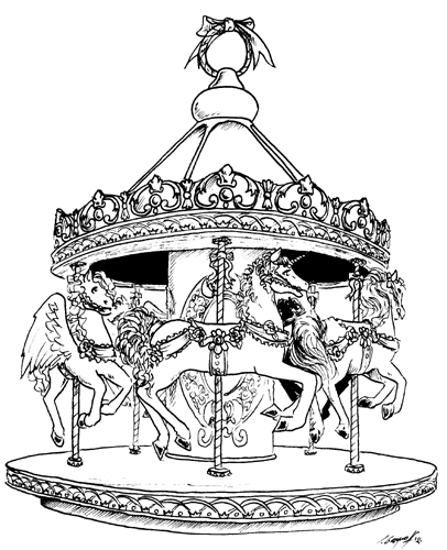
So just a week back I took on a weekend 'geek' project. For a project at work we needed a carousel style component. Here is an example:

carousel example

I started on a Friday morning and was essentially finished on Sunday night. Although I will confess that I have tinkered with it on and off over the last week or so.

I think this component is fairly flexible and does a good job of illustrating how to write a component for the Yahoo! User Interface library.

I was going to wait and write up an article explaining how the component is built. But until I can get that post together, I will point you to the component and the documentation I have already put together for it.

It's not finished. Probably has some code that could be refactored and certainly could use improvements. Based on my testing it works on most recent browsers. Let me know if it is useful or if you think an extended article given as a tutorial for the Y!UI library using the carousel component would be helpful.

Check the out the carousel component here.

Monday, May 15, 2006

Ajax Experience Slides & Ajax Links

At the Adaptive Path Designing & Building with Ajax workshop (Austin, TX) I mentioned that I would post a set of good Ajax technical links. You can find these links (in their unadorned state) on my portfolio site.

I also spoke on Friday afternoon at the Ajax Experience in San Francisco. You can find the same basic talk I gave there in a previous blog article.

Michael Mahemoff has also posted his notes on Ajaxian of my talk.

The Ajax Experience was an excellent conference. The depth of materials, the quality of speakers, the excellent venue, and the awesome nofluffjuststuff and Ajaxian guys really made this the best conference I have been to this year.

Technorati Tags: , , , , , , , , ,

Wednesday, May 10, 2006

Yahoo! UI: More Patterns & Code

Check out the latest additions to the Yahoo! User Interface library and the Yahoo! Design Pattern library.

Windowing, menus, auto complete and more...

You can read the full story at the Yahoo! UI Blog.

Technorati Tags: , , , , , , , , ,

Wednesday, April 12, 2006

Designing for Ajax - Presentation

Update (07/24/06): You can now find my presentations at http://billwscott.com/share/presentations/

Recently I have been giving a talk on Designing for Ajax. I have given the talk or variations of the talk at:
Tonight I had the opportunity to present this talk for the WebGuild hosted at Google and we had a nice turn out, lots of great questions and good discussion afterwards. The talk stems from a previous blog I wrote on Nine Tips for Designing Rich Internet Applications.

In the course of giving the talk I have now simplified it to 7 interactive design principles:
  • Keep it direct
  • Provide live feedback
  • Offer an invitation
  • Cross borders relunctantly
  • Create a light footprint
  • Show Transitions
  • Think in Objects
I do all of my presentations in Keynote, so to make it widely available and still contain all of the nice transitions and embedded sample movies I have encoded it as an interactive Quicktime movie file.

You can download a medium sized Quicktime version of the presentation here.

You should download it to your desktop as I don't want my host to have to suffer with streaming it. Also, the interactive (click to move through presentation) works better when downloaded.

The PDF version is also available here.

I will be giving this talk (or variations of the talk) in the next couple of months at:
  • CSU/Hayward (not open to public)
  • City College/SF (not open to public)
  • Oracle Brown Bag
  • Adobe/Macromedia Brown Bag
  • eBay Brown Bag
  • Adaptive Path/Austin
  • The Ajax Experience/SF
  • Adaptive Path/Amsterdam
  • SIGCHI.NL/Amsterdam
So enjoy. And hey and here is what I ask in return.
  • If you find other examples that illustrate the patterns I have in the presentation, feel free to
    • Tag the site in either del.icio.us.com or myweb2.search.yahoo.com under the tag 'ypatternexample'. Add other tags as you see fit. Also, add a comment to tell how to see the feature or what your thoughts positive or negative are about this example
    • Or send me a link, snapshot or description via email at ajaxevangelist @ yahoo dot com
  • If you find good counterexamples, also tag them and not it in the comments.
As I understand it, the WebGuild will have a podcast available from the talk as well. So check their website for that update.

Technorati Tags: , , , , , , , , ,

Monday, April 03, 2006

ALE - Ajax Linking and Embedding

Just a quick note. Check out Zimbra's spec for ALE.

Its like OLE (Object Linking and Embedding in the Microsoft Office World-- the technology that allows you to embed excel docs in a word doc, etc.) Only ALE uses iframes that are ALE-enabled that can load ALE-aware components.

The applications for this are for richer blogs, wikis and personalized pages. It also seems applicable to apps like Writely to incorporate. Also it could be used in lieu of badges on blogs, allowing rich interaction to be embedded in a blog page.

I like the move to componentize functionality in the front end and make the back end service oriented. Makes for a clean architecture.

Technorati Tags: , ,

Thursday, March 30, 2006

Mind Hacking Visual Transitions

When I attended Kathy Sierra's workshop on Creating Passionate Users, she mentioned the book Mind Hacks. I quickly added it to my Amazon wish list. However the next day at O'Reilly's booth they were giving away books. I could only choose one-- guess what they had-- that's right, Mind Hacks.

Mind Hacks is all about short experiments or hacks you can do to discover how your brain is really working. There are 100 hacks. For example, hack #59 discusses how we actually hear with our eyes (you can check out the McGurk Effect for yourself). Or try #65 which explains Why Can't You Tickle Yourself? And goes on to describe how to build a self-tickling machine.

But the hack that really got my attention (no pun intended) was hack #37 Grab Attention.

Sudden movement or light can grab your attention, thanks to a second region for visual processing.

It turns out that besides our normal visual processing region of the brain (you are using the occipital lobe right now while reading this blog) there is a second region that deals with attention capture.

We experience it everyday. While talking with a friend at a park someone throws a frisbee to another person in the background. Without trying you notice this change of motion even though you are not looking directly at it. You can thank the superior colliculus for this little attention interruption.

As the authors describe it this region of the brain is not very sophisticated. But it does a good job of telling you to pay attention because something may be coming at you. You aren't sure what it is but you had better pay attention to it.

One of the next set of patterns I am working on getting out the door at Yahoo! covers the idea of Transitions (also known as animated effects or cinematic effects.) The connection between hack #37 and its application to transitions was immediately obvious. This is one of the reasons that moving something on the screen or causing it to fade or rapidly show up can get the attention of the user so readily.

So this fed into my thinking, "how do I use transitions for good and not for evil?" How do I use transitions to communicate the correct intention to the superior colliculus? As Kathy Sierra likes to say, "Learn to speak to the BRAIN, not to the MIND."

So a few days passed after reading this. I was starting to write up the rationale for the parent Transition pattern using the research cited in the Mind Hacks book. While doing some more research I stumbled across an article on 24ways that discussed the transition effects in the Scriptaculous library. At the beginning of his article, Michael Heilemann writes:
...let me just take a moment to explain how I came to see smooth transitions as something more than smoke and mirror-like effects included for with little more motive than to dazzle and make parents go ‘uuh, snazzy’.

Earlier this year, I had the good fortune of meeting the kind, gentle and quite knowledgable Matt Webb at a conference here in Copenhagen where we were both speaking (though I will be the first to admit my little talk on Open Source Design was vastly inferior to Matt’s talk). Matt held a talk called Fixing Broken Windows (based on the Broken Windows theory), which really made an impression on me, and which I have since then referred back to several times.

You can listen to it yourself, as it’s available from Archive.org. Though since Matt’s session uses many visual examples, you’ll have to rely on your imagination for some of the examples he runs through during it. Also, I think it looses audio for a few seconds every once in a while.

Anyway, one of the things Matt talked a lot about, was how our eyes are wired to react to movement. The world doesn’t flickr. It doesn’t disappear or suddenly change and force us to look for the change. Things move smoothly in the real world. They do not pop up.
Turns out that Matt Webb is one of the authors (along with Tom Stafford) of Mind Hacks (duh!) Well that made sense. I listened to his talk and got very excited. I had been writing and talking about how to use and not abuse these effects on the web. Matt's talk and his writing in the Hack book (and other articles online) finally gave me solid grounding for those propositions.

A couple of examples stand out from the Broken Windows talk.

Dodging the Apple Widgets
Matt pointed out the odd effect used to dismiss the Apple Mac OS X Widgets. Instead of going away from you when dismissed, instead they fly out at you and fade out. The effect is as if the widgets are coming straight at you (like a star field) and whiz right by your head. Matt's point is that the action is "put the widgets away" but the effect communicates "look out their are flying widgets that are about to hit me." The action is for them to diminish in importance. However the superior colliculus is screaming "incoming-incoming-look out!".

What Just Happened?
Zeitgeist

The second example is the Flickr Daily Zeitgeist a blog sidebar plugin (Matt discusses this in detail here). When new photos show up they fade slowly in place overlaying four photos within the tile of photos. Not bad. You may or may not notice the photo showing up but that's ok. Its very secondary. However when it goes away it rapidly scales down revealing the images underneath while replacing one of the four images. The sudden rapid movement once again gets the superior colliculus to say "What the..." You look and by the time you glance you are not really sure what happened.

How the Real World Works
Matt also makes the same observation that I have discussed before. That real world objects don't just pop in and pop out, appearing and disappearing suddenly. We usually see them go away or go somewhere in particular. By creating an online space that never behaves this way it makes for a more brain-intensive experience in trying to determine "what just happened."

A Few Transitions
Just so we are all on the same page, here are some of the transitions that are being reviewed for the Yahoo! Design Pattern Library:
  • Brighten. Raise the luminosity or opacity of an object. Used to call attention to an area. The opposite of dim.
  • Dim. Lower luminosity or opacity of an object.
  • Expand. Animate an object growing.
  • Collapse. Animate an object shrinking.
  • Slide. Show an object move out from another object while being attached to that object.
  • Self-Healing. Once an object is removed from an area a hole is left. Once the object is placed elsewhere the hole seals up, effectively healing itself.
  • Animate. Simply animating position.
  • Fade In. Cause an object to appear by fading in the object's opacity.
  • Fade Out. Cause an object to disappear by fading out the object's opacity. Often the Self-Healing transition is used to close the hole left by the object.
  • Spotlight. Usually used to momentarily highlight a region that has changed. The highlight is often combined with a Fade Out to create a One-Second Spotlight pattern.
What Transitions Communicate
To me the key thing that any interface must do is communicate clearly and effectively.

Transitional effects should communicate the state of the interface or the actions that have just taken place.
  • If an object fades away we know it changed state from visible to invisible even if we are not staring directly at the object.
  • If an object fades into view then we know the object has arrived. It was not there but now is here.
  • If an object fades rapidly it is seen as more important. If it fades slowly its importance is lower.
  • If an object is coming at us (getting larger and appearing to go past us) then we think of it as something that is important (and dangerous).
  • If an object zooms down in size rapidly and disappears it will capture the user's attention immediately. However if the object was not in the user's immediate focus (user was not directly manipulating the object) they will glance to see the change but may not even be able to tell what object went away.

Purpose of Transitions
First, they are primarily for communication. Keep in mind that transitions reinforce communication. Having said that, it is important that the goal of communication be kept in mind regarding any transition effects.

Second they can be used for engagement.
Interacting with an area on the screen that responds by slightly growing or seeing an accordion pane "snap" into place creates a slightly richer and compelling experience. The interface seems more alive. Of course going slightly overboard can be the equivalent of blink for Web 2.0 (blink 2.0?)

One can imagine situations such as in games where engagement can take a more important role. However, in most web sites, communication is the most important purpose for transitions with engagement being second.

Guidelines for Transition Effects
From the discussion above we can extract some general principles for transitional effects.

1) The more rapid the change the more important the event.
2) Rapid movement is seen as more important than rapid color change.
3) Movement toward the user is seen as more important than movement away from the user.
4) Very slow change can be processed without disrupting the user's attention.
5) Movement can be used to communicate where an object's new home is. By seeing the object moving from one place to another we understand where it went and therefore will be able to locate the object in the future.
6) Transitions should normally be reflexive. If an object moved and collapsed to a new spot, you should be able to open it and see it open up with the reverse transition. If you delete an object and it fades, then if you create an object it should fade into place. This creates a concept of symmetry of action.

I would love to have feedback on what you think are the proper usages for these kinds of transitions.

Technorati Tags: , , , , , , , , ,

Tuesday, March 28, 2006

Round Up from IA Summit 2006

Just got back from lovely Vancouver where I attended the IA Summit 06 (Mar 23-27). I really meant to blog during the event. But I always found someone interesting to talk to or somewhere lovely in Vancouver to explore. I was also on a panel discussing Challenges to Wireframing with Rich Internet Applications.

As a quick aside, I do not believe I have visited a friendlier city. Smiling, friendly, helpful and always accommodating. And what an incredibly beautiful city. The 2010 Winter Olympics will be there as well as just north in Whistler. I got a chance to drive half-way to Whistler to the lovely town of Squamish. Mountains, sea, waterfall-- splendid beauty.

Ok now back to the summit.

Big Thoughts
So not really sure I came away with a lot of new revelations. But several ideas were reinforced.
  • Make good design viral
    Not his words, but my take from Jared Spool's talk on the Role of IAs in User Experience: The best organizations propogate good design by education & adminstration rather than by review or consulting. Both consultation & review become bottlenecks. I have often been in centralized groups (as I am now at Yahoo!) and I find that sharing knowledge and creating many avenues for sharing best practices to be the secret to new and wonderful ideas forming. Here were some of his tips:
    • Have a clear vision of success
    • Disseminate user knowledge and feedback quickly
    • Use design problems as teachable moments. People that find problems get kudos.
    • Make collecting feedback inexpensive
    • Share learning
    • Make good design the path of least resistance
  • Embrace Change
    I didn't really hear anyone say this but there are some in the Information Architecture community that are a little fearful of the changes that are happening with the move from content being central to interaction being more central. I say to them go read Who Moves My Cheese? and go embrace change. Jared mentioned that if you are going to be an IA specialist you will need to find companies large enough to have an economy to support your specialization. [hey there are folks who only do surgery on the hand-- they are needed but are not abundant.] And let me clarify one point. The skillset of IA is just as needed now as ever. It is the specific narrow role I am speaking of.
  • It's About the Community, Stupid
    The term mentioned by Rashmi Sinha was Social Information Architecture. This is the understanding the information must be crafted/architected in a way that can be virally manipulated by social networks. It gets to the heart of the thought the experience is not just the computer human interaction but the interaction between humans enabled by technology. This is also the thought behind David Weinberger's book, Small Pieces Loosely Joined (he gave the keynote).
Great Talk
Has to go to my fellow Yahoo!s, Kevin Cheng and Jane Jao. They presented on Communicating Concepts Through Comics. Kevin is one half of the wonderful ok/cancel site (the other have is Tom Chi also at Yahoo!). It was a fun talk that showed how storyboarding with comics can communicate user scenarios in a way that engages the complete product team as well as users who participate in reading the comics and commenting on the storyline. It is a great technique for fleshing out the conceptual phase & features of a product.

Kevin and Jane also gave an all day workshop and taught people how to draw simplified comics. I dropped in at the end of the day and was really impressed with some of the comics I saw. (I will have them on flickr later tonight tagged as iasummit06

My Panel
I had a great time with Todd Warfel, Thomas Vander Wal, Nathan Curtis and Livia Labate discussing with the audience the challenges of creating rich interactions with wireframes.

Some folks requested the latest version of our interesting moments grid. You can find the inline editing and drag and drop templates at my blog article on The Interaction Matrix.

Some Books, Sites and other Things of Random Interest
  • Book - How Customers Think
  • Carson Workshops - Mentioned by Francois Jordaan
  • Book - Lead Users - Understanding early adopters as users
  • Interesting IA Tool - swipr - Visio toolkit for end-to-end wireframing. Looks promising.
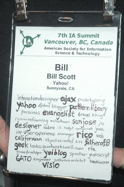
My Badge
They gave us big badges with lots of space to tag ourselves (or let other tag us). I chose to tag myself like this:


Technorati Tags: , , , , , ,

Friday, March 17, 2006

Real World Ajax - NYC

Real World Ajax in NYC, Monday 3/13 was a blast. I gave a talk on Designing for Ajax. It is a look at the most common patterns used by Ajax applications and the good design principles that underpin them.

You can catch a video interview with me about what is going on with the patterns, ajax and developer services at Yahoo.

I especially enjoyed
  • Christophe Conraet from Adobe demo'ing the extra cool Adobe Ajax-Flex Bridge. I have already found an internal app within Yahoo! that this might be a good fit for. Essentially I can now mix Flex and Ajax freely on the page. I can manipulate flex (flash) components via JavaScript. And with the connectivity capabilities of flash you can do some pretty cool Comet style interactions (collaboration, white boarding, push style technology)
  • David Heinnemer Hannson's Rails talk. David just keeps adding more and more cool stuff to Rails every day. His example of driving multiple rails applications via a flash bridge (again Comet-style technology) was really cool.
  • Kevin Hackman of Tibco gave a very interesting tour of early Ajax apps in the enterprise (1999-2003). Its really cool to see what incredible work was happening before the "Ajax Christening."
  • Scott Dietzen, CTO of Zimbra gave a great look into the world of Zimbra. I really like the Zimlets. Great way to extend their product. Scott, Ross and the others at Zimbra are a very talented team.
I also had interesting conversations with Backbase by CEO Jouk Pleister and Rob Gonda the new editor-in-chief for Ajax Developer's Journal.

It was good to touch base with JackBe founder, Jacob Derechin. The exciting news for them is they have added three really talented folks from Sun Microsystems (Deepak Alur, Dan Malks, John Crupi). These are the authors of the Core J2EE Patterns book. I had an great talk with them about the world of patterns. JackBe is an interesting Ajax toolkit for the enterprise. It is the only full framework I am aware of that can handle really low bandwidth/latency connections (and I am talking 9600 baud Ajax!)

So others have done a great job of summarizing. Here are a few articles on the conference:
Jeremy Geelan and Dion Hinchcliffe are great hosts. Check out their upcoming seminars in San Jose, CA in April as well as back in NYC in June.

Thursday, March 16, 2006

All I Really Need to Know I Learned from a 128K Mac

On Monday I had the wonderful opportunity to speak at the Real World Ajax Conference in NYC. During my talk on Designing for Ajax, I mentioned how I got my start in the world of user interface and user experience -- writing the Macintosh game GATO in 1985.

Several attendees came up afterward and told me that they had played and enjoyed GATO. That's always fun to find someone who has enjoyed something you created.

One of those that spoke with me was Blake Patterson. I didn't recognize the name but after an email followup I connected him with one of his sites that I have frequented, ipodhacks.com. I also found out he runs ByteCellar a site that covers the history of early computing. Blake requested that I give some of the history behind creating the game and the experiences of early Macintosh development. I pointed him to some comments I posted on Andy Hertzfeld's Folklore site.

Blake wrote up a nice summary of those comments. You can read his article here.

After reading his article it really came home to me how defining the event of writing that game was in my life. Like the famous book, All I Need to Know I Learned in Kindergarten; I can say that really All I Need to Know I Learned from a 128K Mac. So what did that Mac teach me?
  • Passion. I fell in love with computing on that puny Mac. I caught the passion of folks like Guy Kawasaki and Steve Jobs for this insanely great computer. Heck that phrase "insanely great" I continue to use to this day.
  • It's Possible. Look when we started development we were green. We did not know the "C" language. We made horrible mistakes. It looked like we would never succeed. We had unrealistic deadlines. But one by one we solved our problems. And we did it.
  • Event-Driven programming. The Mac introduced me to the world of event-oriented development. This underpins everything today. It is the re-introduction of the possiblity of finer-grained events via Ajax that makes it possible to build cool apps on the web.
  • Object-Oriented programming & design. While C was not object oriented, the Mac had an object-based feel to it. It got me into reading the book on SmallTalk, the purest Object-Oriented language.
  • Model-View-Controller. The powerful pattern that taught me the concept of separation of concerns, pub-sub concepts and the power of abstraction.
  • User-Centered Design. The original PC GATO was divided into many screens. When we sat down to do our brainstorming on how to write a submarine simulation game we thought a lot about how submarine crews need access to their controls/panels. We interviewed a GATO class captain from WWII. That drove us to design a display that never lost the most essential controls. You could flip between a map and other less important controls but never lost the gauges, controls and dials.
  • The Importance of Understanding the Deep Magic. What I mean is after GATO was released we went under the hood. We disassembled the ROM code. We documented it. We reverse engineered everything we could. We learned exactly how memory management, regions, event management and so on worked from the bottom up. This need to demystify the complex was first learned on my Mac.
  • Where to Optimize. Learning from the master, Bill Atkinson. His drive to have a solid design approach and then optimize in the 5% of the code was a lesson I took forward into many projects in the future.
  • Use the Tools. There weren't many tools available on the Mac. But we put MacPaint, MacDraw to use to create backdrops and vector shape files to create the graphical aspects of GATO. I have since always tried to use tools in novel ways to get my work done (see my VISIO toolkit as one example).
  • Being Pixel Perfect. Design is made up of nuances. Apple always has gotten this. I fussed over every pixel in drawing the GATO screens (although I will admit the explosion routine was horendous -- it was created the night before our first public demonstration.) To this day it drives me nutty to see something one or two pixels off.
  • Minimalism. Heck we only had black and white. It forced you to think about designs without having tons of colors and shading, etc.
  • Principles of Interactive Design. Directness, Immediate Feedback, Modeless Design, and so on. Writing one of the first complex games utilizing Windows, Menus, Icons and Pointers (WIMP) was an exciting playground to learn within. We had the Mac & Lisa to thank for inspiration.
  • Pay Attention to Real World Constraints. Hey it was a 128K Mac. Its one thing to design for the sky, its another to design for an extremely memory constrained system.
That's the list of things that immediately come to mind. I am sure there are others. For folks who did not live through the Mac & Lisa revolution I hope this little walk down nostalgia lane can capture the magic I felt when working on GATO and my lowly 128K Macintosh.

I should add that the other two developers/designers were James Rhodes and Sean Hill. James was (and I am sure still is) one of the finest developers I have ever worked with. Sean was a master at marketing and creativity. Sean later led the game unit at Sphere (formerly Spectrum Holobyte). As I understood it he was lead for the highly successful Falcon game.

Tuesday, March 14, 2006

Google Acquires SketchUp

About a year or so back I fell in love with an application.

At the time I had been pondering what should the ideal user interface prototyping tool look like. In my mind what I wanted was a way to doodle ideas and make those ideas come alive. Once alive I felt I should be able to quickly re-arrange the sketches and interact with them or allow users to interact with them.

The key thought was I don't want to burdern this interface sketching tool with requirements generation or code generation. I just want it for quick ideation. And I would like it to be approachable to those who are normally tool adverse.

In researching the space (at the time I had a desire to design, build and produce a product) I stumbled across SketchUp.

SketchUp was the perfect example of what I was struggling to envision. SketchUp was created by a garage startup to go up against the likes of AutoCAD. Its mission was to bring 3D sketching to the masses. I remember the first time I played with my son, who was 7 at the time, was having a little timeout on the bed next to where I was working. I heard a "WHOA, Dad that's cooool. Can I play with that?" Now I thought geez this is an awesome serious tool. Real architecture, landscaping, even game design can be done with this sketching tool and here my son who is only 7 sees it as a fun. And after his timeout, yes even he could do some cool stuff with it.

I remember having a conversation last year at the IA Summit in Montreal with Jesse James Garrett about this tool. At the time I was trying to gauge the need for a tool like this. He remarked that he had heard Alan Cooper talking about it being a great example of wonderful application design.

I forget where I read about it, but in an article describing how this little company (@lastSoftware) was able to withstand even AutoCAD's response, they said the real secret to SketchUp's success is "it is just a blast to use!"

And today that application I fell in love with just joined the ranks of Google. Congratulations Google! I am wondering what's cooking with MeasureMap (another favorite of mine), Writely and SketchUp joining the fold.

BTW, I still would love to see a SketchUp for UI prototyping. Wish I had time to work on it. Maybe someone will catch the vision.

Wednesday, March 08, 2006

Slides from eTech Talk

I gave my eTech talk today at 12:15pm. I followed an incredible sweeping history of computing by George Dyson.

I kept thinking, wow! how to follow someone like Mr. Dyson.

But the talk seemed to be well received. Most importantly several folks really got excited about the vision that I was putting forth. In a nutshell, a pattern library becames a vocabulary for a tribe. It becomes a nesting place for exposing solutions to help create a passionate design & development community.

You can get the PDF here (5 mb). If you want all of the animations here is a MOV version of the Keynote (3.6 mb). (Note: Links have been updated as of 3/9 12:24am PST. Prior to this they pointed to an incorrect version of the talk)

I had prepared the speech on paper. However, my extemperanous nature took over and I gave the talk from the gut. But just for heck of it here is the full text of the prepared speech.

The Written Form of the Talk (with the accompanying slide noted in brackets)
[interactive language of attention]
I was very fortunate to attend Kathy Sierra's talk on Monday Morning -- Creating Passionate Users. So many nuggets I am still ruminating on. But one thought in particular is apropos to our talk today. The "Power of a tribe" Its really about thinking about who your tribe of passionate users will be around your product or services.

Its not so much thinking about how to get their attention but how to foster a tribe. For once you have a tribe you have attention.

[attention. tribes pay attention.]
Tribe members pay attention to the tribe.

I was also struck by the quick peek we had into the second Life tribes. Wasn't that an incredible story about the tax revolt. Second Lifers setting property on fire to protest taxation. And guess what? It got attention. And it changed the rules.

[tribal platform.]
Yesterday, I heard Jeffrey McManus who leads our Yahoo! Developer Network describe the suite of web services as a "Participation Platform". May I stretch it a bit and call it a tribal platform?

[Yahoo! Developer Network.]
The Yahoo! Developer Network has been a shining example within Yahoo! (and we believe outside as well) of the importance of openness in this clamor for garnering the user's attention. It has been the backplane to our openness, sort of a canvas of openness on which we can express even more openness.

[internal tribes]
It has had a good social impact within Yahoo! Its platform of participation has created tribes within Yahoo! that are motivated to share and connect with tribes on the outside. And we have our tribe days too - called hack days. These internal mashup contests, the best Yahoo! Music Engine Plugin, the best Konfabulator (Yahoo! Widgets) day. These kind of tribe days captivate the imagination and attention of our best designers and developers.

In fact a good example of this is just yesterday Chad Dickerson, Edward Ho, Jonathan Trevor, and Karon Weber unleashed CheckMates here at the conference. You can check it out at chaddickerson.com. Its really just a tribal sort of thing.

[two recent examples]
Well with all of this tribal goodness going on inside the halls of Yahoo! it just had to work its way out into the wild.

Two very recent examples I would like to share is the release of the Yahoo! Design Pattern Library and the Yahoo! User Interface Library.

[design tribe]
So at Yahoo! I have two roles. One is as Ajax Evangelist. The other is the Design Pattern Shepherd. I am organizationally within User Experience. I am fortunate to work for the likes of Erin Malone and Larry Tesler. Both who believe strongly in the power of the tribe.

[design tribe. new models.]
Well, this last year has seen the rise of Ajax and the revival of JavaScript and Flash. We are no longer bound by the page refresh model. With this change, new user interaction idioms have surfaced on the web. The exciting thing about these new "patterns of interaction" is that they make it easier to create engaging interactions. And they also go a long way in making information relevant. Engaging interactions help get the user's attention. Relevant information goes a long way in keeping the user's attention.

[attention. engaging.]
Getting the user's attention is all about engagement. It's about creating a compelling reason for interest. It's about what we call the Wow! Factor. There are points in the user's interaction that are pure moments of opportunity. Opportunities for engagement. Opportunities for getting the user's attention. Moments for creating interest. Interesting moments.

[attention. relevant.]
But it's not just about getting the user's attention. It's also about keeping the user's attention. It's about creating relevancy -- creating more reasons for the user to stay interested. By having intelligence more near the user can experience a deeper delight with the interface. Not just an initial euphoric Wow!, but a deeper more satisfying delight.

[attention. loyalty.]
The final stage of all of this goodness is pure, unadulterated love. It's that "sit around the campfire singing Kumba-ya" kind of attitude. It is when attention turns into habit. The goodness of wow and delight blend together to create loyalty. The blending of engagement and relevancy.

Now here is where as an Ajax Evangelist I would normally make an altar call to come to this Ajax goodness. But I am not going to claim that a little Ajax powder is going to guarantee you a slice of the user's attention. All I can say is that there are new ways of interaction. And these new ways of interaction create the possibility to be more engaging and more relevant.

And that is what this design tribe is struggling with. How to communicate, design, document these rich interactions.

[immediate]
First, its about the immediacy of information, logic and presentation that can be brought near just in time. Ajax makes it possible to provide what is needed in the nick of time.

What immediacy brings to the table is the ability to be relevant. No longer does information have to be stale. Patterns exist that illustrate how to bring information near. Relevant, just-in-time information is attention-getting & keeping.

[direct]
And what about directness? If the user has to go through a lot of indirect steps to find information or accomplish their task, how long do you think you will hold their attention? But if you can provide direct editing, drag and drop and other desktop mechanisms the user may find themselves more confident and engaged in your site.

[inviting]
And how about the power of an invitation?
Nothing gets someone's attention more than offering an appropriate tip at just the right moment. And how about politeness? Doesn't that rank high on your attention meter? These patterns throw out the welcome mat. If done correctly, they provide relevant instruction just when you need it. Enticing the user to engage.

[without boundaries]
Want to lose the user's attention? How about erecting hurdles for them? How about making them jump unneccessarily from page to page and turn a simple process into a laborious one? That was the old model. It centered around page-to-page interaction. But these patterns bias staying in the page. They help keep the user engaged by not giving them a point to decide to bail out.

[light footprint]
Users will lose interest if tasks seem to hard. The newer styles of interaction center around keeping a light footprint. Making it easy for the user to interact.

[cinematic]
And don't forget animations (in measure). Transitions can communicate relationships. What has changed. Symmetry of action.

[rich in objects]
And finally, if all content has the same level of richness, what kind of interest will be created? Little or none! But take some content and turn it into an object. Now its bloggable, shareable, searchable. Rich Internet Objects like trip planner make it fun to create content. Similar work is being enabled by projects like microformats.

[pattern list]
This is just a few of the themes of interaction that have emerged recently on the web. And these are the patterns that make up much of these interactions you now see on the web.

This study of what patterns were emerging on the web and what patterns were emerging across Yahoo! are being catalogued within the Yahoo! Design Pattern Library.

[pattern library]
Recently, 2/13, we released a public facing version of the Pattern Library. While it currently only has a handful of patterns in its initial release, we plan to fill out this library over the course of the year.

Why? It's really about surfacing a vocabulary. It's about creating a language around getting and keeping the user's attention. It's about ways to create Wow, Delight & Love.

Every good tribe has a language. This is one dialect of the design tribe's language.

So when you create a language connotations arise and metaphors and similes and double entendres arise. Lots of various birds come to roost here.

So its also about creating a nesting place for all of the other ideas that surround design solutions. It's about understanding and discussion the context of a problem. When to use a pattern. How to use a pattern. And the rationale. But it's even broader. By having a library, a language we can talk about getting and keeping user's with special needs. We can consider accessibility concerns. We can consider internationalization issues. Issues with degradability. All the things that affect getting and keeping the user's attention.

And even more exciting from its branches we can hang the fruit of code. Good and honest implementations of the patterns.

[developer tribe.]
So the the new model also affects the developer tribe. In this case it is a struggle to find the best code solutions to interaction problems

[developer tribe. yahoo! ui library]
For this tribe we have released Yahoo! User Interface Library.

[another ajax framework?]
So why another framework? Well, inspired by the acquisition of Oddpost (now Yahoo! Mail Beta) in 2004, Thomas Sha started the development of a Yahoo! Ajax framework in Jan/2005. As it flourished internally the decision was made to expand the tribe.

Once again the belief was that by using the Yahoo! Developer Network's Participation Platform we could share and benefit at the same time.

And we see a real synergy between the various tribes: mashups, designers and developers.

So in conclusion, the real purpose of all of this is to surface a vocabulary and expose solutions so that the language of the tribe is more visible and the path to full tribal membership is clearly marked.

[surface, expose]
The patterns are important because they surface a language. By exposing services and the code that can implement the designs we are providing a few tools that may help you get and keep your user's attention.