Confession
Ok, I'll start with a confession.
I think accessibility issues have always been an abstract concept to me.
It usually was an afterthought, something that the usability folks dinged us for. You know the text wasn't dark enough or the font was too small. It seemed to me that every experience I had with accessibility was from the negative perspective.
You see, I love rich interfaces. I love visualizations. I enjoy pushing the envelope. Somehow in my mind I just saw accessibility and richness as mutually exclusive.
Conversion
This all changed over the last two weeks. It happened almost the first time I met Victor Tsaran, Yahoo!'s Accessibility Evangelist/Manager. Victor is an incredibly bright engineer who happens to be non-sighted. If ever there was an evangelist and champion for accessibility, Victor is the man.
Victor does not come at accessibility from the negative aspect. Not at all. He approaches it with an enthusiasm, a sense of humor, and a challenge to create rich interfaces that are richly accessible.
Instead of just looking at the government mandates to comply to accessibility, what about accepting the challenge to create richer interfaces for those that need assistance? That is something that is tremendously exciting. Rich Accessibility. And there is movement afoot to make this much more possible.
The Challenge
Screen readers (one of the assistive technologies used for those without sight) parse in the page and break it down into sections, links, form controls, headers, etc. and allow the user to use shortcut keys to navigate the content. As it navigates the content the reader will use speech technology to read the content and provide as much contextual information as possible. For example, it can tell headers, links and controls from each other based on HTML markup. The speech is usually sped up considerably as the user gets proficient at understanding the speech at a high velocity. In fact, Victor can navigate most pages faster than a sighted user.
But with rich DHTML and Ajax techniques the screen readers comfortable world of page refresh and static page content goes away. What happens when content is updated dynamically? What about the lack of keyboard navigation of the custom DHMTL controls that is critical to being able to explore a rich interface? What about only supporting certain features with the mouse (e.g., drag and drop being the only avenue to perform certain tasks?)
Fortunately a lot is happening in the world of web accessibility. IBM recently donated a large amount of open source code to Mozilla to support accessibility (BTW, IE is on the game too). Ways to mark up HTML (and thus components) in a rich manner to cue screen readers that I have navigated to a tree control and its 3rd node out of 5 is currently open and has the name MyFile. And of course techniques for moving keyboard focus around. IBM, Mozilla and the screen reader companies (JAWS and Windows Eyes) are working together to make it possible to fully describe a rich interface to a non-sighted user and allow them to have a rich experience on the web.
This is an exciting time to be designing for the web! The promise is that we can design for richness for all users.
Learn about the current state of accessibility on the web or for fun try out the Firefox Screen Reader Emulator Extension. Finally, read Nate Koechley's blog, Yahoo!'s longtime champion for accessibility.
Thursday, September 22, 2005


Thursday, September 15, 2005
Flock: On Ramp for Web 2.0?
Lots of buzz around Flock. The new social browser scheduled for an October release. Oh no, you say. Not another browser!
No, its not really a new browser.
Flock brilliantly chose to use the Firefox engine (Gecko engine). Flock is an open source browser (like Camino for the Mac) built by some talented guys in Palo Alto, some of which were part of the Mozilla foundation.
They keep the gecko layout engine. Its just the chrome they mess with.
So think about some of the things that really open the web up in the world of Web 2.0.
Safari 2.0 made a step in that direction by making RSS subscriptions much easier. Flock appears to go much further.
Here are some of it features:
Remember the early desktop operating systems? Did not even have disk fragmenters. Lots of utilities that are standard in the desktop OS now was once built as a little tool that got incorporated later into the OS. Is this where browsers will head? We could have stability on the layout engine (IE, Gecko, Safari being the main ones to consider) but have new browser wars that compete on functionality not just around being able to display a page and support richness.
Will IE7 have some of these concepts or did they miss the boat?
Extensions to Firefox can do some of this, but really who outside of geekdom actually installs firefox plugins or has used greasemonkey? And how many times has firefox crashed due to rogue extensions. Its seems natural that browsers will incorporate what the extensions do and will grow like desktop operating systems did.
Google has a secret Firefox project going. Aaron Boodman who built greasemonkey is working on that team. Its been rumored that google is going to unleash a new web os based on Firefox. Is it like Flock?
In an earlier post on the Come To Me Web there was some discussion about how do you get folks to adopt the power of Web 2.0. I think Flock has possibly hit on the right way to do this. The browser can be the On-Ramp for Web 2.0.
More information at ajaxian, technocrunch, wired, flock, rolandtanglao, barcamp.
No, its not really a new browser.
Flock brilliantly chose to use the Firefox engine (Gecko engine). Flock is an open source browser (like Camino for the Mac) built by some talented guys in Palo Alto, some of which were part of the Mozilla foundation.
They keep the gecko layout engine. Its just the chrome they mess with.
So think about some of the things that really open the web up in the world of Web 2.0.
- Come To Me Web. RSS Syndication
- Folksonomy.
- The tagging phenomon popularized by flickr
- The social bookmarking popularized by delicious
- Blogging
- building blogs
- locating blogs
Safari 2.0 made a step in that direction by making RSS subscriptions much easier. Flock appears to go much further.
Here are some of it features:
- sharing and tagging bookmarks. They have a partnership with delicious. They include a way to see these in what they call "bread crumbs". Bad name. More like tagged bookmarks.
- Watching lists of users and being notified as pages are bookmarked
- Blog tool that allows you to drag and drop elements from pages you surf into a shelf that you can later compose into a blog using the common blog publishing tools
- Ability to grab snippets and drop them as blockquotes in blogs.
- Flickr integration for photo sharing and dropping into blogs directly
Remember the early desktop operating systems? Did not even have disk fragmenters. Lots of utilities that are standard in the desktop OS now was once built as a little tool that got incorporated later into the OS. Is this where browsers will head? We could have stability on the layout engine (IE, Gecko, Safari being the main ones to consider) but have new browser wars that compete on functionality not just around being able to display a page and support richness.
Will IE7 have some of these concepts or did they miss the boat?
Extensions to Firefox can do some of this, but really who outside of geekdom actually installs firefox plugins or has used greasemonkey? And how many times has firefox crashed due to rogue extensions. Its seems natural that browsers will incorporate what the extensions do and will grow like desktop operating systems did.
Google has a secret Firefox project going. Aaron Boodman who built greasemonkey is working on that team. Its been rumored that google is going to unleash a new web os based on Firefox. Is it like Flock?
In an earlier post on the Come To Me Web there was some discussion about how do you get folks to adopt the power of Web 2.0. I think Flock has possibly hit on the right way to do this. The browser can be the On-Ramp for Web 2.0.
More information at ajaxian, technocrunch, wired, flock, rolandtanglao, barcamp.
Tuesday, September 13, 2005
New Yahoo! Mail Goes Beta Tomorrow
Finally going to be in limited beta release.

Ok, first disclaimer. I work for Yahoo. And Darren James, fellow Rico-man & former teammate at Sabre now works for the Y!Mail team. But, before joining he & I were avid gmail lovers. I got in very early in the gmail beta program and evangelized it to all my friends (and enemies ;-).
When I knew I was joining Yahoo, I was concerned that I would have to leave my gmail aside. Of course there is no one at Y! telling me I had to leave it. But it felt wrong to be using the competitor's product and liking it better.
Now, I knew some of the oddpost guys so I was pretty confident that it would be awesome. But would it be better than gmail? On the first day I got hooked into the new Yahoo! Mail.
I was relieved. I actually liked it better than gmail! Not that there aren't a couple of features that gmail has that I still like better. But, seriously the new Yahoo! Mail is better than gmail. I know sounds biased. But really its great.
The first version I got to use was a lot like the original oddpost mail in that it appeared in a separate window with no "browser chrome". Looked like a desktop app. Its own menus, etc. Shortly after joining, they made a decision to move it back into the chrome. Reasons included in the chrome is friendlier to tabbed browsers and popup blockers. I was nervous. Would this screw it up?
But no, due to the excellent product management & design (kudos to Greg Rosenberg!) decisions the in the chrome design is actually better.
Want to read & see some screenshots. Read Ryan Kennedy's blog about it (he works on the Yahoo! Mail web service underlying the new mail client).
Favorite features:
Update: Sign up for Beta program at: http://whatsnew.mail.yahoo.com
Ok, first disclaimer. I work for Yahoo. And Darren James, fellow Rico-man & former teammate at Sabre now works for the Y!Mail team. But, before joining he & I were avid gmail lovers. I got in very early in the gmail beta program and evangelized it to all my friends (and enemies ;-).
When I knew I was joining Yahoo, I was concerned that I would have to leave my gmail aside. Of course there is no one at Y! telling me I had to leave it. But it felt wrong to be using the competitor's product and liking it better.
Now, I knew some of the oddpost guys so I was pretty confident that it would be awesome. But would it be better than gmail? On the first day I got hooked into the new Yahoo! Mail.
I was relieved. I actually liked it better than gmail! Not that there aren't a couple of features that gmail has that I still like better. But, seriously the new Yahoo! Mail is better than gmail. I know sounds biased. But really its great.
The first version I got to use was a lot like the original oddpost mail in that it appeared in a separate window with no "browser chrome". Looked like a desktop app. Its own menus, etc. Shortly after joining, they made a decision to move it back into the chrome. Reasons included in the chrome is friendlier to tabbed browsers and popup blockers. I was nervous. Would this screw it up?
But no, due to the excellent product management & design (kudos to Greg Rosenberg!) decisions the in the chrome design is actually better.
Want to read & see some screenshots. Read Ryan Kennedy's blog about it (he works on the Yahoo! Mail web service underlying the new mail client).
Favorite features:
- Powerful, fast search with snippet view
- Tabbed search, compose windows for easy window management
- Fast auto-complete
- Drag and drop email into address book and it adds users to address book
- Endless scrolling (same concept as LiveGrid)
- Nice attachment interface
- Subject randomizer (can't think of a topic... let it pick one :-)
Update: Sign up for Beta program at: http://whatsnew.mail.yahoo.com
Friday, September 02, 2005
Rich Data = Open Data
James Governor has done an excellent job on expanding my definition of richness to more clearly include open information.
We are witnessing many tipping points. The Richness in the data dimension is not just about opening the page, it is about opening up the web as a platform.
Check out his blog.
Open Data is 3D data, Rich data is open data
We are witnessing many tipping points. The Richness in the data dimension is not just about opening the page, it is about opening up the web as a platform.
Check out his blog.
Open Data is 3D data, Rich data is open data
Tuesday, August 30, 2005
Richness: The Web in 3D
What is Richness?
Richness in terms of a user interface means that the application provides a rich interaction model, a rich visual model and richness in the data and logic it provides. This is in fact a good way to think about richness—in three dimensions: the visual dimension, the interaction dimension and the data dimension. These three dimensions provide ways for communication to happen between the user and the system. They allow the user to visualize the system, interact with it and change or find information it contains.
Axiom of Richness: An interface is only as rich as its ability to communicate in all three dimensions.
Visual Richness
First, a user interface must visually communicate with the user. We often call this the presentation or the view of an interface. It is communication that moves outward from the software to the user. Along the visual dimension we find techniques like affordances, feedback, visual styles and graphical visualization. These techniques help an application create visual richness. But the key to richness is whether there is communication happening along the visual channel. Providing cinematic effects, blinking, flashing and other bells and whistles when abused can actually reduce the richness of an application. It is the finesse along this channel that creates a rich visual experience
It is interesting to note that the web has always had the potential for some level of visual richness. Free from the more stylized approach of desktop applications and with an open visual palette, web sites and applications have tended to be more visually stunning. The visual dimension though has often been on the static side. With the introduction of cinematic effects (visual effects that are more akin to those used in the world of cinema for transitional effects), the web now has the tools for expressing visual richness along a time continuum.
(Note: for simplicity I focus on the visual dimension. In reality it can include audible clues or in the case of those visually or audibly handicapped feedback along other tools like site readers.)
Interaction Richness
Second, a user interface must allow the user to interact freely with its interface. The user must feel freedom of movement, freedom to change their mind, the ability to interact directly with objects in the interface and the capability to make small changes and see the resulting impact. These interactions combine user events with feedback in the visual dimension. Previously on the web the main events included: submitting a form or clicking a hyperlink. With DHTML and Ajax support, the granularity of events has become finer in detail. User interaction can be as minute as the motion of the mouse or as coarse as submitting a form.
But again, richness in interaction is only as good as the communication it affords. Drag and drop and hover events do not necessarily make an interface rich. It is the proper uses of interaction communication tools (events) that make a rich interaction possible.
The desktop has long provided the capacity for rich interaction. It is the advent of Ajax + DHTML that opens up the door for the same level of interaction for the web. (Of course, this also includes the world of Flash as an alternative RIA model.)
Data Richness
But the final ingredient to rich communication is what the user can do with the world of information available on the web. And more specifically how tailored the information and state is to the user. If the application can remember the user’s previous state, allow the user to perform rapid lookups in place and do validation inline (all without a page refresh) then the potential for richness is even greater. Without the ability to change and find information rapidly, visual and interaction richness are severely limited. It is like owning a sports car but not being able to drive it.
If the information is relevant and lively then the interface will have the feel of richness. This is an essential ingredient to the experience that makes the Web 2.0 a platform for the come-to-me web.
Three Degrees of Freedom
Being able to move data freely in and out of the user’s space is a key to creating a rich experience in all three dimensions. In the classic web model we had a lot of freedom along the visual dimension (sometime to our own injury :-) We had a lot of freedom along the interaction dimension... but it was limited since the sandbox was the page. Ajax broke down the wall of the data dimension-- enhancing the other dimensions along with it.
This is one way to think about richness. In 3D.
Richness in terms of a user interface means that the application provides a rich interaction model, a rich visual model and richness in the data and logic it provides. This is in fact a good way to think about richness—in three dimensions: the visual dimension, the interaction dimension and the data dimension. These three dimensions provide ways for communication to happen between the user and the system. They allow the user to visualize the system, interact with it and change or find information it contains.
Axiom of Richness: An interface is only as rich as its ability to communicate in all three dimensions.
Visual Richness
First, a user interface must visually communicate with the user. We often call this the presentation or the view of an interface. It is communication that moves outward from the software to the user. Along the visual dimension we find techniques like affordances, feedback, visual styles and graphical visualization. These techniques help an application create visual richness. But the key to richness is whether there is communication happening along the visual channel. Providing cinematic effects, blinking, flashing and other bells and whistles when abused can actually reduce the richness of an application. It is the finesse along this channel that creates a rich visual experience
It is interesting to note that the web has always had the potential for some level of visual richness. Free from the more stylized approach of desktop applications and with an open visual palette, web sites and applications have tended to be more visually stunning. The visual dimension though has often been on the static side. With the introduction of cinematic effects (visual effects that are more akin to those used in the world of cinema for transitional effects), the web now has the tools for expressing visual richness along a time continuum.
(Note: for simplicity I focus on the visual dimension. In reality it can include audible clues or in the case of those visually or audibly handicapped feedback along other tools like site readers.)
Interaction Richness
Second, a user interface must allow the user to interact freely with its interface. The user must feel freedom of movement, freedom to change their mind, the ability to interact directly with objects in the interface and the capability to make small changes and see the resulting impact. These interactions combine user events with feedback in the visual dimension. Previously on the web the main events included: submitting a form or clicking a hyperlink. With DHTML and Ajax support, the granularity of events has become finer in detail. User interaction can be as minute as the motion of the mouse or as coarse as submitting a form.
But again, richness in interaction is only as good as the communication it affords. Drag and drop and hover events do not necessarily make an interface rich. It is the proper uses of interaction communication tools (events) that make a rich interaction possible.
The desktop has long provided the capacity for rich interaction. It is the advent of Ajax + DHTML that opens up the door for the same level of interaction for the web. (Of course, this also includes the world of Flash as an alternative RIA model.)
Data Richness
But the final ingredient to rich communication is what the user can do with the world of information available on the web. And more specifically how tailored the information and state is to the user. If the application can remember the user’s previous state, allow the user to perform rapid lookups in place and do validation inline (all without a page refresh) then the potential for richness is even greater. Without the ability to change and find information rapidly, visual and interaction richness are severely limited. It is like owning a sports car but not being able to drive it.
If the information is relevant and lively then the interface will have the feel of richness. This is an essential ingredient to the experience that makes the Web 2.0 a platform for the come-to-me web.
Three Degrees of Freedom
Being able to move data freely in and out of the user’s space is a key to creating a rich experience in all three dimensions. In the classic web model we had a lot of freedom along the visual dimension (sometime to our own injury :-) We had a lot of freedom along the interaction dimension... but it was limited since the sandbox was the page. Ajax broke down the wall of the data dimension-- enhancing the other dimensions along with it.
This is one way to think about richness. In 3D.
Thursday, August 25, 2005
Cell Phone Usability: Too Much Feedback
Growing up, my family had one of those boat-anchor black Ma-bell telephones that had the metallic bell. There was no voice mail back then. And generally it could ring 25 or 30 times before the circuit was released. Back then the phone was in another room. You needed the ring to let you know they were still calling and it was worthing running to answer it.
But I don't use my cell phone that way. And most folks don't use their cell phone that way.
1) It is hooked to their anatomy
2) They make a decision to either answer it quickly or ignore the call for later (or never)
3) The phone is now in public space
Given this different usage pattern, why do cell phones follow this old model... that of the ring, ring, ring? Why can't I set my phone to do abbreviated ring? I mean I use vibrate when in meetings, but at my desk I don't mind a simple one-time ring to let me know someone is calling.
Take my normal ring (say the first ring is 1.5 seconds long) and cut it in half. And that's it. No other rings. You know I am not stupid. I don't need the phone to keep ringing while I scramble to get it out of my pocket.
One argument against would be: I won't know if they are still calling if it doesn't keep ringing.
Answer: 1) I have a mental model of how long I have to answer the phone, I don't need the annoying auditory feedback, 2) The phone has lights that whirl and dance telling me the phone is ringing.
Maybe my phone is ancient. But I only have vibrate & annoying as my two options.
Oh and while I am ranting... this Samsung has a light that flashes every 5 or 10 seconds that I swear will blind you if you look at it. In fact I have to cover it up or turn it over just to sleep at night-- I thought it was a lightning flash at first... do these people use these phones?
Anybody have a better phone?
But I don't use my cell phone that way. And most folks don't use their cell phone that way.
1) It is hooked to their anatomy
2) They make a decision to either answer it quickly or ignore the call for later (or never)
3) The phone is now in public space
Given this different usage pattern, why do cell phones follow this old model... that of the ring, ring, ring? Why can't I set my phone to do abbreviated ring? I mean I use vibrate when in meetings, but at my desk I don't mind a simple one-time ring to let me know someone is calling.
Take my normal ring (say the first ring is 1.5 seconds long) and cut it in half. And that's it. No other rings. You know I am not stupid. I don't need the phone to keep ringing while I scramble to get it out of my pocket.
One argument against would be: I won't know if they are still calling if it doesn't keep ringing.
Answer: 1) I have a mental model of how long I have to answer the phone, I don't need the annoying auditory feedback, 2) The phone has lights that whirl and dance telling me the phone is ringing.
Maybe my phone is ancient. But I only have vibrate & annoying as my two options.
Oh and while I am ranting... this Samsung has a light that flashes every 5 or 10 seconds that I swear will blind you if you look at it. In fact I have to cover it up or turn it over just to sleep at night-- I thought it was a lightning flash at first... do these people use these phones?
Anybody have a better phone?
Tuesday, August 09, 2005
The Come To Me Web
Tonight I attended the BayCHI event, Are You Ready for Web 2.0? The panelist were David Sifry, Technorati; Stewart Butterfield, Flickr/Yahoo!; Paul Rademacher, HousingMaps; Thomas Vander Wal, PersonalInfoCloud.com.
Wikipedia defines Web 2.0 as:
Web 2.0 defines a newer incarnation of the World Wide Web typified by the transition from the typical website hosting HTML/XHTML pages, to a platform that provides a point of presence (sometimes known as a Web portal), from which any of the following interactions may occur: syndication, aggregation, publishing, etc.
My previous blog struggles with what to call the narrower slice of this platform that centers around rich in-page user experience vs. the old page-based model. But on to the broader topic... the Web 2.0 platform.
Here is what I heard tonight.
Stewart reminded us of Web 0.1, the days of gopher and the wonder of discovering a site. Web 1.0 moved us into browsing and consuming pages. Web 2.0 has brought about the addressability of smaller chunks or services. Meaning it or not, these became public APIs. Of course Flickr and others have formalized their APIs and allow others to create new and novel tools and services around their content. He used the quote from Tim O'Reilly, that this is an "Architecture of Participation."
Stewart also showed some of the new tools in Flickr. Things like the best photos rising to the top, a feature called interestingness. Of real interest was the concept of clustering or the ability to infer semantic meaning to a group of tags and cluster them. One example is the tag Turkey clustering around the country, the holiday and the food.
David (Technorati) showed some fascinating graphs on the blogosphere. They are tracking 15 million blogs! It has been doubling every 5.5 months over the last 30 months! There are 80,000 new blogs a day (almost one a second). And tagging is growing. Almost a third of blogs use tags with 10,000 new tags a day.
I like the phrase he used-- The attention economy.
Paul created HousingMaps.com. He called it a mashup of google and craigslist. The reference for mashup comes from remixing music by overlaying two songs with the hope that the result is somewhat pleasing. The new Web 2.0 and its open platform means mashups are possible.
Paul did a nice job with his interface for HousingMaps, but there was an interesting discussion that as some had tried to mashup his mashup the results were not so good.
But the ability to take rich services and put them together in a way the originators did not think about is an awesome power of Web 2.0.
Thomas (InfoCloud) is a fascinating guy. He has been thinking on the concept of personal information clouds that follow us around for quite some time. I especially liked his simple explanation of Web 1.0 vs. Web 2.0. The former was the I GO GET web and the latter is the COME TO ME web.
The I GO GET was about reading, consuming, printing, findability, etc.
The COME TO ME is about what we have found that we like, categories, reuse of information, re-findability, and about attraction.
The attraction part is really something to contemplate. Attraction is the ability to cause that information cloud to form around me in the websphere so that I can be hooked into relevant information. It is about preserving my time so that I spend less time finding and more time using what I have attracted. Or re-finding something.
Pulling the thoughts together, Web 2.0 is the Web on Demand. Across all of the medias the move is for deep personalization of content. RSS syndication is become more approachable to the average consumer.
But most folks have not entered into the world of Web 2.0 (outside the Bay Area-- I know I just moved from Dallas and it is a smaller community that is savvy to these concepts). So the challenge to the designer is how do we make mashups, remixes, RSS subscriptions easier to use?
One answer is providing subtle invitations to the broader Web 2.0 platform of possibilities along the a line of discovery as the user moves through his normal Web 1.0 style of navigation. Inferring what the user is interested in, offering to package similar content, helping them customize their pages with content are all important parts of this experience. It will be along the path of normal consumption that most user's will dip their toe into the Web 2.0 waters and hopefully they will be hooked.
Wikipedia defines Web 2.0 as:
Web 2.0 defines a newer incarnation of the World Wide Web typified by the transition from the typical website hosting HTML/XHTML pages, to a platform that provides a point of presence (sometimes known as a Web portal), from which any of the following interactions may occur: syndication, aggregation, publishing, etc.
My previous blog struggles with what to call the narrower slice of this platform that centers around rich in-page user experience vs. the old page-based model. But on to the broader topic... the Web 2.0 platform.
Here is what I heard tonight.
Stewart reminded us of Web 0.1, the days of gopher and the wonder of discovering a site. Web 1.0 moved us into browsing and consuming pages. Web 2.0 has brought about the addressability of smaller chunks or services. Meaning it or not, these became public APIs. Of course Flickr and others have formalized their APIs and allow others to create new and novel tools and services around their content. He used the quote from Tim O'Reilly, that this is an "Architecture of Participation."
Stewart also showed some of the new tools in Flickr. Things like the best photos rising to the top, a feature called interestingness. Of real interest was the concept of clustering or the ability to infer semantic meaning to a group of tags and cluster them. One example is the tag Turkey clustering around the country, the holiday and the food.
David (Technorati) showed some fascinating graphs on the blogosphere. They are tracking 15 million blogs! It has been doubling every 5.5 months over the last 30 months! There are 80,000 new blogs a day (almost one a second). And tagging is growing. Almost a third of blogs use tags with 10,000 new tags a day.
I like the phrase he used-- The attention economy.
Paul created HousingMaps.com. He called it a mashup of google and craigslist. The reference for mashup comes from remixing music by overlaying two songs with the hope that the result is somewhat pleasing. The new Web 2.0 and its open platform means mashups are possible.
Paul did a nice job with his interface for HousingMaps, but there was an interesting discussion that as some had tried to mashup his mashup the results were not so good.
But the ability to take rich services and put them together in a way the originators did not think about is an awesome power of Web 2.0.
Thomas (InfoCloud) is a fascinating guy. He has been thinking on the concept of personal information clouds that follow us around for quite some time. I especially liked his simple explanation of Web 1.0 vs. Web 2.0. The former was the I GO GET web and the latter is the COME TO ME web.
The I GO GET was about reading, consuming, printing, findability, etc.
The COME TO ME is about what we have found that we like, categories, reuse of information, re-findability, and about attraction.
The attraction part is really something to contemplate. Attraction is the ability to cause that information cloud to form around me in the websphere so that I can be hooked into relevant information. It is about preserving my time so that I spend less time finding and more time using what I have attracted. Or re-finding something.
Pulling the thoughts together, Web 2.0 is the Web on Demand. Across all of the medias the move is for deep personalization of content. RSS syndication is become more approachable to the average consumer.
But most folks have not entered into the world of Web 2.0 (outside the Bay Area-- I know I just moved from Dallas and it is a smaller community that is savvy to these concepts). So the challenge to the designer is how do we make mashups, remixes, RSS subscriptions easier to use?
One answer is providing subtle invitations to the broader Web 2.0 platform of possibilities along the a line of discovery as the user moves through his normal Web 1.0 style of navigation. Inferring what the user is interested in, offering to package similar content, helping them customize their pages with content are all important parts of this experience. It will be along the path of normal consumption that most user's will dip their toe into the Web 2.0 waters and hopefully they will be hooked.
Sunday, August 07, 2005
PIAs vs RIAs
Ok, so I have been struggling with what to call the non-rich internet application approach. You know the web that we have known and loved for all these years. In writing about and discussing it I have noticed what a pain it is to succintly point out the differences between the old model and the new.
So what really is the difference between the old and the new?
Well, the traditional web has this model:
Most of the time I just call this new web model RIAs (Rich Internet Applications). Its both short and long (ah! the beauty of an acronym!)
But what do we call this traditional, previous, older thingy?
Well it really is a page-based interaction model. Applications built with this page-based approach are really Paged Internet Applications, or PIAs. Or perhaps, they could be called Page-Based Applications (PBAs). But for symmetry (and maybe subtle confusion :-) we could talk about PIAs vs. RIAs.
What do you think? Certainly someone has to have a better idea?
BTW, I am aware of Web 1.0 vs. Web 2.0. I kind of like that but the term Web 2.0 was being used to describe web companies that started up after the dot-bomb and are thriving (like Flickr).
So what really is the difference between the old and the new?
Well, the traditional web has this model:
- The user enters information at the page level or clicks on a link to go to another page
- The page refreshes to show the result of the user’s request
- Everything is framed in the context of a page or document that has content
- The user interacts with items on the page and the feedback is immediate.
- The page does not have to refresh to complete the user’s interaction
- The page can be more like a canvas or desktop with content being objects the user interacts with
Most of the time I just call this new web model RIAs (Rich Internet Applications). Its both short and long (ah! the beauty of an acronym!)
But what do we call this traditional, previous, older thingy?
Well it really is a page-based interaction model. Applications built with this page-based approach are really Paged Internet Applications, or PIAs. Or perhaps, they could be called Page-Based Applications (PBAs). But for symmetry (and maybe subtle confusion :-) we could talk about PIAs vs. RIAs.
What do you think? Certainly someone has to have a better idea?
BTW, I am aware of Web 1.0 vs. Web 2.0. I kind of like that but the term Web 2.0 was being used to describe web companies that started up after the dot-bomb and are thriving (like Flickr).
Sunday, July 17, 2005
Changing Jobs - New Challenges
Well it is with a mixture of sadness and excitement that I had my last day at Sabre this past Friday. Sadness, because I leave behind many friends and colleagues that I greatly respect. Excitement because of the opportunities ahead.
As I told those at my farewell party, I have had an absolute blast working there over the last 3 years. It has been challenging and rewarding working to establish a user experience team as part of the normal process within Sabre. I have been fortunate to have had great folks around me. And the really good news is that the team is well positioned to continue the momentum and do greater things with the new leadership coming into that team.
My new challenge is far from Texas where Sabre is based and where I have lived most of my life. I am joining the Yahoo Platform User Experience team (in Sunnyvale, CA). I have the interesting title of Designer/Ajax Evangelist and am looking forward to some really exciting work in the days ahead.
So what was it that got me interested in moving my family across the country, entering the crazy CA real estate market and leave an incredible job at Sabre?
It really came down to a strong gut feeling. First, the job pulls from so many things I have done in the past yet reaches into a number of unknown challenges. Second, I was amazed by the team of folks involved. One of the things I look for when creating a team or joining a team is the incredible mix of passion + brilliance + humility. That is not an easy balance to strike. The secret is to realize that the ideas are a team effort and the competition is outside the organization. I am very excited about what Yahoo is doing and will be doing in the future and am thankful for the opportunity to make a contribution there.
As for Rico, the effort is growing. Darren is being given a full-time role within Sabre to work on Rico. I hopefully (given time constraints of a new job) will continue to play an important role in the Rico project. Richard Cowin will continue his role as co-collaborator with Darren. Jacques Morel is also from Sabre and has recently joined the effort. Others are starting to join as contributors and there are some exciting talks happening around ways to expand the Rico effort.
My thanks and appreciation goes to David Endicott, VP Development Sabre Airline Solutions. He is an awesome guy to work for! And thanks to Brad Jensen my former VP who brought me to Sabre with his passion for usability.
As I told those at my farewell party, I have had an absolute blast working there over the last 3 years. It has been challenging and rewarding working to establish a user experience team as part of the normal process within Sabre. I have been fortunate to have had great folks around me. And the really good news is that the team is well positioned to continue the momentum and do greater things with the new leadership coming into that team.
My new challenge is far from Texas where Sabre is based and where I have lived most of my life. I am joining the Yahoo Platform User Experience team (in Sunnyvale, CA). I have the interesting title of Designer/Ajax Evangelist and am looking forward to some really exciting work in the days ahead.
So what was it that got me interested in moving my family across the country, entering the crazy CA real estate market and leave an incredible job at Sabre?
It really came down to a strong gut feeling. First, the job pulls from so many things I have done in the past yet reaches into a number of unknown challenges. Second, I was amazed by the team of folks involved. One of the things I look for when creating a team or joining a team is the incredible mix of passion + brilliance + humility. That is not an easy balance to strike. The secret is to realize that the ideas are a team effort and the competition is outside the organization. I am very excited about what Yahoo is doing and will be doing in the future and am thankful for the opportunity to make a contribution there.
As for Rico, the effort is growing. Darren is being given a full-time role within Sabre to work on Rico. I hopefully (given time constraints of a new job) will continue to play an important role in the Rico project. Richard Cowin will continue his role as co-collaborator with Darren. Jacques Morel is also from Sabre and has recently joined the effort. Others are starting to join as contributors and there are some exciting talks happening around ways to expand the Rico effort.
My thanks and appreciation goes to David Endicott, VP Development Sabre Airline Solutions. He is an awesome guy to work for! And thanks to Brad Jensen my former VP who brought me to Sabre with his passion for usability.
Sunday, July 10, 2005
Thin Ajax Clients - Model-View-Controller
Ok, I normally try to post just on the design side of things. But as you can tell I wear two hats: Technology and Design. This blog is on the technology side of things.
With the introduction of the LiveGrid behavior on our openrico.org site I have received a lot of good questions about how to do things like sorting, filtering, selection, editing, column re-ordering, searching, deleting, creating, etc.
In each case, the question is essentially the same. How do I sort the records since they are not in the client? Or how do I select all when I have only 10 records in the client?
The answer lies in one guiding principle: Keep as much data and logic on the server as possible and access it just in time.
We are strong believers in the software design pattern called Model-View-Controller. Essentially keep the model (data, business logic, domain objects) separate from the View (presentation, page, screen, forms) and let the Controller (events, submits, requests, interactions) drive pulling information (Model) to be presented (View) only as needed.
This results in a very thin client with little logic to maintain (read: avoid duplication on the client) and a smaller memory footprint on the client as well as avoiding having JavaScript do heavy lifting.
Lets take an example: Sorting. With the LiveGrid I have a few records in the client at any given time. If I want to sort then I would issue an Ajax request (Controller) to sort the data (Model) on the server. The response would be a small slice of the data (sorted) that gets shown in the table (View).

By pushing logic and data onto the server, we can implement a typical model-view-controller architecture that creates a clean separation of concerns and makes for a nice thin client.
We will open up API on the LiveGrid shortly that will make it easier to perform each of these type of functions.
With the introduction of the LiveGrid behavior on our openrico.org site I have received a lot of good questions about how to do things like sorting, filtering, selection, editing, column re-ordering, searching, deleting, creating, etc.
In each case, the question is essentially the same. How do I sort the records since they are not in the client? Or how do I select all when I have only 10 records in the client?
The answer lies in one guiding principle: Keep as much data and logic on the server as possible and access it just in time.
We are strong believers in the software design pattern called Model-View-Controller. Essentially keep the model (data, business logic, domain objects) separate from the View (presentation, page, screen, forms) and let the Controller (events, submits, requests, interactions) drive pulling information (Model) to be presented (View) only as needed.
This results in a very thin client with little logic to maintain (read: avoid duplication on the client) and a smaller memory footprint on the client as well as avoiding having JavaScript do heavy lifting.
Lets take an example: Sorting. With the LiveGrid I have a few records in the client at any given time. If I want to sort then I would issue an Ajax request (Controller) to sort the data (Model) on the server. The response would be a small slice of the data (sorted) that gets shown in the table (View).
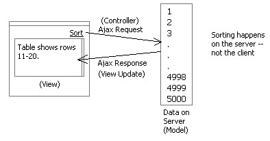
Another example: Selection. Let's say I want to select all records. I hit some Select All link (like in gmail) and this issues an Ajax request to select all records (Controller). On the server some index list (Model) is updated to record that all rows are selected. The response comes back with the same rows being displayed (View) in the table-- except that the checkbox that is on each row gets checked based on a value set for the first (assume checkbox is first column) column of data.
By pushing logic and data onto the server, we can implement a typical model-view-controller architecture that creates a clean separation of concerns and makes for a nice thin client.
We will open up API on the LiveGrid shortly that will make it easier to perform each of these type of functions.
Sunday, July 03, 2005
Why is Sabre Supporting Rico as OpenSource?
I've been asked this question on numerous occassions. Here is my take on why it has happened.
1) Sabre Airline Solutions invested significantly in a set of standard core technology platforms built on open source technology (Java Swing, JSP/Struts, JDO, Hibernate, Spring, J2EE technologies, etc.). This rich experience with open source has created a desire among those involved to share back with the community.
2) During this investment phase a number of open-source friendly folks were hired and moved into influential positions
3) We understood that whatever innovations we had arrived at, others were probably at the same stage or would shortly be there. Why not put our stuff out and let it be a part of the early wave (for Ajax & rich internet applications) and perhaps influence how things shape up in the world. of the web Sabre has a history of innovations and so it fit with this thinking.
4) We understand that we are not really in the business of building frameworks. If we get our frameworks out to the larger community then they will only get better.
5) Those of us involved are pretty passionate folks that really get excited about innovation!
6) We have the right people at executive level that are willing to think outside the box about our how some of our software gets developed.
7) Its just great publicity.
I have been extremely pleased during my last three years at Sabre. I have had tremendous support in every endeavor I have launched. This support has been at the executive level, at the product marketing level and at the development level. I think things were just ripe for Sabre to do something like this.
Anyway that's my view on it.
1) Sabre Airline Solutions invested significantly in a set of standard core technology platforms built on open source technology (Java Swing, JSP/Struts, JDO, Hibernate, Spring, J2EE technologies, etc.). This rich experience with open source has created a desire among those involved to share back with the community.
2) During this investment phase a number of open-source friendly folks were hired and moved into influential positions
3) We understood that whatever innovations we had arrived at, others were probably at the same stage or would shortly be there. Why not put our stuff out and let it be a part of the early wave (for Ajax & rich internet applications) and perhaps influence how things shape up in the world. of the web Sabre has a history of innovations and so it fit with this thinking.
4) We understand that we are not really in the business of building frameworks. If we get our frameworks out to the larger community then they will only get better.
5) Those of us involved are pretty passionate folks that really get excited about innovation!
6) We have the right people at executive level that are willing to think outside the box about our how some of our software gets developed.
7) Its just great publicity.
I have been extremely pleased during my last three years at Sabre. I have had tremendous support in every endeavor I have launched. This support has been at the executive level, at the product marketing level and at the development level. I think things were just ripe for Sabre to do something like this.
Anyway that's my view on it.
Tuesday, June 28, 2005
Death to Paging! - Rico LiveGrid Released
Ok, How About a Revolution?Aren't you tired of getting a chunk of search results from Google, Yahoo, A9, product listings, real estate pages, etc.? And then having to scroll to the bottom and hit the "next page?". In the words of Andy Rooney, "I know am!" What I normally do is search, scroll through results to the bottom of the page, scroll back up to double-check, then I have to scroll back down to navigate to the next page. Seems like a lot of bother to just move through my results.
Have you ever thought that there could be a better way -- or at least an alternative to the standard google paging control?

First a Little HistoryAt Sabre, we started experimenting with managing very large data sets with HTML tables. Our in-house table component had grown very rich in features (things like inline editing, sorting, selection, multi-sort, custom editors, row re-arrangement, grouping and other desktop-like features). But one thing we were not happy with was its handling of large sets of data.
Our table supported two styles of navigation: scrolling and paging. With scrolling you could create a natural way to interact with the data-- but if you had a lot of records just the amount of HTML that was required to download to the page made it unusable once you got over 1000 records.
We supported paging early on to address this issue. The user chooses the page by selecting a specific page number or using the next/previous paging controls.

One nice feature I added was a pre-calculation of the first and last field values of each page for the sorted column. I then displayed this in a page navigation combo box.
This allowed the user to navigate to a particular part of the data without having to guess which page. Additionally, I added tooltips that showed what each page contained. This worked fairly well.
However, most clients really wanted us to make the table a scrolling table. This was not feasible due to large data sets.
The Dilema
The catalyst came when we were designing a new web application. Initially all of the design discussions pointed to tables with less than 500 records. Since the user needed to select multiple values within the table we designed the screens to use the scrolling variety of our table. However, soon after implementation started the design requirements changed (!) and now we had to deal with 10's of thousands of flights.
Now we could have moved them to our paging table. However, given the requirement for the user to move through the flights and make multiple selections before moving to the next step, we were concerned with the usability of this approach. First, would users really think their flight would still be selected after paging to the next set of results? Seeing the page refresh does not make one think everything has been kept. Second, the user really wanted scrolling tables.
Enter Ajax
So what we settled on was to take the existing paging table and turn all page and sort requests into Ajax-based requests. Our theory was that if the transition between pages was almost instanteous without a page refresh then the user would be able to 1) understand selection was persistent, 2) be able to move through the data quickly. It turned out that performance was excellent. And since it was faster there was less confusion about whether selection was maintained while paging.
Darren James (on my team) did an incredible job of squeezing more and more optimizations out of the ajax response/update. It was his work on the table, cinematic effects and drag & drop that brought about the Rico framework.
User Feedback
The users absolutely love it! They couldn't believe the responsiveness they were getting from a table in a web application. But they still had one request. They wanted to control the table by scrolling. And they wanted it to be fast even with large data sets.
A Scrolling Ajax Table
So after launching Rico (http://openrico.org) Darren, Richard Cowin and I felt that this would be the right thing to tackle. We all felt that it should start as a lightweight behavior. Behaviors in Rico are just JavaScript logic and/or layout that gets applied to raw HTML. In this case we are applying just the logic of hooking up an HTML table to any arbitrary set of data via Ajax. Other behaviors (sorting, filtering, reordering, etc.) are planned later.
Introducing LiveGrid Behavior
By applying the LiveGrid behavior, your HTML table gets connected to any size data set and it gets adorned with a scrollbar to control the navigation. The scroller becomes the replacement for the standard Previous/Next page controller bar. When dragging the scroll bar you are actually issuing ajax commands to pull the data into the table in real time! Of course we provide data caching and event buffering strategies to minimize the number of requests and smooth out the scrolling.
Death to Paging?
First, let me say that I really don't believe that paging is evil or that it is wrong in all cases. But I believe the reason that most sites have paging solutions is because 1) its easy to implement, 2) handles the problem of large sets of data and 3) it is convention.
Rarely is paging decided because it is the better choice over something like scrolling. (I should hasten to add that I do discuss some of the cons of scrolling later in this article.)
Our Pitch
So, here is what we are advocating. We would like people to start thinking about replacing the paging data model with the more inuitive scrolling data model. It is not an accident that for years this has been a good model on the desktop. And there have been a number of tables built in the desktop or applet world that do exactly what LiveGrid does-- connect up to a virtual set of data and allow you to scroll through it. In fact, I wrote a table to do this very thing in 1998 for the Java Swing framework.
So we are hoping the release of LiveGrid will create a dialogue of discussion around the best way for users to move through information on the web and in web applications. We need better ways of displaying search results, product lists, real estate listings, etc. on the web.
To help you understand some of the possible impact we provide two demos for the scrolling LiveGrid.
Pitch #1: To the Corporate World: You Can Do It on the Web!
The first example demonstrates a table with around 1000 movies accessible. Only ten are shown and possibly 30 are cached on the browser at any given time. By scrolling the table, the database is queried to return more data just in time and on-the-fly.
One of the big reasons we did not take more applications at Sabre to the web was the inability to manage in a user friendly, easy manner large sets of data in tables. The LiveGrid concept solves this problem. Think of it as GoogleGrids (aka, GoogleMaps)!
Pitch #2: To the Web World: Show Results in a Scrolling LiveGrid
I worked up a search engine example using the excellent Yahoo Search Services API. This illustrates what a search engine page could look like with the LiveGrid behavior. Its really quite fun to play with. I have demonstrated it to computer novices who are not easily enamored by technical stuff. Their response has been, "Why don't they already do it this way?"

In the Yahoo Search example, we are bringing back live data from the search (usually around 35 rows for caching). Then as you scroll we are buffering as needed around you. The result is you can jump anywhere in the search data. Currently, the scroller is limited to 1000 results (the limit placed by the Yahoo Search API).
Feedback Design Considerations
We have experimented with several ideas to provide adequate feedback. During scrolling at certain points (when crossing a buffer boundary) there can be a slight delay. We plan on adding a twirling wheel (as in Firefox or Mac) just above the scrollbar and to the right of the status to indicate when the table is busy fetching data. Is this the right approach? The balance here is to not show it too often. It should be a lot like Dunstan Orchard's Live Search on his http://1976design.com/blog which waits to search when the user pauses so the number of updates is minimized.
We added a tooltip (right now it does not fade away-- thats a bug -- but I have come to like it the way it is :-) that shows which record you are currently scrolling through. Also I dynamically update the status bar to show the range of records that are being scrolled through. I think both together give enough assurance that something is happening even with a slight delay in loading data. Certainly there are other ways to provide the feeling of scrolling while waiting slightly for data to flow in.
Your Feedback
Ultimately, its everyone in the application and web community that that will judge if the time is ripe for banishing many of the ubiquitous Prev/Next Page bars in favor of the scrollbar.
I am convinced this technique has important implications in the corporate application world and has the potential to change the way we interact with many of the search results, product listings and data grids we find on the web.
We welcome your feedback!
The Demos
You can find the two demos at:
http://openrico.org/demos/livegrid
Note: This link is broken as of 2007. I will post an alternate location for the demo of the live search.http://openrico.org/yahooSearch.page
The Solution
It should be noted that besides the demos, we are providing open source code to make your tables behave in this manner. Try it, enjoy it and make your sites and applications better. Report bugs to us so that we can provide the best LiveGrid behavior possible.
Have you ever thought that there could be a better way -- or at least an alternative to the standard google paging control?

First a Little HistoryAt Sabre, we started experimenting with managing very large data sets with HTML tables. Our in-house table component had grown very rich in features (things like inline editing, sorting, selection, multi-sort, custom editors, row re-arrangement, grouping and other desktop-like features). But one thing we were not happy with was its handling of large sets of data.
Our table supported two styles of navigation: scrolling and paging. With scrolling you could create a natural way to interact with the data-- but if you had a lot of records just the amount of HTML that was required to download to the page made it unusable once you got over 1000 records.
We supported paging early on to address this issue. The user chooses the page by selecting a specific page number or using the next/previous paging controls.
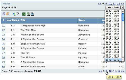
One nice feature I added was a pre-calculation of the first and last field values of each page for the sorted column. I then displayed this in a page navigation combo box.
This allowed the user to navigate to a particular part of the data without having to guess which page. Additionally, I added tooltips that showed what each page contained. This worked fairly well.
However, most clients really wanted us to make the table a scrolling table. This was not feasible due to large data sets.
The Dilema
The catalyst came when we were designing a new web application. Initially all of the design discussions pointed to tables with less than 500 records. Since the user needed to select multiple values within the table we designed the screens to use the scrolling variety of our table. However, soon after implementation started the design requirements changed (!) and now we had to deal with 10's of thousands of flights.
Now we could have moved them to our paging table. However, given the requirement for the user to move through the flights and make multiple selections before moving to the next step, we were concerned with the usability of this approach. First, would users really think their flight would still be selected after paging to the next set of results? Seeing the page refresh does not make one think everything has been kept. Second, the user really wanted scrolling tables.
Enter Ajax
So what we settled on was to take the existing paging table and turn all page and sort requests into Ajax-based requests. Our theory was that if the transition between pages was almost instanteous without a page refresh then the user would be able to 1) understand selection was persistent, 2) be able to move through the data quickly. It turned out that performance was excellent. And since it was faster there was less confusion about whether selection was maintained while paging.
Darren James (on my team) did an incredible job of squeezing more and more optimizations out of the ajax response/update. It was his work on the table, cinematic effects and drag & drop that brought about the Rico framework.
User Feedback
The users absolutely love it! They couldn't believe the responsiveness they were getting from a table in a web application. But they still had one request. They wanted to control the table by scrolling. And they wanted it to be fast even with large data sets.
A Scrolling Ajax Table
So after launching Rico (http://openrico.org) Darren, Richard Cowin and I felt that this would be the right thing to tackle. We all felt that it should start as a lightweight behavior. Behaviors in Rico are just JavaScript logic and/or layout that gets applied to raw HTML. In this case we are applying just the logic of hooking up an HTML table to any arbitrary set of data via Ajax. Other behaviors (sorting, filtering, reordering, etc.) are planned later.
Introducing LiveGrid Behavior
By applying the LiveGrid behavior, your HTML table gets connected to any size data set and it gets adorned with a scrollbar to control the navigation. The scroller becomes the replacement for the standard Previous/Next page controller bar. When dragging the scroll bar you are actually issuing ajax commands to pull the data into the table in real time! Of course we provide data caching and event buffering strategies to minimize the number of requests and smooth out the scrolling.
Death to Paging?
First, let me say that I really don't believe that paging is evil or that it is wrong in all cases. But I believe the reason that most sites have paging solutions is because 1) its easy to implement, 2) handles the problem of large sets of data and 3) it is convention.
Rarely is paging decided because it is the better choice over something like scrolling. (I should hasten to add that I do discuss some of the cons of scrolling later in this article.)
Our Pitch
So, here is what we are advocating. We would like people to start thinking about replacing the paging data model with the more inuitive scrolling data model. It is not an accident that for years this has been a good model on the desktop. And there have been a number of tables built in the desktop or applet world that do exactly what LiveGrid does-- connect up to a virtual set of data and allow you to scroll through it. In fact, I wrote a table to do this very thing in 1998 for the Java Swing framework.
So we are hoping the release of LiveGrid will create a dialogue of discussion around the best way for users to move through information on the web and in web applications. We need better ways of displaying search results, product lists, real estate listings, etc. on the web.
To help you understand some of the possible impact we provide two demos for the scrolling LiveGrid.
Pitch #1: To the Corporate World: You Can Do It on the Web!
The first example demonstrates a table with around 1000 movies accessible. Only ten are shown and possibly 30 are cached on the browser at any given time. By scrolling the table, the database is queried to return more data just in time and on-the-fly.
One of the big reasons we did not take more applications at Sabre to the web was the inability to manage in a user friendly, easy manner large sets of data in tables. The LiveGrid concept solves this problem. Think of it as GoogleGrids (aka, GoogleMaps)!
Pitch #2: To the Web World: Show Results in a Scrolling LiveGrid
I worked up a search engine example using the excellent Yahoo Search Services API. This illustrates what a search engine page could look like with the LiveGrid behavior. Its really quite fun to play with. I have demonstrated it to computer novices who are not easily enamored by technical stuff. Their response has been, "Why don't they already do it this way?"
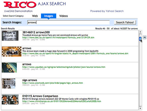
In the Yahoo Search example, we are bringing back live data from the search (usually around 35 rows for caching). Then as you scroll we are buffering as needed around you. The result is you can jump anywhere in the search data. Currently, the scroller is limited to 1000 results (the limit placed by the Yahoo Search API).
Pros
- Familiarity. Anyone who has used a PC/Mac is familar with a scrollbar
- Ease of use. Just scroll it baby.
- Control is visible along the side, not hidden at the bottom
- Shows you how much data you have and where you are in relation
- With the tooltip and the results feedback it provides you something to watch and helps you to navigate while data loads.
- I don't have to configure how much I want to see on a page. Designers decide what works best and then you can just scroll through it.
- The old problem of I have two scrollbars. One in the window around the results the other on the page itself. [Solutions: make scrollbar styled differently? Keep the complete scroller above the fold]
- If you have millions of results, you might not want to set the scroller extent to millions. The granularity of the scroll bar gets to be too small. However, it would be fascinating to actually scroll down to those last results. Anybody actually seen those? Do we even know if they exist ;-)
- Scroller extending below the page fold. Perhaps the best use is to keep the scrolled area completely above the fold. But hey, since you can scroll so fast through your data you won't miss the few extra rows of information below the fold (that you had to scroll to anyway.)
Feedback Design Considerations
We have experimented with several ideas to provide adequate feedback. During scrolling at certain points (when crossing a buffer boundary) there can be a slight delay. We plan on adding a twirling wheel (as in Firefox or Mac) just above the scrollbar and to the right of the status to indicate when the table is busy fetching data. Is this the right approach? The balance here is to not show it too often. It should be a lot like Dunstan Orchard's Live Search on his http://1976design.com/blog which waits to search when the user pauses so the number of updates is minimized.
We added a tooltip (right now it does not fade away-- thats a bug -- but I have come to like it the way it is :-) that shows which record you are currently scrolling through. Also I dynamically update the status bar to show the range of records that are being scrolled through. I think both together give enough assurance that something is happening even with a slight delay in loading data. Certainly there are other ways to provide the feeling of scrolling while waiting slightly for data to flow in.
Your Feedback
Ultimately, its everyone in the application and web community that that will judge if the time is ripe for banishing many of the ubiquitous Prev/Next Page bars in favor of the scrollbar.
I am convinced this technique has important implications in the corporate application world and has the potential to change the way we interact with many of the search results, product listings and data grids we find on the web.
We welcome your feedback!
The Demos
You can find the two demos at:
http://openrico.org/demos/livegrid
Note: This link is broken as of 2007. I will post an alternate location for the demo of the live search.
The Solution
It should be noted that besides the demos, we are providing open source code to make your tables behave in this manner. Try it, enjoy it and make your sites and applications better. Report bugs to us so that we can provide the best LiveGrid behavior possible.
Saturday, May 28, 2005
Mind Mapping Design Patterns
I have long been fascinated with design patterns.
My first real encounter was in the field of software design when the classic book, Design Patterns by the so called Gang of Four (Erich Gamma, Richard Helm, Ralph Johnson, John Vlissides).
Many of the patterns I had already been using. I just did not know to call them patterns. For example, the classic Model-View-Controller pattern had been something I had known about since reading the original Smalltalk book. It gave a clean way of designing user interfaces. Keeping the model (data), controller (events) and view (page/screen) separate from each other.
Later, when at i2 Technologies, I wrestled with creating a common user interface across our products as well as a common platform of technology. This drove me to look across all of our products. Of necessity you start to see patterns emerge. I kept thinking about coming up with a list of best practices or design patterns for interaction. But, I guess I was not clear enough in my thinking to really put it together then (1998.)
I think I was thinking more about interaction design principles than patterns.
Definitions
Ok, a few definitions are in order. Design principles are foundation concepts that help guide and shape us. Sort of a moral compass to good design. For example, the Xerox PARC adage to Keep Information in Context is a powerful design principle. It reminds us to first of present information and not just data. And to present it in proximity or in relationship with the context to interpret the data with. Style guidelines are specific rules that govern the usage of interface components, container and content. Design Patterns are best practices that express a practice in context of the user's problem focused by the design constraint.
Patterns, Patterns Everywhere
When I arrived at Sabre (Airline Solutions) to create a User Experience Team, one of the first things I did was to start a masochistic effort to evaluate about 25 of our products performing an in-depth analysis at the screen by screen level as well as noting the systemic issues. After spending a solid 4 months doing nothing but using our products, learning their quirks and looking at every screen I saw a negative set of patterns appear that I typically label anti-patterns. And as I pitched solutions I saw the same ones emerging over and over.
Now one would have thought (given my love for google since the first days it went beta) I would have googled' around for interaction design patterns. So as I later did research I found three basic sites that contain a good number of design patterns enumerated. Here they are listed in order of relevance and detail:
At Sabre we are working on an initiative to document interaction design patterns.
One of the things that frustrated me about the patterns is that they are hard to categorize. The current sites try to put them in strict categories. This works for the most part but leaves something to be desired.
I think a faceted approach would be better and hope to one day get around to that on a domain I have reserved (uipatterns.org).
Enter Mind Mapping
Have you heard of Mind Maps? Its sort of like graphically doodling what is on the brain and capturing the associations between the thoughts as they emerge. With the right tool it is a very freeing exercise in brainstorming. There are a number of software products that provide ways to mind map. My favorite is Mind Manager.
Well, I needed a new way to think about the patterns. So I took the concept of Mind Mapping and applied to a set of design patterns.
Where It Led Me
Ok, I didn't know where it would lead me. I just sort of started typing in pattern names as bubbles on the page. Then I started associating them. Soon I started thinking, "Ok, if I keep going this way I will just keep re-arranging and never get done." So I stopped and asked the question that we always as the teams we design for, "Who is the user and what is her goal?"
Duh! When I asked that question I suddenly decided to take a goal-oriented approach to the user. Each design pattern follows roughly the same pattern:
So I created one bubble just for the User and one just for the Designer.

I also added a third bubble for Design Principles. Just ignore that for this discussion.
User's Goals
As I looked at the goals I started seeing just a smaller set of basic goals. Appropriate patterns that address the goal can be added as leaf nodes in the mind map.

As I began to fill in each node, I discovered that this was a very natural way to express the organization of the design patterns.
Notice on the right hand side of the white bubbles I placed some gray bubbles that express a constraint. On the left is goal leading up to it and a constraint on the right choosing the right patterns.
Designer's Contraints
On the designer side I started listing constraints that were governing the patterns. These are patterns that are primarily driven by the constraints. In many ways these are patterns that do not apply specifically to a goal.

Practical Outcome of this Exercise
What this mind map arrived at was a way to find patterns based on the user's goals and based on design constraints. These are the two factors we as designers use in going to our toolbox. The other categorizations are useful but don't match my mental model of how I find a pattern for usage.
What would this look like on a patterns site? Well besides providing text search and faceted search, a pattern finder wizard could lead a designer to ideas on solving a problem (or show him we are missing patterns for this problem.) Its a pattern itself. The TroubleShooter pattern. Like the Microsoft Hardware Troubleshooter Wizard.
See the Mind Map
Want to view the whole mind map? You can download the map file but you will need the free viewer from Mind Jet. Download the viewer and the map file. Install the viewer and open the map file. You can expand, collapse nodes, zoom and print.

My first real encounter was in the field of software design when the classic book, Design Patterns by the so called Gang of Four (Erich Gamma, Richard Helm, Ralph Johnson, John Vlissides).
Many of the patterns I had already been using. I just did not know to call them patterns. For example, the classic Model-View-Controller pattern had been something I had known about since reading the original Smalltalk book. It gave a clean way of designing user interfaces. Keeping the model (data), controller (events) and view (page/screen) separate from each other.
Later, when at i2 Technologies, I wrestled with creating a common user interface across our products as well as a common platform of technology. This drove me to look across all of our products. Of necessity you start to see patterns emerge. I kept thinking about coming up with a list of best practices or design patterns for interaction. But, I guess I was not clear enough in my thinking to really put it together then (1998.)
I think I was thinking more about interaction design principles than patterns.
Definitions
Ok, a few definitions are in order. Design principles are foundation concepts that help guide and shape us. Sort of a moral compass to good design. For example, the Xerox PARC adage to Keep Information in Context is a powerful design principle. It reminds us to first of present information and not just data. And to present it in proximity or in relationship with the context to interpret the data with. Style guidelines are specific rules that govern the usage of interface components, container and content. Design Patterns are best practices that express a practice in context of the user's problem focused by the design constraint.
Patterns, Patterns Everywhere
When I arrived at Sabre (Airline Solutions) to create a User Experience Team, one of the first things I did was to start a masochistic effort to evaluate about 25 of our products performing an in-depth analysis at the screen by screen level as well as noting the systemic issues. After spending a solid 4 months doing nothing but using our products, learning their quirks and looking at every screen I saw a negative set of patterns appear that I typically label anti-patterns. And as I pitched solutions I saw the same ones emerging over and over.
Now one would have thought (given my love for google since the first days it went beta) I would have googled' around for interaction design patterns. So as I later did research I found three basic sites that contain a good number of design patterns enumerated. Here they are listed in order of relevance and detail:
- Welie's Interaction Design Patterns
- Tidwell's UI Patterns & Techniques
- Laakso's User Interface Design Patterns
At Sabre we are working on an initiative to document interaction design patterns.
One of the things that frustrated me about the patterns is that they are hard to categorize. The current sites try to put them in strict categories. This works for the most part but leaves something to be desired.
I think a faceted approach would be better and hope to one day get around to that on a domain I have reserved (uipatterns.org).
Enter Mind Mapping
Have you heard of Mind Maps? Its sort of like graphically doodling what is on the brain and capturing the associations between the thoughts as they emerge. With the right tool it is a very freeing exercise in brainstorming. There are a number of software products that provide ways to mind map. My favorite is Mind Manager.
Well, I needed a new way to think about the patterns. So I took the concept of Mind Mapping and applied to a set of design patterns.
Where It Led Me
Ok, I didn't know where it would lead me. I just sort of started typing in pattern names as bubbles on the page. Then I started associating them. Soon I started thinking, "Ok, if I keep going this way I will just keep re-arranging and never get done." So I stopped and asked the question that we always as the teams we design for, "Who is the user and what is her goal?"
Duh! When I asked that question I suddenly decided to take a goal-oriented approach to the user. Each design pattern follows roughly the same pattern:
- Pattern Name
- Problem
- Use When
- Solution
- Examples
So I created one bubble just for the User and one just for the Designer.
I also added a third bubble for Design Principles. Just ignore that for this discussion.
User's Goals
As I looked at the goals I started seeing just a smaller set of basic goals. Appropriate patterns that address the goal can be added as leaf nodes in the mind map.
As I began to fill in each node, I discovered that this was a very natural way to express the organization of the design patterns.
Notice on the right hand side of the white bubbles I placed some gray bubbles that express a constraint. On the left is goal leading up to it and a constraint on the right choosing the right patterns.
Designer's Contraints
On the designer side I started listing constraints that were governing the patterns. These are patterns that are primarily driven by the constraints. In many ways these are patterns that do not apply specifically to a goal.
Practical Outcome of this Exercise
What this mind map arrived at was a way to find patterns based on the user's goals and based on design constraints. These are the two factors we as designers use in going to our toolbox. The other categorizations are useful but don't match my mental model of how I find a pattern for usage.
What would this look like on a patterns site? Well besides providing text search and faceted search, a pattern finder wizard could lead a designer to ideas on solving a problem (or show him we are missing patterns for this problem.) Its a pattern itself. The TroubleShooter pattern. Like the Microsoft Hardware Troubleshooter Wizard.
See the Mind Map
Want to view the whole mind map? You can download the map file but you will need the free viewer from Mind Jet. Download the viewer and the map file. Install the viewer and open the map file. You can expand, collapse nodes, zoom and print.
Interactive Wireframes: Documenting RIAs
Background
I started designing (and developing) user interfaces professionally 20 years ago. My first experience was writing GATO, a submarine simulation, for the then newly minted Macintosh.
I moved through a myriad of business domains from there. These included designing interfaces in the areas of:
Interaction Design for the Web
It was exhilerating to have the constraint of visual design removed in product ideation. But with that exhileration came the realization that a much larger constraint had been placed on any design I wanted to come up with. The interaction dimension had all but been eliminated.
This constraint though tended to make it easier to mockup and interface or build wireframes for a design. Since most interaction occured at the page boundary, one could create interactive slide shows of the application to understand happy and sad paths. This had always been challenging in the desktop world... how do I document the interaction dimension?
Simulating Interaction with PowerPoint
By this time I was also doing lots of design work and lots of prototyping of new concepts.
One of the tools I used to present an interface was PowerPoint. It provided a way to create slide snapshots of the interface and stitch them together with hyperlinks and animation to simulate an interface. There were problems however.
The Problem
But as we started adding more and more rich interaction in our web application it got harder and harder to document the interaction in the tool.
With the recent rise in popularity of rich internet application solutions, this problem will become a much bigger issue.
Several things could happen:
So in the spirit of cobbling I recently created at technique in Visio to animate wireframes.
The problem we face is how to visualize the interaction dimension. How do we communicate what all lights up, fades, changes, pops and sizzles when the user types, points, clicks our interface.
In the entertainment world, the technique for visualizing the flow of a movie or game is through storyboards.
Enter Visio
One obvious way is to add hyperlinks and then generate the Visio wireframe as a web site. But this just gets us back to PowerPoint (with a little less power.)
Storyboarding
So what I created in Visio is a new stencil library that contains a way to document and drive a storyboard animation for the wireframe interface.

In another blog I will discuss the features of the Visio Wireframe Toolkit I built. But for now just imagine I have stencils for all sorts of web components, containers and content. I can create my wireframe with all of these elements and then use the Storyboard stencil to drive what parts of the interace show up when walking through a storyboard.
Visio Layers
Visio contains a concept called layers. Think photoshop. With one twist. The layers are really just tags. A shape (component, container, content) can be in zero, one or more layers. I have the ability to turn layers on or off. All objects that participate in that layer will turn on/off with the layer visibility.
The visual glue that holds this together is the ability to snap together storyboard frames and walk through the frames which drives turning layers on or off.

In this example, the user scenario (storyboard) is called Swap Shift. The respective steps are clicking on the desired shift, entering search criteria, checking to see if the schedule change will be what they want and finally submitting the request for the swap.
In Visio, as I double-click each storyboard step that part of the interface becomes visible. This simulates interaction with the application in a staged movie-style manner. Double-clicking the header resets the scenario to the beginning state. You can view an animation of this to see it in action.
The feedback has been very favorable. We have used this toolset to present a very complex application to a set of customers that have traditionally been hard to nail down and communicate with. They expressed a real appreciation for getting a chance to observe the interaction at much more intuitive way than traditional functional specs or wireframes.
There are issues of course.
I hope to publish a much expanded version of this with detailed examples as well as the stencil library. I am awaiting the editoral staff's decision.
I started designing (and developing) user interfaces professionally 20 years ago. My first experience was writing GATO, a submarine simulation, for the then newly minted Macintosh.
I moved through a myriad of business domains from there. These included designing interfaces in the areas of:
- wargaming
- airline forecasting
- software reverse engineering
- integrated development environments
- shipping and logistics management
- supply chain planning
- airline scheduling, operations, planning, revenue management
- telecommunications
- oil & gas production
- lots of interface toolkits and frameworks
Interaction Design for the Web
It was exhilerating to have the constraint of visual design removed in product ideation. But with that exhileration came the realization that a much larger constraint had been placed on any design I wanted to come up with. The interaction dimension had all but been eliminated.
This constraint though tended to make it easier to mockup and interface or build wireframes for a design. Since most interaction occured at the page boundary, one could create interactive slide shows of the application to understand happy and sad paths. This had always been challenging in the desktop world... how do I document the interaction dimension?
Simulating Interaction with PowerPoint
By this time I was also doing lots of design work and lots of prototyping of new concepts.
One of the tools I used to present an interface was PowerPoint. It provided a way to create slide snapshots of the interface and stitch them together with hyperlinks and animation to simulate an interface. There were problems however.
- Screen real-estate constraint. Powerpoint puts you in a smaller resolution to work with.
- Very hard to maintain and change. No good way to visualize the interaction dimension. Have to debug hyperlinks that are hidden behind an object's hyperlink dialog.
- Too much time spent wiring.
- Simulating in-page interaction meant creating animations or duplicating pages with slight modificiations.
- Limited drawing tools
- No good way to create templates (throw them all on a single page or put them in the gallery which could not be shared with anyone unless they installed them in the exact same directory structure as you did when they were saved.)
The Problem
But as we started adding more and more rich interaction in our web application it got harder and harder to document the interaction in the tool.
With the recent rise in popularity of rich internet application solutions, this problem will become a much bigger issue.
Several things could happen:
- RIA toolkits get simple enough that you can develop a quick prototype that can simulate the various interactions without a lot of code. Sounds great but probably not going to be the majority solution.
- The community agrees on a set of notations that can indicate various interactions (double click, fade, zoom, etc.) that can be documented in a static page. These efforts have been numerous in the past. I recall working on a notational system in 1993 for desktop interactivity.
- People cobble together tools that allow them to be pragmatic in their documentation. Wireframe the interface. Take the more interaction-dense parts and create animations with various tools to explain the interface. This will definitely continue to happen.
- A killer tool comes out that solves all of our problems. And world peace happens, too. :-)
So in the spirit of cobbling I recently created at technique in Visio to animate wireframes.
The problem we face is how to visualize the interaction dimension. How do we communicate what all lights up, fades, changes, pops and sizzles when the user types, points, clicks our interface.
In the entertainment world, the technique for visualizing the flow of a movie or game is through storyboards.
Enter Visio
One obvious way is to add hyperlinks and then generate the Visio wireframe as a web site. But this just gets us back to PowerPoint (with a little less power.)
Storyboarding
So what I created in Visio is a new stencil library that contains a way to document and drive a storyboard animation for the wireframe interface.
In another blog I will discuss the features of the Visio Wireframe Toolkit I built. But for now just imagine I have stencils for all sorts of web components, containers and content. I can create my wireframe with all of these elements and then use the Storyboard stencil to drive what parts of the interace show up when walking through a storyboard.
Visio Layers
Visio contains a concept called layers. Think photoshop. With one twist. The layers are really just tags. A shape (component, container, content) can be in zero, one or more layers. I have the ability to turn layers on or off. All objects that participate in that layer will turn on/off with the layer visibility.
The visual glue that holds this together is the ability to snap together storyboard frames and walk through the frames which drives turning layers on or off.
In this example, the user scenario (storyboard) is called Swap Shift. The respective steps are clicking on the desired shift, entering search criteria, checking to see if the schedule change will be what they want and finally submitting the request for the swap.
In Visio, as I double-click each storyboard step that part of the interface becomes visible. This simulates interaction with the application in a staged movie-style manner. Double-clicking the header resets the scenario to the beginning state. You can view an animation of this to see it in action.
The feedback has been very favorable. We have used this toolset to present a very complex application to a set of customers that have traditionally been hard to nail down and communicate with. They expressed a real appreciation for getting a chance to observe the interaction at much more intuitive way than traditional functional specs or wireframes.
There are issues of course.
- I have tried to make it simple to configure each step as to which layers turn on or off. It is still can be tedious if you get a large number of layers.
- It does not display more advanced effects like: zoom, fade, puff, slide, etc. Although these could be written as VB scripts and mostly simulated with an expanded syntax for each storyboard shape.
- How to communicate in printing? Well you can tell which layers print or not. So you just have to take the extra step to specify what will show up for a printout.
I hope to publish a much expanded version of this with detailed examples as well as the stencil library. I am awaiting the editoral staff's decision.
Very Rich Mail Clients
Mail over the web has always sucked.
That is why when gmail came out I signed up as quick as I could get a friend's friend that worked at Google to invite me.
gmail set a new standard for the masses on what a mail tool could be like. Fast, responsive, innovative, keyboard driven, etc.
In fact, when I had the option on my iMac to synch the gmail up with Apple's Mail I initially chose this route. But quickly decided that I loved the following about a web mail client:
However, I guess my head was in the sand. I never really had heard of a company called OddPost that had been building a rich mail client. It had a very loyal following and was way before gmail and it turns out a lot richer.
Of course Yahoo had heard of them. That is why they bought them out last year. At the Ajax Summit, Iain Lamb one of the OddPosts founders (now part of the Yahoo!Mail team) presented his pre-Yahoo email client.
Iain and his team took the approach to model itself after Outlook (for obvious acceptance purposes). Only they tried to tone down the interface a little.
Some re-incarnation of this technology is the foundation for a brand new (or renovated) Yahoo!Mail client sure to be soon on our horizon. Will be interesting to compare with gmail.
Scalix
Just found this one this morning. This is a Linux/Unix based solution that provides mail & calendars. The client runs in Firefox or IE and displays an almost complete clone of Outlook. Again, the client is the interesting part. It demonstrates how far you can take a DHTML client to mimic a fairly complex desktop application.
Scalix also competes head to head with the back office part of the Outlook Exchange system. Love it when Microsoft has competition :-)
And by the way I really hate the way Microsoft Outlook Web Mail client looks these days. Did they have to paint everything gradiated blue? Geez.
Web mail delivery is a natural. I for one have made the switch and do not want to go back. Of course at work I am still chained to outlook for calendar appointments :-(
Flash Based
Outside of the Ajax world, check out Laszlo Systems. They have a Mail client that has been adopted by Earthlink.
Also check out this Business Week article on web mail.
That is why when gmail came out I signed up as quick as I could get a friend's friend that worked at Google to invite me.
gmail set a new standard for the masses on what a mail tool could be like. Fast, responsive, innovative, keyboard driven, etc.
In fact, when I had the option on my iMac to synch the gmail up with Apple's Mail I initially chose this route. But quickly decided that I loved the following about a web mail client:
- Don't have to learn another mail tool
- One place for all my files
- Don't waste my disk space on keeping mail
- Easy to find it from anywhere I have web access
- And I just like the interface (always room for improvement :-)
However, I guess my head was in the sand. I never really had heard of a company called OddPost that had been building a rich mail client. It had a very loyal following and was way before gmail and it turns out a lot richer.
Of course Yahoo had heard of them. That is why they bought them out last year. At the Ajax Summit, Iain Lamb one of the OddPosts founders (now part of the Yahoo!Mail team) presented his pre-Yahoo email client.

Iain and his team took the approach to model itself after Outlook (for obvious acceptance purposes). Only they tried to tone down the interface a little.
Some re-incarnation of this technology is the foundation for a brand new (or renovated) Yahoo!Mail client sure to be soon on our horizon. Will be interesting to compare with gmail.
Scalix
Just found this one this morning. This is a Linux/Unix based solution that provides mail & calendars. The client runs in Firefox or IE and displays an almost complete clone of Outlook. Again, the client is the interesting part. It demonstrates how far you can take a DHTML client to mimic a fairly complex desktop application.
Scalix also competes head to head with the back office part of the Outlook Exchange system. Love it when Microsoft has competition :-)
And by the way I really hate the way Microsoft Outlook Web Mail client looks these days. Did they have to paint everything gradiated blue? Geez.

Web mail delivery is a natural. I for one have made the switch and do not want to go back. Of course at work I am still chained to outlook for calendar appointments :-(
Flash Based
Outside of the Ajax world, check out Laszlo Systems. They have a Mail client that has been adopted by Earthlink.
Also check out this Business Week article on web mail.
Ajax Applets: Rich DHTML Clients Via Light-Weight Plug-Ins
Several years back I was reviewing some marketing material that presented what one of my technology teams would be creating for the company I worked for. The team was chartered with building common components for web applications. One of the line items claimed we would deliver 'a rich set of Motif Applets.'
A Little History Lesson
Now if you know a little about the history of user interface toolkits, you will recognize that Motif is a user interface toolkit for UNIX X/11 systems (I first worked with this technology in 1990) and applets are bits of functionality delivered to the browser as Java byte code and run by a Java virtual machine plug-in. Its like making an oil & water shake. The terms don't go together. But I have always enjoyed the way it rolled off my tongue-- motif applets. I kind of like the way it sounds. I could just picture a marketing person gleefully stringing technology buzz words together inventing in whole cloth new dimensions to the web.
When applets burst on the scene they promised to bring about the revolution that would do away with or at least seriously diminish the necessity of desktop applications at all. Of course, lots of problems existed with the applet model. Usually the footprint was too large for the initial download. Of course some of that was bad timing -- not enough broadband to be used widely. They mostly found their home in intranet environments or as some very specific small tools on the web. I am also convinced that most people are not looking for a desktop experience when they use web applications--but that is another blog for another day.
Back to Ajax
So what's this got to do with Ajax?
Well, there are several rich DHTML toolkits that I have recently seen demonstrated that use the same concepts as X11/Motif architecture and Java Applets yet are Ajax based frameworks. A kind of modern day motif applet ;-). So, what are the characteristics that define these toolkits?
And what's it got to do with Motif?
As I mentioned before, Motif is a GUI toolkit based on the X11 Windowing System developed by MIT. X Windows is a desktop based, network delivered user interface system. When you start an X11 client (like mail tool, terminal window or calculator) the actual process could be running on another machine. A display Server is required (think browser + plugin) on your end to view the GUI application. Of course the program & display server could be running on a single client machine or you could even run the program on one machine and display it on someone else's machine (if they have an X Server with permission). The secret behind the whole thing is the X11 protocol.
By pushing a fairly efficient stream of interface instructions over a network wire to an X11 server GUIs could be remoted in distant places to simple machines with little compute power, just a nice monitor, called X Terminals.
This is exactly what a couple of the DHTML/Ajax Toolkits are doing.
JackBe
JackBe is a super-rich client framework for building web applications that can really replace desktop applications. In fact, I do not think any other toolkit like this exists today. Jacob Derechin and his brother Luis started the company in 2002 and started building solutions for corporate customers. Along the way Intel and others got excited about the potential and invested in the company. They added Ajax before it was called Ajax. They built a full (yes I mean full) IDE for building rich internet applications. Complete with all of the normal bells and whistles: layout grids, rich component set, drag and drop interface, data binding, and so on.
Besides normal looking web applications, at the Ajax Summit Jacob demonstrated the web app that Tupperware uses for its 250,000 salespersons. It was a Visual Basic application that Tupperware really just wanted remoted and not changed in any manner. Just deliver it over the web. Jacob succeeded. It looked and behaved just like the original VB application. Yet was all in DHTML.
And what is one of the core architectural decisions they made?
They wanted to be able to deliver RIA functionality over a dial-up line. And to prove the point Jacob always demos his applications over the client's dial-up line. It responds like it is running over broadband!
So how did they accomplish the speed? When you hit a JackBe application (NQ Suite) you get an initial download of a JavaScript rendering engine (they call it an assembler) that is about 29K. Since it is JavaScript the client will cache based on browser setting (usually 20 days.) Each screen or dialog is defined as a template and delivered in a compressed binary style format re-encoded as text. This means a complex GUI can be delivered in just a few kilobytes.
This takes a page from the X11 book. XRemote was an optimized X protocol for dial-up lines. This is essentially what JackBe does. Of course this is what browser plugins accomplish. They are rendering engines that accept a proprietary protocol. So in essence its kind of like a plug-in without a proprietary technology.
Tibco
Just saw this the other day. Tibco has been working on a complete rich DHTML GUI framework and IDE GUI builder for a while. The video demo is pretty fascinating. They have an incredibly complete set of components, tools and data binding mechanisms (SOAP, etc.). The rendering works the same basic way that JackBe works. The TIBCO General Interface Framework and the client-side application code are passed to the browser as a series of small, cacheable files which the browser treats as native JavaScript and XML. Tibco's rendering/data engine is around 89k in size.
The result is what appears to be (like JackBe) a very snappy interface.
It is interesting to note that both can claim a no-plug-in architecture since no proprietary technology is required to be downloaded (e.g., flash, java, svg). However, in actuality it is kind of a light-weight plug-in architecture since a rendering engine in the native browser language (javascript) is downloaded.
So, as always technology comes full circle.
Only now we have Ajax Applets that provide a richer, faster and more integrated visual experience for the user delivered over a light-weight, native-style plug-in architecture.
A Little History Lesson
Now if you know a little about the history of user interface toolkits, you will recognize that Motif is a user interface toolkit for UNIX X/11 systems (I first worked with this technology in 1990) and applets are bits of functionality delivered to the browser as Java byte code and run by a Java virtual machine plug-in. Its like making an oil & water shake. The terms don't go together. But I have always enjoyed the way it rolled off my tongue-- motif applets. I kind of like the way it sounds. I could just picture a marketing person gleefully stringing technology buzz words together inventing in whole cloth new dimensions to the web.
When applets burst on the scene they promised to bring about the revolution that would do away with or at least seriously diminish the necessity of desktop applications at all. Of course, lots of problems existed with the applet model. Usually the footprint was too large for the initial download. Of course some of that was bad timing -- not enough broadband to be used widely. They mostly found their home in intranet environments or as some very specific small tools on the web. I am also convinced that most people are not looking for a desktop experience when they use web applications--but that is another blog for another day.
Back to Ajax
So what's this got to do with Ajax?
Well, there are several rich DHTML toolkits that I have recently seen demonstrated that use the same concepts as X11/Motif architecture and Java Applets yet are Ajax based frameworks. A kind of modern day motif applet ;-). So, what are the characteristics that define these toolkits?
- They download some core library or rendering engine
- This download is automatic
- Each page or content request is interpreted by the rendering or plug-in engine.
And what's it got to do with Motif?
As I mentioned before, Motif is a GUI toolkit based on the X11 Windowing System developed by MIT. X Windows is a desktop based, network delivered user interface system. When you start an X11 client (like mail tool, terminal window or calculator) the actual process could be running on another machine. A display Server is required (think browser + plugin) on your end to view the GUI application. Of course the program & display server could be running on a single client machine or you could even run the program on one machine and display it on someone else's machine (if they have an X Server with permission). The secret behind the whole thing is the X11 protocol.
By pushing a fairly efficient stream of interface instructions over a network wire to an X11 server GUIs could be remoted in distant places to simple machines with little compute power, just a nice monitor, called X Terminals.
This is exactly what a couple of the DHTML/Ajax Toolkits are doing.
JackBe
JackBe is a super-rich client framework for building web applications that can really replace desktop applications. In fact, I do not think any other toolkit like this exists today. Jacob Derechin and his brother Luis started the company in 2002 and started building solutions for corporate customers. Along the way Intel and others got excited about the potential and invested in the company. They added Ajax before it was called Ajax. They built a full (yes I mean full) IDE for building rich internet applications. Complete with all of the normal bells and whistles: layout grids, rich component set, drag and drop interface, data binding, and so on.
Besides normal looking web applications, at the Ajax Summit Jacob demonstrated the web app that Tupperware uses for its 250,000 salespersons. It was a Visual Basic application that Tupperware really just wanted remoted and not changed in any manner. Just deliver it over the web. Jacob succeeded. It looked and behaved just like the original VB application. Yet was all in DHTML.
And what is one of the core architectural decisions they made?
They wanted to be able to deliver RIA functionality over a dial-up line. And to prove the point Jacob always demos his applications over the client's dial-up line. It responds like it is running over broadband!
So how did they accomplish the speed? When you hit a JackBe application (NQ Suite) you get an initial download of a JavaScript rendering engine (they call it an assembler) that is about 29K. Since it is JavaScript the client will cache based on browser setting (usually 20 days.) Each screen or dialog is defined as a template and delivered in a compressed binary style format re-encoded as text. This means a complex GUI can be delivered in just a few kilobytes.
This takes a page from the X11 book. XRemote was an optimized X protocol for dial-up lines. This is essentially what JackBe does. Of course this is what browser plugins accomplish. They are rendering engines that accept a proprietary protocol. So in essence its kind of like a plug-in without a proprietary technology.
Tibco
Just saw this the other day. Tibco has been working on a complete rich DHTML GUI framework and IDE GUI builder for a while. The video demo is pretty fascinating. They have an incredibly complete set of components, tools and data binding mechanisms (SOAP, etc.). The rendering works the same basic way that JackBe works. The TIBCO General Interface Framework and the client-side application code are passed to the browser as a series of small, cacheable files which the browser treats as native JavaScript and XML. Tibco's rendering/data engine is around 89k in size.
The result is what appears to be (like JackBe) a very snappy interface.
It is interesting to note that both can claim a no-plug-in architecture since no proprietary technology is required to be downloaded (e.g., flash, java, svg). However, in actuality it is kind of a light-weight plug-in architecture since a rendering engine in the native browser language (javascript) is downloaded.
So, as always technology comes full circle.
Only now we have Ajax Applets that provide a richer, faster and more integrated visual experience for the user delivered over a light-weight, native-style plug-in architecture.
Wednesday, May 11, 2005
Ajax Summit: LiveSearch in Moderation
A Lesson from the Ajax Summit
Often we will do something just because we have the technical ability to do it. When performing a live search (ajax-enabled searching), it is just as easy technically to get the results on each keystroke.
Dunston Orchard of Apple has a nice approach to LiveSearch that he presented. Check it out at 1976design.com/blog. (I suggest searching for 'puppy')
Here is the user experience issue. When the user types in an Ajax-enabled field do they want the search to happen at every keystroke? This is the approach Bitflux took. Like Dunston, I find this sort of approach annoying. Dunston provides several nice touches to his live search feature.
One interesting question. Should the search button also be available? Dunston shows it when javascript is disabled (since live search is turned off). But does not if JS is enabled (live search is on). I believe he has done the only correct thing. By the time they get around to hitting the search button, the search is either already started or in process.
However, I experience about a half-second confusion as you wait for the search to initiate.
Maybe allowing the Enter or Tab to initiate the search instantly and would alleviate the confusion (at least for the keyboarders).
BTW, while you are his site read about the panarama banner at the top. Marvel at his slide downs-- way cool and check out the balloon details that show as you mouse over the live search results.
Anyway, the moral of the story is: Remember the user is more important than technical prowess. Just because you can do it, does not mean you should do it.
Often we will do something just because we have the technical ability to do it. When performing a live search (ajax-enabled searching), it is just as easy technically to get the results on each keystroke.
Dunston Orchard of Apple has a nice approach to LiveSearch that he presented. Check it out at 1976design.com/blog. (I suggest searching for 'puppy')
Here is the user experience issue. When the user types in an Ajax-enabled field do they want the search to happen at every keystroke? This is the approach Bitflux took. Like Dunston, I find this sort of approach annoying. Dunston provides several nice touches to his live search feature.
- as soon as typing stops (appears to be half second) the search initiates.
- you know it initiated because you get the apple style spinning wait circle
- the list fills in
- details show in very cool callouts as you hover over the summary results.
One interesting question. Should the search button also be available? Dunston shows it when javascript is disabled (since live search is turned off). But does not if JS is enabled (live search is on). I believe he has done the only correct thing. By the time they get around to hitting the search button, the search is either already started or in process.
However, I experience about a half-second confusion as you wait for the search to initiate.
Maybe allowing the Enter or Tab to initiate the search instantly and would alleviate the confusion (at least for the keyboarders).
BTW, while you are his site read about the panarama banner at the top. Marvel at his slide downs-- way cool and check out the balloon details that show as you mouse over the live search results.
Anyway, the moral of the story is: Remember the user is more important than technical prowess. Just because you can do it, does not mean you should do it.
Ajax Summit - Rich & Scalable Ajax
I was fortunate enough to have been invited to speak at the recent Ajax Summit hosted by Adaptive Path & O'Reilly May 9 & 10. The purpose of the gathering was to bring together a cross-section of designers and developers who have been developing sites and applications the Ajaxian way.
My small part to play in all of this was to present a few things that we are doing with Ajax for our Sabre Airline Solutions applications.
What we are doing at Sabre
Within Airline Solutions I lead the User Experience Team. Over the last couple of years I also led the desktop and web interface technology teams. This included providing technical vision for these core technologies as well as working with 40+ products for user product design.
One of our strategic initiatives has been to create a rich set of web-based components and frameworks to support the development of web applications for the airline industry. This component set includes advanced components like: data grid, tree, menu, layout, tab, calendar, multi-select combo and many others.
Over time we have added remote scripting concepts to our framework to boost performance and interactivity. Once google maps came along we saw that the time was right to adopt their techniques with XmlHttpRequest, or what has come to be known as Ajax.
What I Presented
My presentation was on Rich & Scalable Ajax. It can be summarized as showing Ajax in the context of large data sets and with rich interaction.
Just-in-time Data
To demonstrate Ajax with large data sets we demonstrated our table component (in non-edit mode) with a 1000 records on the server, paging in data in near real-time. The point being that we can keep the data on the server and keep the client memory print small providing just-in-time data.
Just-in-time Business Logic
The second example I presented uses a small JavaScript framework that we will be releasing as Open Source that provides Ajax simplification, true drag and drop and cinematic effects. In the example, you can drag and drop crew members into a calendar. The calendar lights up the available days for scheduling based on information fetched via Ajax as soon as the user selects the crew member in the browser. The cinematic effects are demonstrated during the drop.
I will post the demo at a later date.
Drag and Drop
Drag and Drop is not new on the web, although I would argue it is rare. Most drag and drop frameworks are only drag frameworks. Managing drop management is the more important part. Handling all of the transitions in an extensible way is vital to its usefulness. What we provide is a clean, simple, object-oriented framework that implements drag and drop in a way that is trivial to add to your web-based applications. This is the idea behind the framework.
Well that's enough about my stuff. In the next set of posts I will give my observations on what I learned at the Summit.
My small part to play in all of this was to present a few things that we are doing with Ajax for our Sabre Airline Solutions applications.
What we are doing at Sabre
Within Airline Solutions I lead the User Experience Team. Over the last couple of years I also led the desktop and web interface technology teams. This included providing technical vision for these core technologies as well as working with 40+ products for user product design.
One of our strategic initiatives has been to create a rich set of web-based components and frameworks to support the development of web applications for the airline industry. This component set includes advanced components like: data grid, tree, menu, layout, tab, calendar, multi-select combo and many others.
Over time we have added remote scripting concepts to our framework to boost performance and interactivity. Once google maps came along we saw that the time was right to adopt their techniques with XmlHttpRequest, or what has come to be known as Ajax.
What I Presented
My presentation was on Rich & Scalable Ajax. It can be summarized as showing Ajax in the context of large data sets and with rich interaction.
Just-in-time Data
To demonstrate Ajax with large data sets we demonstrated our table component (in non-edit mode) with a 1000 records on the server, paging in data in near real-time. The point being that we can keep the data on the server and keep the client memory print small providing just-in-time data.
Just-in-time Business Logic
The second example I presented uses a small JavaScript framework that we will be releasing as Open Source that provides Ajax simplification, true drag and drop and cinematic effects. In the example, you can drag and drop crew members into a calendar. The calendar lights up the available days for scheduling based on information fetched via Ajax as soon as the user selects the crew member in the browser. The cinematic effects are demonstrated during the drop.
I will post the demo at a later date.
Drag and Drop
Drag and Drop is not new on the web, although I would argue it is rare. Most drag and drop frameworks are only drag frameworks. Managing drop management is the more important part. Handling all of the transitions in an extensible way is vital to its usefulness. What we provide is a clean, simple, object-oriented framework that implements drag and drop in a way that is trivial to add to your web-based applications. This is the idea behind the framework.
Well that's enough about my stuff. In the next set of posts I will give my observations on what I learned at the Summit.
Subscribe to:
Posts (Atom)